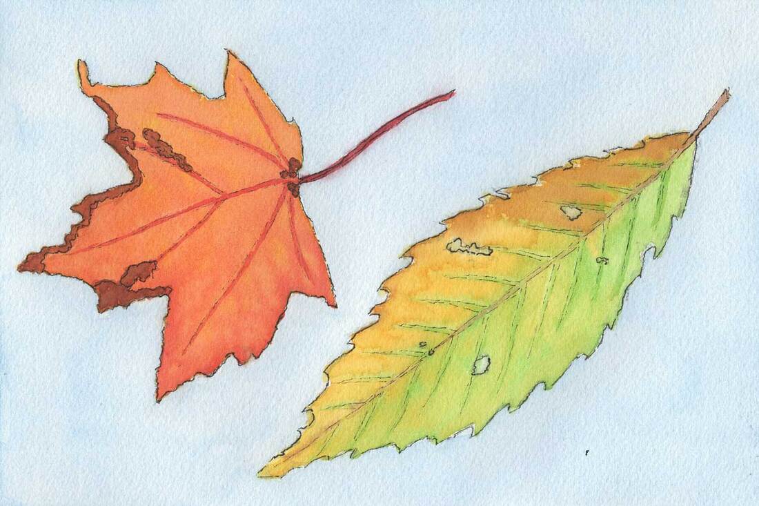
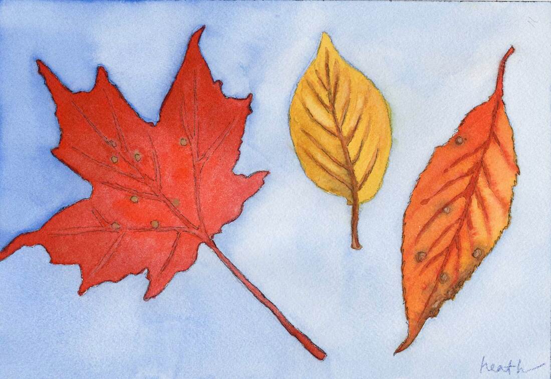
 Green and Orange Leaves 6"x9" watercolor on cold pressed paper Sometimes, mixing it up is the best way to go forward. When we work with the same process over and over, it can become rote, the fun gets lost, and we start to lose interest. This summer, I took my watercolors out to our boat, thinking it would be easier to paint with them in the tight quarters, and a lot easier to store the finished paintings while we were underway. What I wasn't thinking about was what I'd learn in general about making a painting, and how that could help my oil painting. What I stumbled on was basically the concept of cross training. 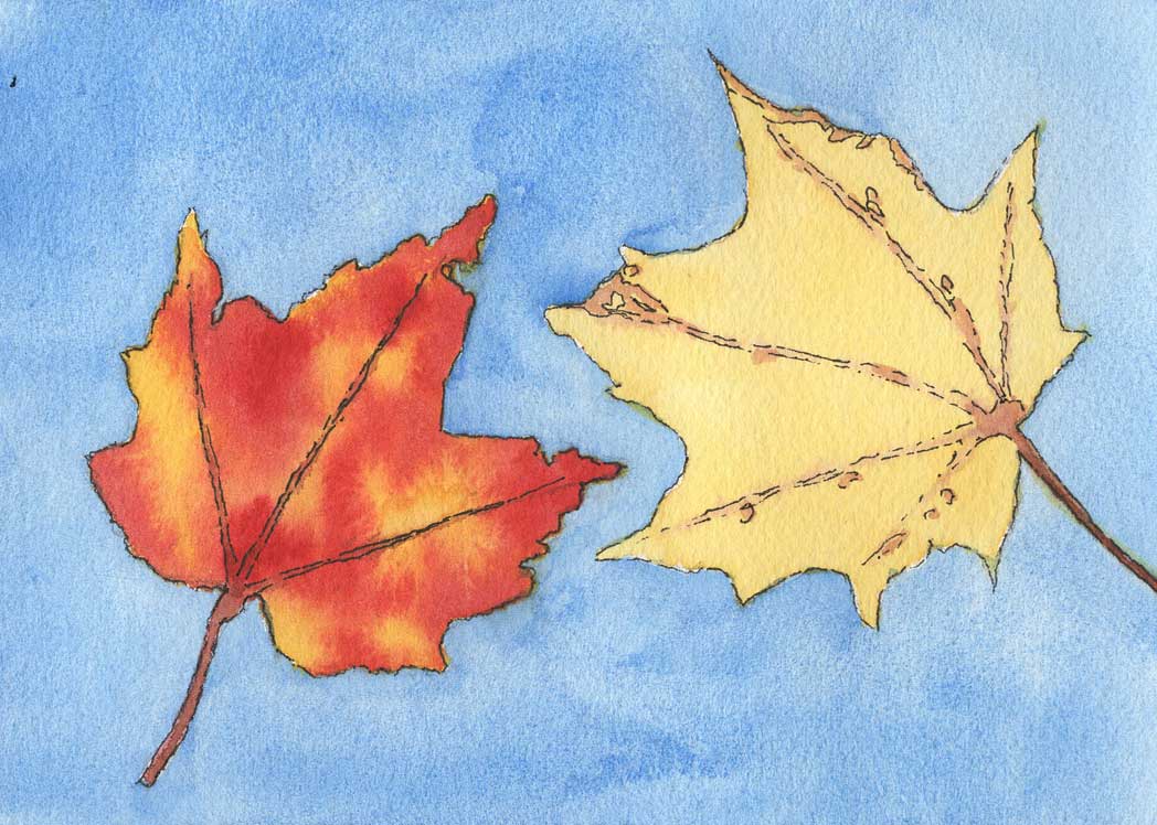 Two Leaves 5"x7" watercolor on cold pressed paper We're all familiar with cross training in sports. Benefits include improved strength, endurance, and fewer and faster recovery from injuries. Let's see if we can relate that to painting in different mediums. When I paint with watercolors, I usually sit, while painting with oils I stand. That means I'm using different muscles in my legs, back, shoulders, and arms. It's probably good for overall fitness and strength. There are plenty of people who stand when they paint in watercolors, so that's simply a personal preference for me. 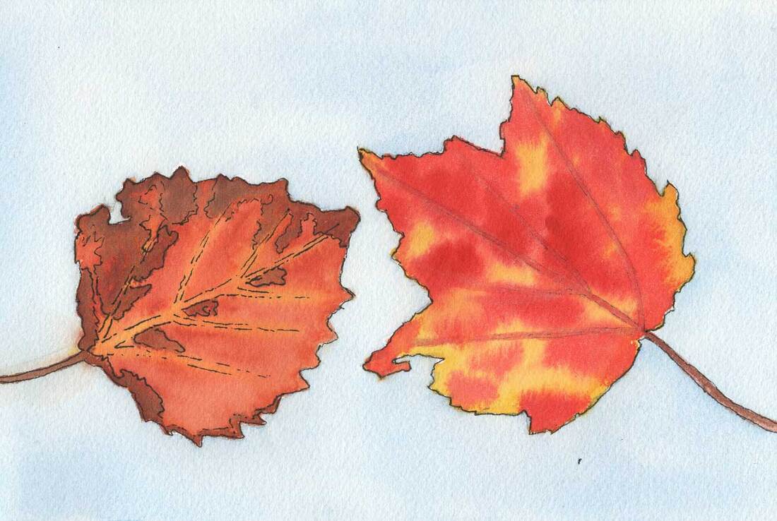 Speckled Leaves 6"x9" watercolor on cold pressed paper But what about cross training for your mind? I was interested to learn that cross training is a thing for writers. There are even course offered in writing for that very purpose. I'm imagining a novelist writing haikus and limericks! A major difference between painting in watercolors and in oils is that watercolors are applied lightest to darkest and in oils we go the opposite direction. The reason is that for watercolor white is created by lack of paint on the white paper, and in oil painting you've got a tube of white. So it's a big head shift to go from one to the other. But the concepts of composition and value are the same. Another difference for me, is that my oil painting is done alla prima, meaning all in one go so all of the paint is wet until I'm done. In watercolor a series of washes is built up to create the picture. It's common for watercolor painters to use a hair dryer to speed up the process between layers.
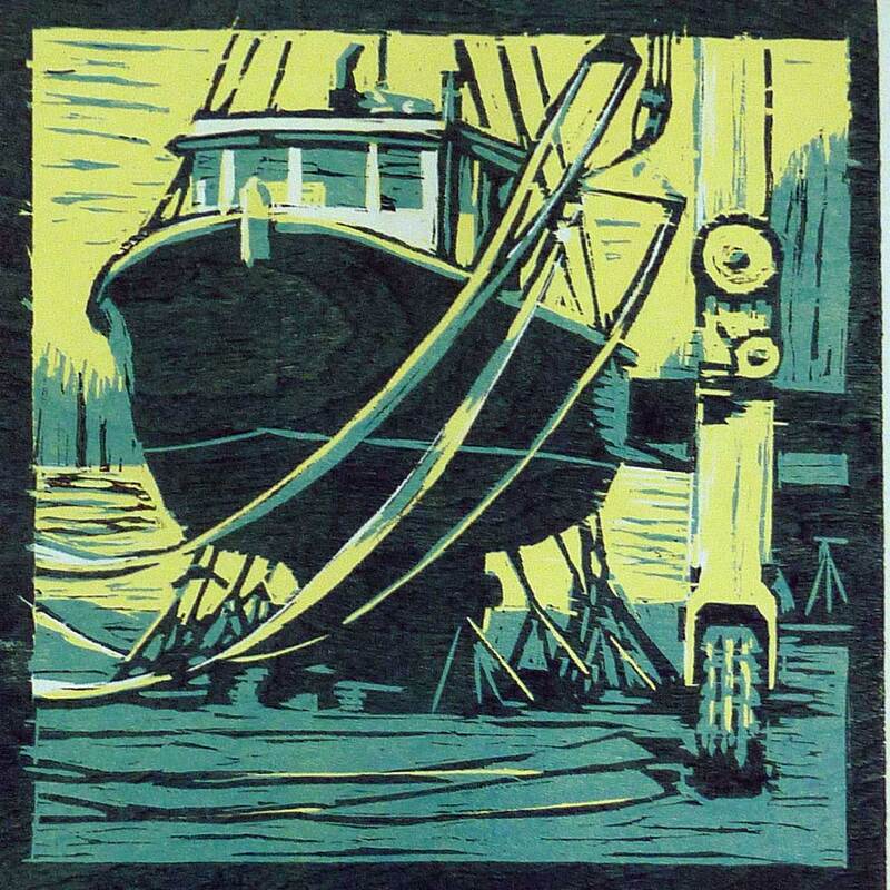
The Irish Piper woodcut on paper and detail of A Serious Game pastel on paper I've also done a bit of cross training making woodcuts and using pastels. Once again, the composition and values are the same as with oils or watercolor. In a woodcut, there are a limited number of layers, so the values and colors have to be simplified. In a pastel, it's almost the opposite, though you are constrained by the number of pastels you own. If you know an accomplished pastelist you've probably seen the hundreds of beautiful pastels they use. That's quite different from the way I mix each color I want in oils using a limited palette of two of each primary color and white.
Learning comes from trial and error, and I find that I learn most from the failures. Working in different mediums expands the opportunities for that learning. When I can let go and not worry about the outcome good things happen. Spending some time making paintings in a different way makes all my paintings better.
0 Comments
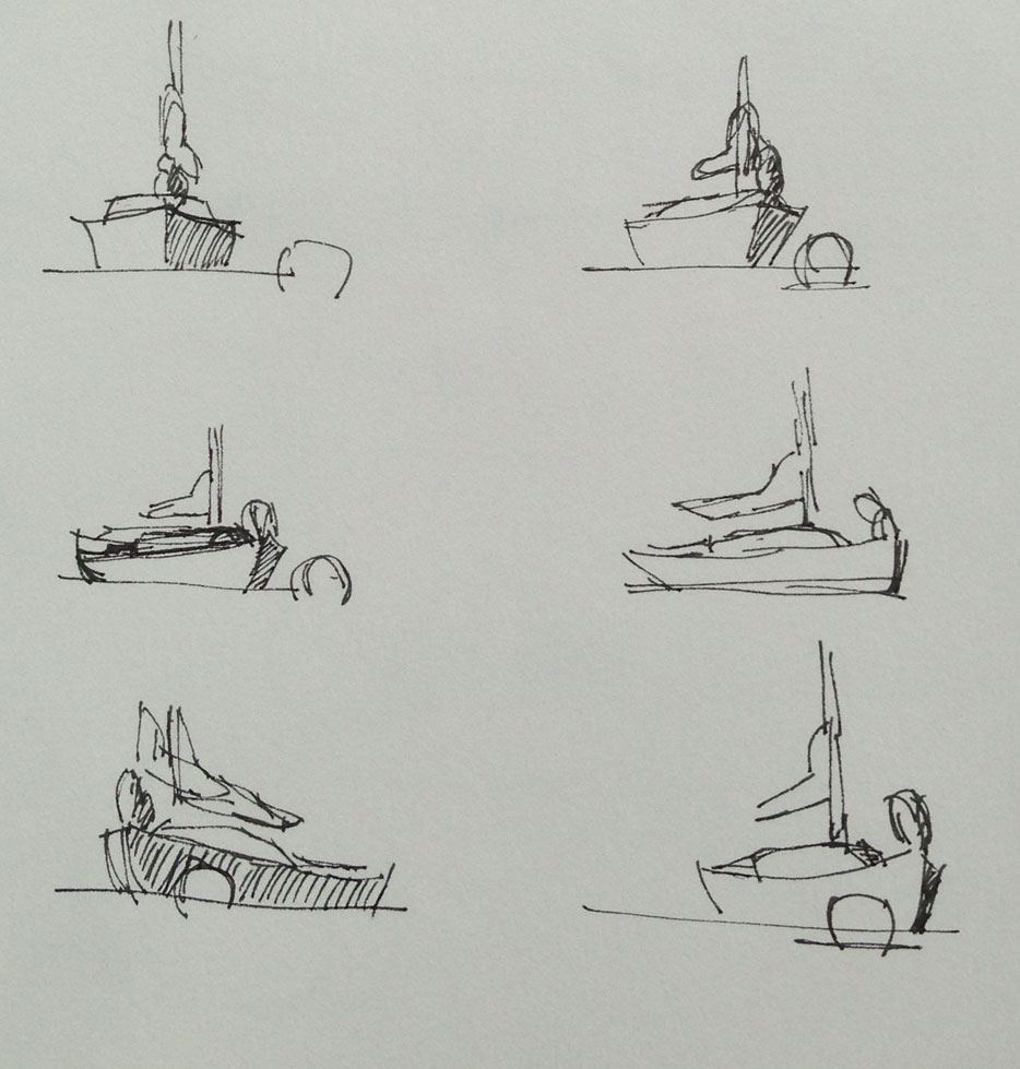
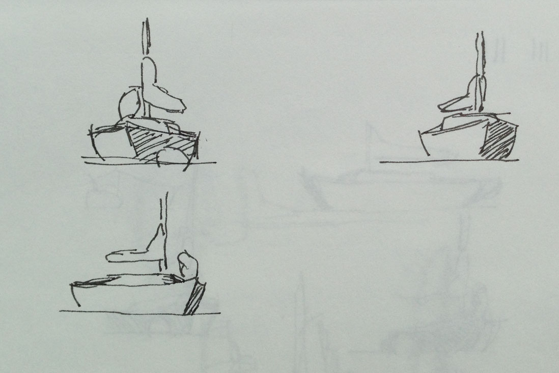
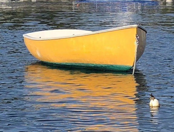
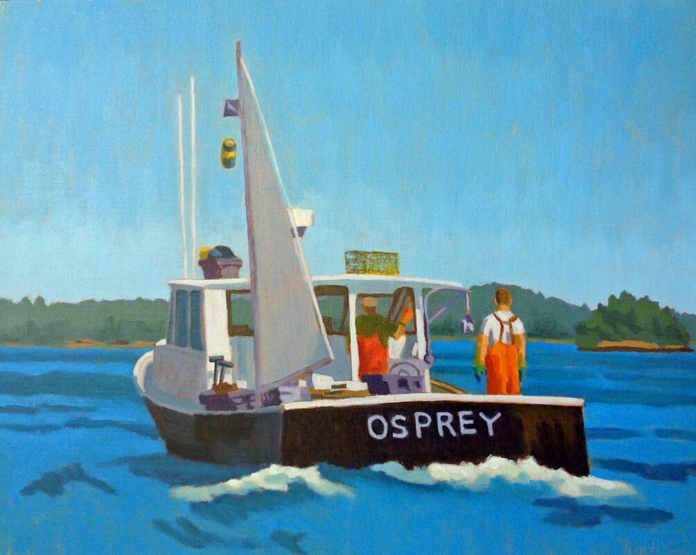 The Sternman 16"x20" oil on linen panel Last month we were on the water with the owners of my painting of the Osprey lobster boat, shown above. As we neared Chebeague Island I saw her on her mooring, so we thought we’d take look at the real thing. She’s a classic. Our guests were surprised at how long she is, since the painting was done from a photo taken off the stern on the port side. As you watch the video below, you can see how the shape changes as we go around the stern. There are so many views to choose from! the Osprey last month as we went by on our boat I love to sit on the dock or on our boat and sketch other boats on their moorings. They turn as the wind and tide fight for dominance, sometimes with almost a 180 degree swing. It’s such a great sketching exercise. And I think it's the secret to painting boats. It's not about what kind of boat you're looking at, though an appreciation for that makes it more fun to be around them. When painting a boat, it's the drawing step that's the most important. And sketching them as they float is key to learning to make a good boat drawing.
The little red sailboat in the drawings above is moored in Boothbay Harbor, and I've spent a lot of time sketching her as she swings on her mooring. Each of these drawings took only a minute or two. And there are many more. 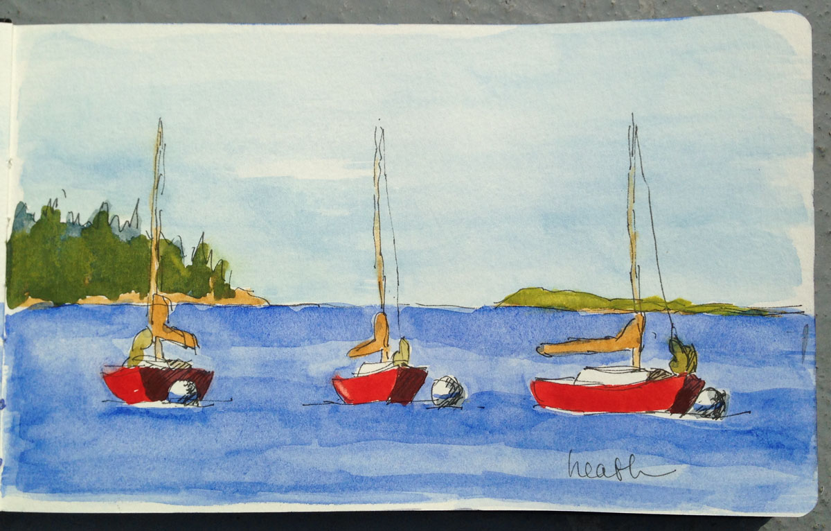 One afternoon, sitting in our cockpit still watching the little red sailboat, I took the best of the above sketches, and from them made a little water color in my sketchbook. I don't remember whether I did the ink or the water color on this piece first, but I like the sketch-like look that the ink gives it. 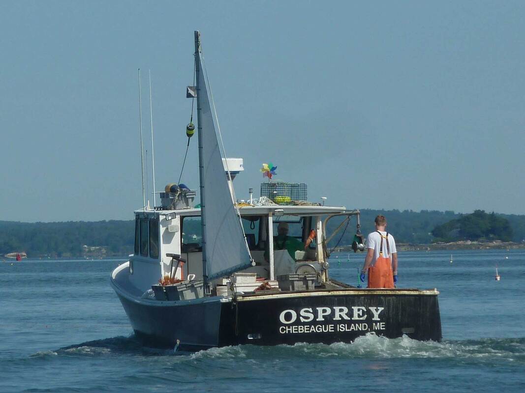 So you can see the simplification that goes into making the larger oil painting, here's the reference photo I took of the Osprey in 2015. It was taken from our boat using a point and shoot Nikon with a zoom, nothing fancy, but better than a cell phone. Painting boats is one of my favorite things to do. The challenge is in the drawing, but the result is usually worth the effort.
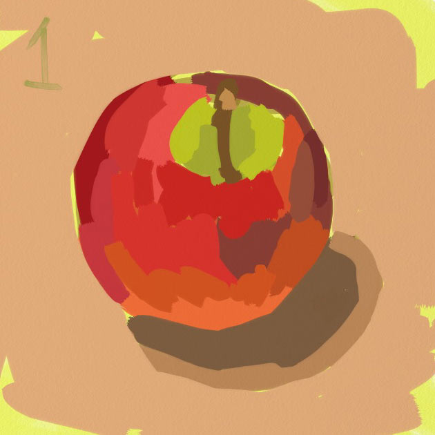
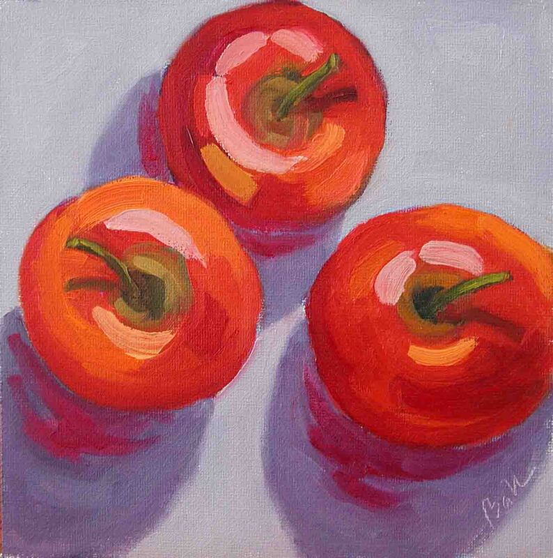 Apples in Oil 2009 I think this might be the first painting of apples I ever made. It was in 2009, before my first workshop with Carol Marine. It turns out she's a great lover of painting apples, and using apples as the subject in exercises to learn to paint better. 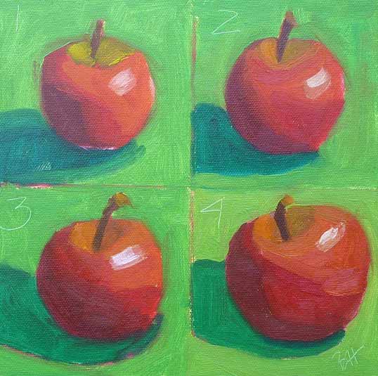 10 minute apples (10 minutes each not counting set up and mixing time) I'm a big proponent of painting from life. For me, the transformation from three dimensions to two is key to making a good painting. Apples are good for that, because they have a nice shape (not perfectly round like a ball), they come in beautiful colors, and they last for a while. Carol taught me the 10 minute apple exercise above, which I use whenever I feel rusty. You mix your colors first, then give yourself 10 minutes to paint the apple, mix the colors again and paint the next one, until all four are done. It's a lot of fun after the first time, when it's kind of scary!
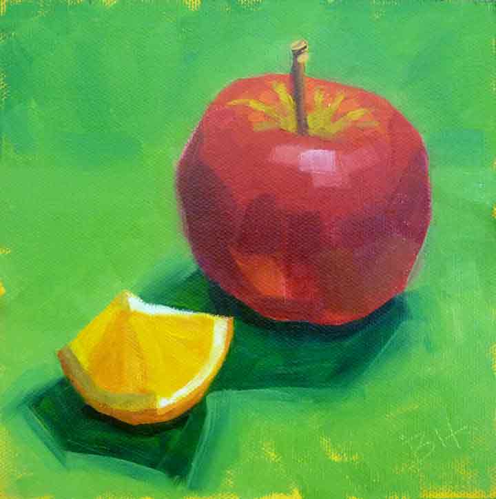
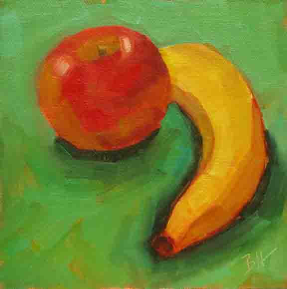
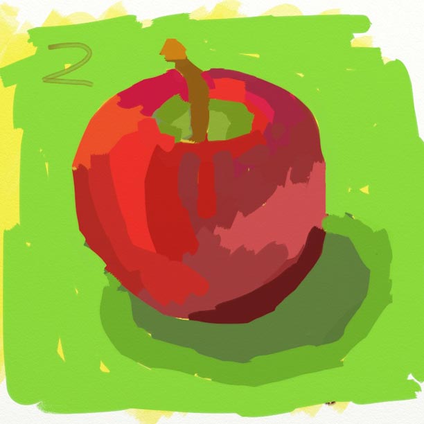
Apples sharing the stage with other fruit Apples go well with other fruit. And I like to paint them on a green background, because the complementary colors red and green really set each other off. What I learned from painting these still lifes was the beginning of my journey to painting out of doors, or was we say, en plein air. If I had gone directly from painting from photos to painting outside, it would have been much much harder.
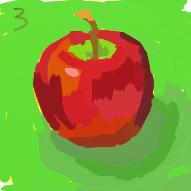
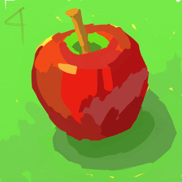
Apples painted on my iPad When I don't have a lot of time, I'll set up a few apples in the kitchen and paint them from life on my iPad. I used the Art Rage app to paint these. The clean up is sooo easy. Don't you think they look better with the green paper underneath? 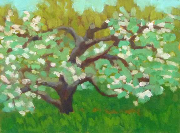 Drew Farm Apple Tree 8"x10" oil on canvas panel And then there are apple trees, I like to paint them too. And my favorite way to do that is while standing right in front of them. It's such a treat to be among these beautiful trees on a spring afternoon when they're in bloom.
But now back to autumn and apples. There always seem to be lots to chose from at my favorite farm stand. In recent years I've discovered Honey Crisp and Autumn Gala (my current favorite). There's a lot to love about the apple. 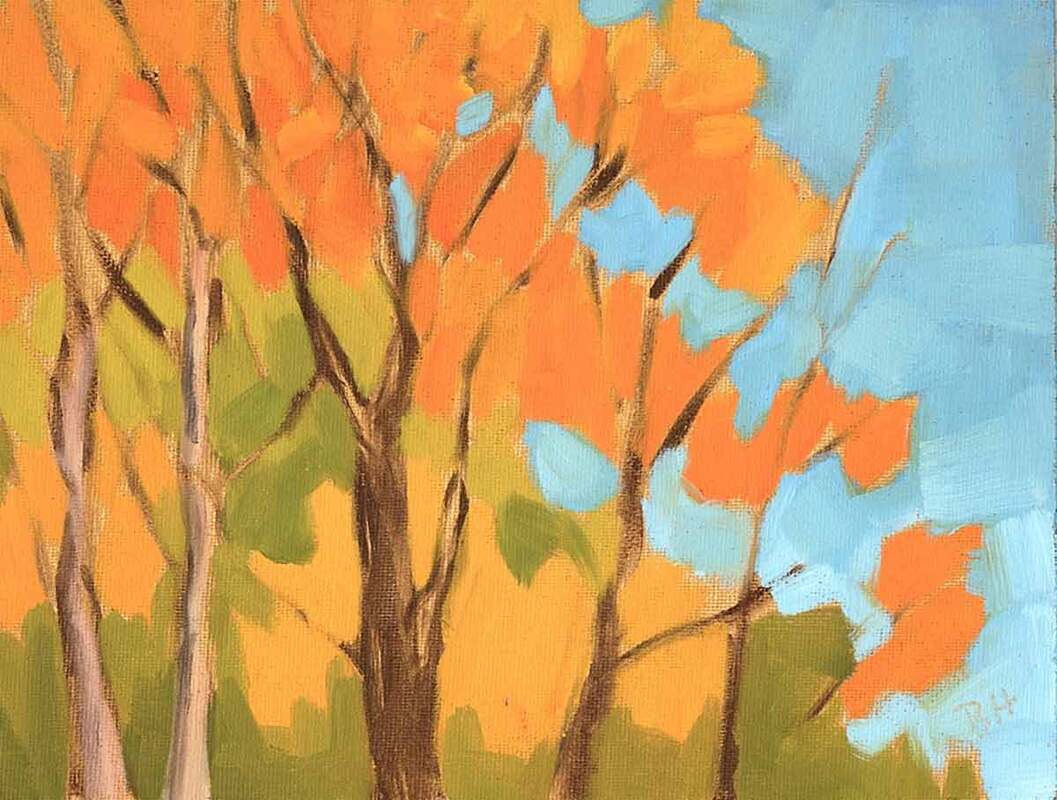 It's Fall 6"x8" oil on canvas panel I had the most delightful comment on Instagram the other day when I posted one of the leaf paintings from the last blogpost. Catherine asked if I knew what kind of leaf I'd painted. She and her grandson are trying to identify trees by their leaves.  Fall is in the Air 6"x8" oil on canvas board And that took me right back to my childhood. I love trees. They are my favorite part of nature with the possible exception of bodies of water. And when I was a child I had this wonderful little paperback book that you could take into the forest and with a tree branch and its leaves, the book would ask you questions that led you to identify the tree. I used it a lot. And about 10 years ago I discovered the book is still available, for a mere $6 in amazon.  Provencal Tree Study 4"x6" oil on French panel It's called Tree Finder: A Manual for identification of Trees by Their Leaves, by May Theilgaard Watts (1893 – 1975). May Watts was an American naturalist, writer, poet, illustrator, and educator. She was a naturalist at The Morton Arboretum and author of Reading the Landscape of America (credit wikipedia).
The Tree Finder Books - left uses leaves, right for deciduous trees in winter This little book is a mystery lover's dream and a school child's game. I hope Catherine and her grandson enjoy it as much I did, and still do. I have a copy of the book and its companion, Tree Finder: A Manual for identifying Deciduous Trees in Winter, in the glove compartment of my car. And I couldn't be more grateful to May watts.
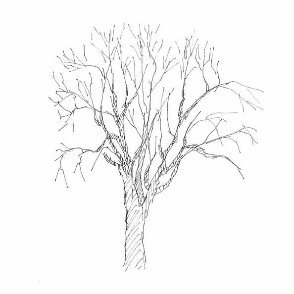
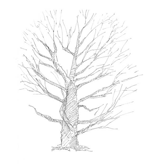
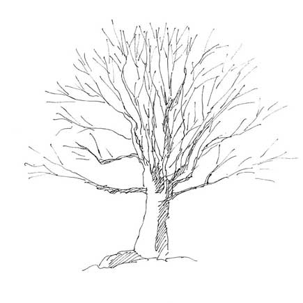
Let me say agin, I adore trees. And winter is the best time to draw them, when the leaves are gone and the structure is visible. If you paint, there's nothing better than getting outside and drawing a few trees. And if you can identify them as well, that's frosting on the cake.
 Watch Them Fall 7"x10" water color on paper There's something about certain subjects that makes me want to paint them with water colors. I first noticed it with Winslow Homer's water colors of the Bahamian surf. They just looked so right in that medium. Colorful fall leaves are another. I love dropping bits of color onto the wet paper to make the mottled colors of the fallen leaves. So if you see me on the side of the road, bent over looking through the leaves to choose my favorites, you'll know what I'm going to do with them. 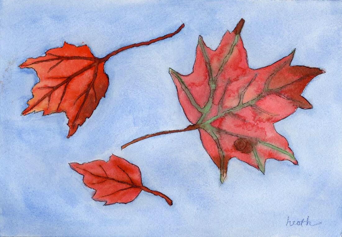 Falling Leaves 7"x10" water color on paper There's a difference in the process of painting with oils and with water colors. With oil paint, we start by painting in the darkest colors and work to the lightest. With water color most painters start with the lightest colors and work their way to the darkest. That's how I painted the leaves on these paintings. The background was added as the last step. And to draw the leaves, I laid them down on the paper and traced them. 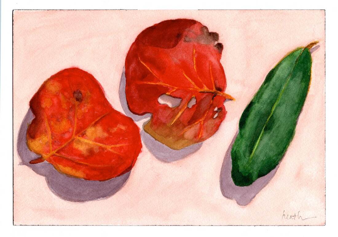 Three Leaves 7"x10" water color on paper The two paintings at the top were painted in the last week or so. The painting above was painted a couple of years ago in Florida. I especially like the beach plum leaves (on the left), they're green in the summer and red and orange and very mottled in the fall, fabulous to paint. Below are a couple of videos showing the process. Here I'm working on the yellow leaf, giving it some color variety and putting in the midrib and veins. To add the blue sky behind the leaves I prepared the blue paint which is dry in the pans (at the top) by wetting it and putting it on the palette. Then I wet the white part of the paper, so that I could drop in the blue paint. I didn't go quite to the edge of the leaves, that can be done when adding the blue paint.
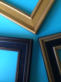
 One thing I know is this. If I buy an unframed painting, the likelihood that it will shortly hang on the well is much less than if I buy one that 's already framed. I think this is true for most people. But it doesn't have to be this way. Framing oil and acrylic paintings is straightforward if you have the right tools and a ready-made frame. There are many quality picture frames available online, and they are very affordable. And, you can have the frames cut to whatever size you need, even when buying online. I've bought frames online from Frame Destination, Florida Frames, and Graphik Dimensions. Franken Frames has also been recommended to me. Alternatively, you can do pretty well at your local framers by simply having them make a frame for you, and doing the framing yourself. Oil and acrylic paintings don't require glass or mats, and a piece of paper across the back is not necessary. With the right tools you can frame a painting in half an hour.
Picture frames and sample moldings Below are the hardware and tools that I like to use and where to get them. Framing4Yourself is great resource, both for the hardware and for instructions. The first task is to secure the painting in the frame. And I’m talking here about a wooden frame and a painting on a panel or canvas. A point driver is used to drive little metal darts called points into the frame, and those hold the painting securely in the rabbet of the frame (the part in the back that’s recessed). When you order a frame, order one with the dimensions of the outside of the painting. You’ll find that there will be a bit of wiggle room for the painting in the frame, you don't have to add that in when you order. Note also that the rabbet will have to be deeper than the thickness of the painting in order to use the point driver method described here. 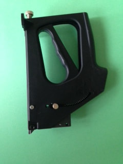 Point Driver 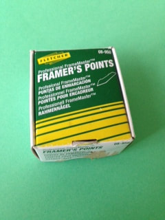 Points I generally check the frame to see which side will look best as the top, dust the frame off, and lay it face down on a towel or something non-abrasive before dropping in and securing the painting. For 8"x10" paintings or smaller, I use one point per side, for larger paintings, I use two per side. An old palette knife is useful for positioning the painting in the frame while it's lying on your workbench. 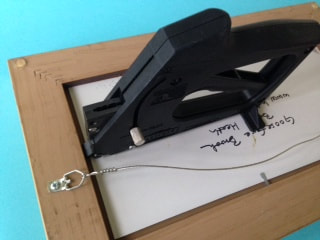 point driver positioned to drive the point into the frame The next task is to attach a wire for hanging, for which I use little gadgets called strap hangers. Always double check to make sure you know which is the top of the painting before making any holes in the back (I’ve messed that up a few times!). I make the holes for the strap hangers about 1/3 of the way down the back of the frame from the top edge. And I use an awl to start the hole for the screws that hold on the strap hangers. This is less work than drilling the holes, and I rarely find a frame that’s too hard for this approach. If you want, you can make a couple of hits with a nail set into the hole made by the awl to get a deeper hole. 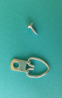 strap hangers and screws, where to order 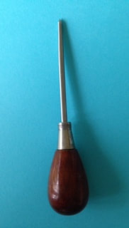 awl, where to order 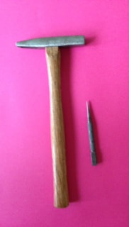 nail set and hammer, available at your local hardware store Picture hanging wire is readily available at your hardware store, and Framing4Yourself has a great selection. Choose wire that’s rated for more than the weight of the painting plus frame. I find the non-coated wire to be easiest, but that’s a personal decision. Needle nose pliers and wire cutters are also useful. 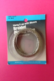 picture hanging wire 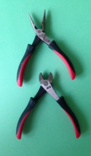 needle nose pliers and wire cutters, available at your local hardware store 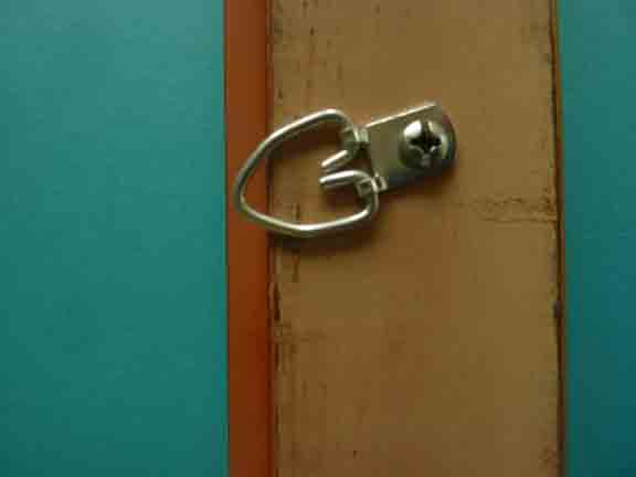 strap hanger screwed to back of frame 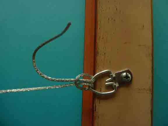 wire tied on to strap hanger 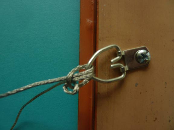 an extra knot before wrapping the wire (I do this for larger paintings) 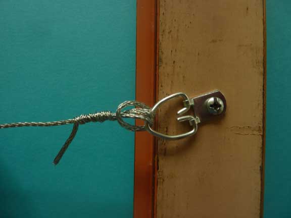 excess wire wrapped around the hanging wire (be sure to neatly cut off the end) And finally, bumpers go on the bottom corners of the painting to keep it from banging into the wall.  To finish off the framing, be sure to include information about the painting on the back, e.g. title, painter, location, etc. You can photocopy this information from your receipt if it is not already on the back of the painting.  Bottom left corner of the back of a framed painting showing the wire attached with a strap hanger, the points, and the bumper If you've bought one of my paintings, have a frame that fits, and are local, I will be happy to frame the painting for you. Please contact me.
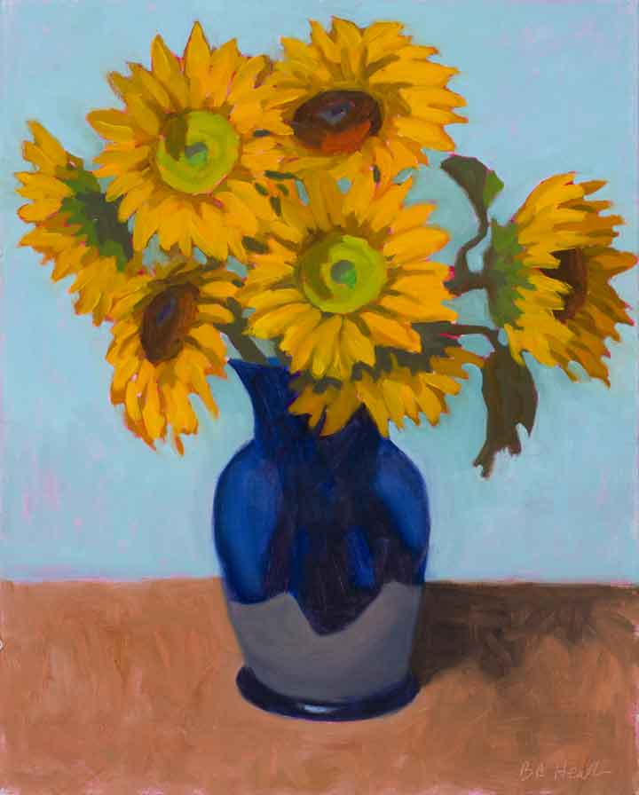 Vase of Sunshine - 20"x16" - oil on linen panel - 2014 I've missed seeing sunflowers this year. I saw a few in people's yards, but it seems that several of the places I normally find them didn't grow any this season. But don't give up hope, they are still available in some markets, so you can create your own vase of sunshine if you hurry. And how cheerful that would be on a day like today, when it's cold and dreary outside. 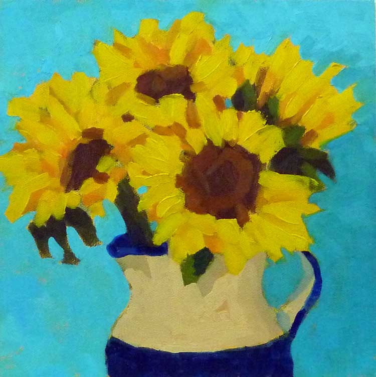 Sunflowers - 8"x8" - oil on canvas panel - 2011 The paintings in this post are some of my favorites of sunflowers I've created over the years. They are one of my favorite painting subjects. There's so much to them, they're "chunky", in that there are lots of shapes and angles, and they have mass and weight. And bright colors too. There's a lot to love about a sunflower. You can see here how my paintings have changed over the years with these images. And I'm not the only artist that as loved sunflowers, Van Gogh sunflowers, anyone? 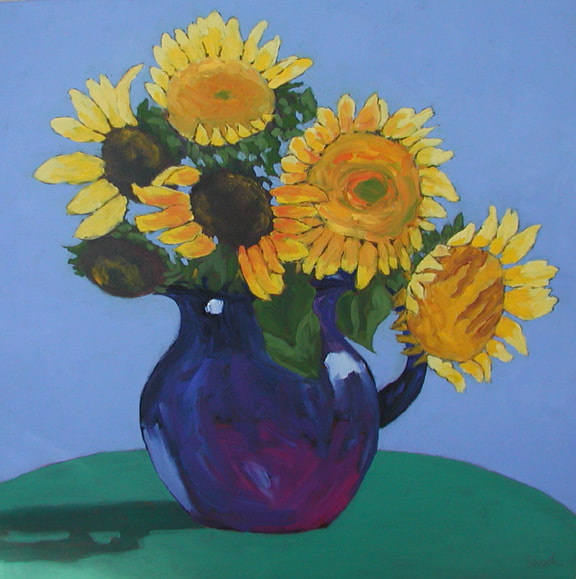 Sunflowers with Blue Pitcher 24"x24" oil on canvas I love to the paint the flowers in vases, where I can arrange the stems to show off the sunflowers to their best advantage. But there's something about having a whole field of them spread out in front you that is pretty amazing. Colby Farms in Newbury, Massachusetts, has one of those fields each year. You can wallow in sunflowers there. I was interested to find on a late afternoon visit that the flowers were not facing the sun. In fact the leaves of the sunflower follow the sun by a process called heliotropism, but only the budding flowers do this. Once the flowers are mature the stem stiffens and they always point east towards the sunrise. I found the best viewing (and easiest parking) there was in the morning. Unfortunately, the 2020 season is past, but do check it out next year. Another recommended spot for sunflower watching in New England is Coppal House Farm in Lee, New Hampshire. Their season runs from late July through early August. If you know of a sunflower Farm in Maine that allows visitors, please let me know! 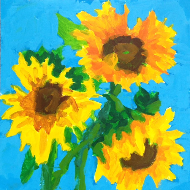 Three Sunflowers 8"x8" acrylic on treated paper And now for something completely different, sunflowers in acrylic, above. My oil paintings are done alla prima (wet in wet). The paintings are done in a couple of hours, before the paint has a chance to dry. In acrylic painting, on the other hand, the paint dries very quickly, while you're painting. Even using the same colors, the look is very different. Which appeals to you most?
 Backdoor To Seal Bay 6"x6" oil on canvas Have you ever walked across a room to look at a painting because the color grabbed your attention? That happens to me a lot. Bold bright color, I love it! But there’s more to a painting than the color. Think about the wonderful black and white photos you’ve seen displayed on walls. They can be very striking. They’re pared down to the essentials, and the most basic of essentials is a pleasing value pattern. It's value that does the work, even if color gets the credit.  Backdoor to Seal Bay Value study What do I mean by value? Value is the lightness or darkness of a shape. A compelling value composition is a pleasing collection of interconnected shapes of different values. Picture a jigsaw puzzle with varying sized pieces in varying shades of black, white, and gray. When I started painting, I thought the composition was the drawing. But lines all by themselves don’t make a composition. It’s the shapes that the lines describe, and the values of the shapes that do that. And when the composition is pleasing, you have winner. The secret is: It doesn’t matter what colors you use, as long as each one has the right value. 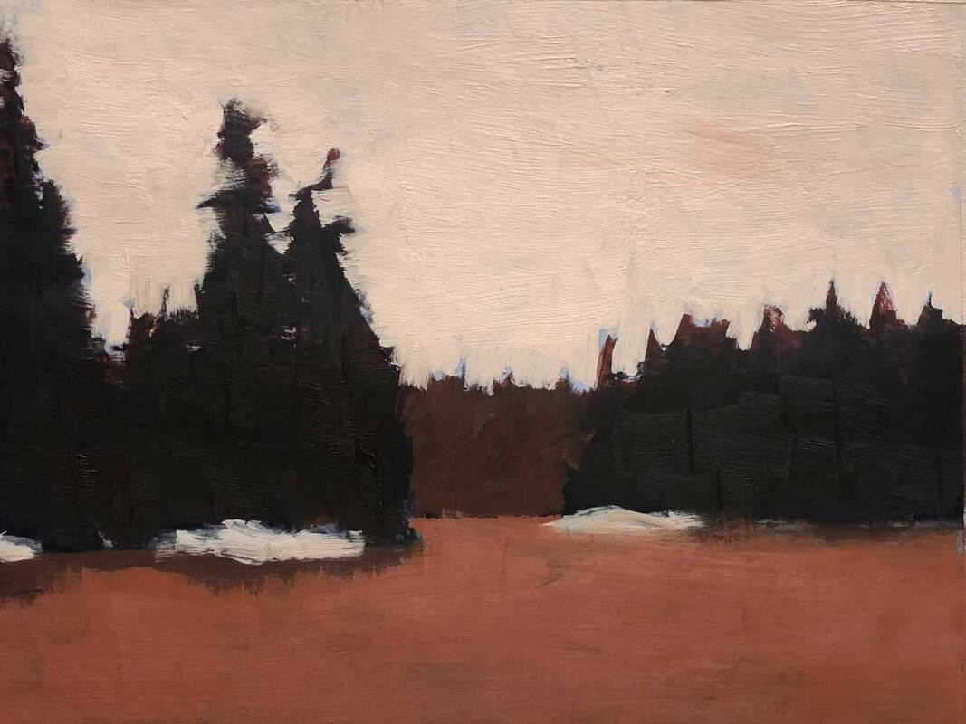 A later Backdoor to Seal Bay Value Study A few weeks ago, my friend Carol Douglas challenged me to paint a landscape scene using the opposite colors of those found in nature. These are called the complementary colors (purple, green, and orange), and they appear on the color wheel in between the three primary colors; red, blue, and yellow. To accept Carol’s challenge I started with the value study above, basically a monochrome version of the scene. As long as I got the values right, I could use any colors I wanted. 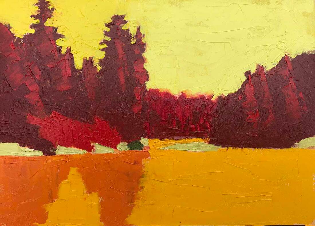 Backdoor to Seal Bay 5"x7" oil on gessobord (using complementary colors) I replaced the greens of the trees with reds, the blue of the water with orange, and the light blue of the sky with yellow. The result is above. What do you think?
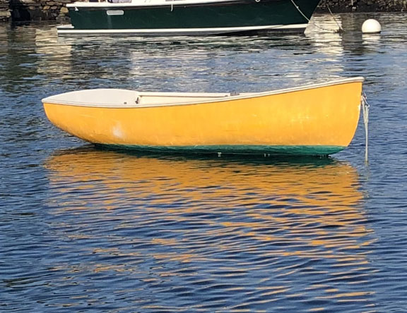
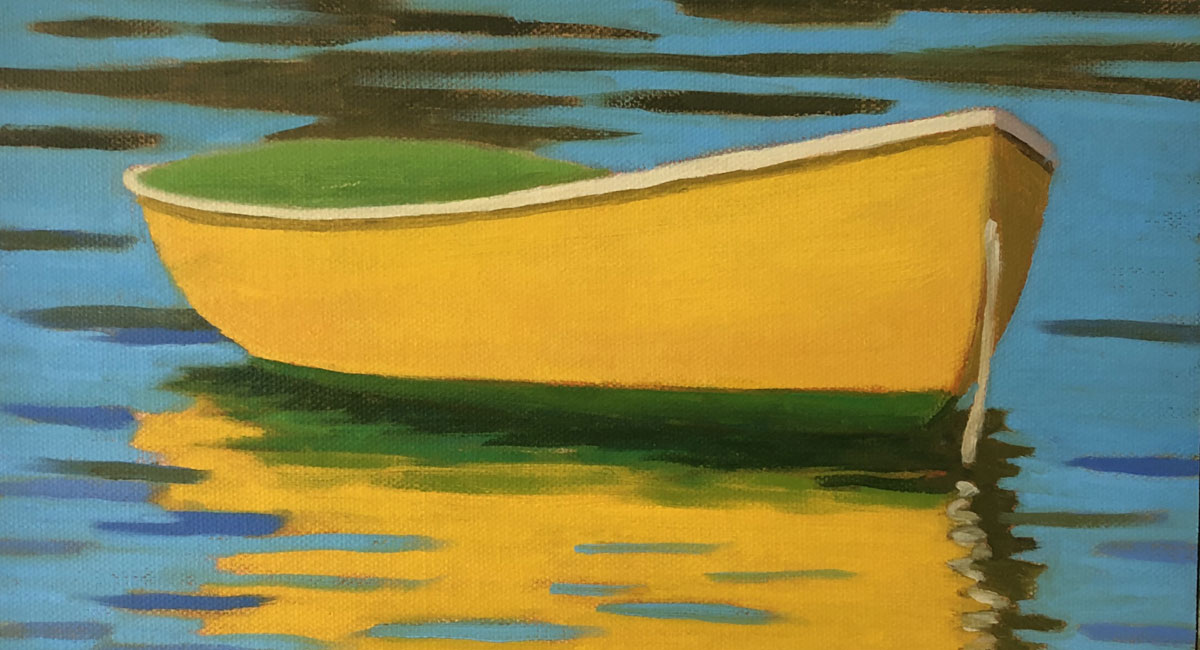 Detail of Mellow Yellow 8"x10" oil on canvas panel Whenever we’re out on the water, I’m looking at the boats with an eye to painting each one. I ask myself questions like: Is the shape appealing? Is it a classic? Is the lighting good? I snap photos on my phone and on my pocket SLR camera. Sometimes, we go dinghy and skiff hunting in our inflatable. My husband drives, and patiently goes round and round the boats while I take photos from every angle. And I look inside the boats. If it’s been raining and they haven’t been bailed out, they don’t sit right in the water, and that doesn’t make for a believable painting.
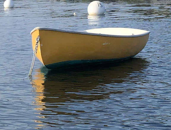
Back in the studio or on the couch, I go over the photos on my laptop. If there’s a boat I like, I try and figure out which angle of view would make the best painting. I crop several photo options and look again. And sometimes I ask my social media friends for their opinion. I did that early this year with these photos of a cheerful yellow rowboat that we saw the previous summer. The left most (top) photo got more votes by a wide margin. It’s also the one I like best. And that photo leads me to a great example of how to draw a boat. In fact, the crux of painting small boats like this one, is the drawing. Once you get the boat shape right and get it sitting in the water, the rest is like any other painting. 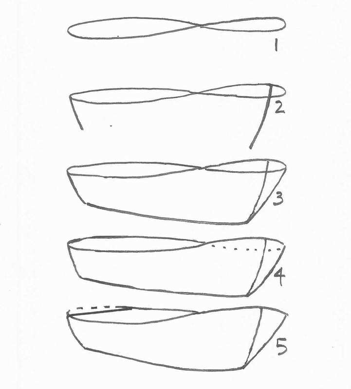 The standard method for drawing a boat is to use a figure 8, as in the image above. This works best if you can see some of the inside of the boat. These are the steps: Step 1: Draw a figure 8. Note that the right hand orb of the ellipse is smaller then the left orb, when the bow of the boat is towards the right. Step 2: From the highest point on the right orb, draw a line down and to the left to create the bow, and another line down and to the right to create the stern. These lines can be somewhat curved as in the diagram or straight depending on the kind of boat you want to draw. Step 3: Draw a line to connect the bow and stern (if the boat is in the water, this line will be under the water as in this painting). And connect the right side of the bow to the bottom of the boat. Step 4: Erase the line that is dotted in the figure, which is not visible. Step 5. If the boat has a square stern, draw a line across the back of the left side of the figure. 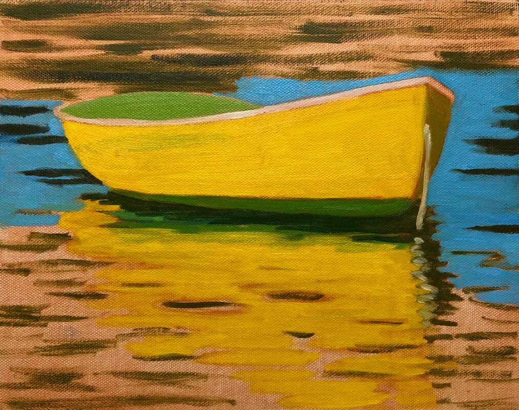 At the stage above I'm starting to work on the reflection. The trick with the reflection is to keep it directly under the boat. It’s really fun to paint the abstract ripples reflecting the blue sky and the yellow side of the boat. It's a push and pull of the two colors against each other.
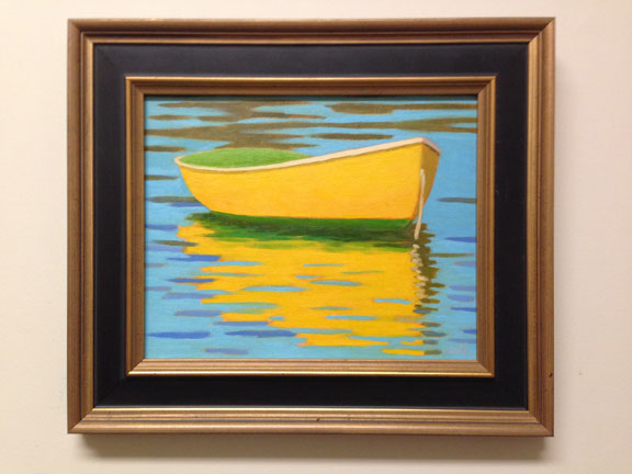
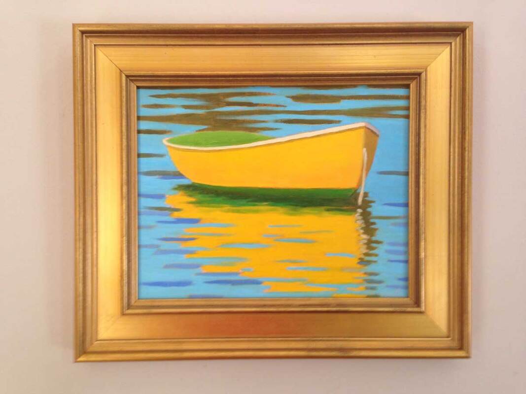
Framing is the last part of the job. What do you think, dark frame or gold frame?
Two paintings I watched being created at this year's CELT Auction by Carol Douglas 40"x40" (left/top) and Marsha Donahue 18"x24" (right/bottom) Have you ever found yourself at an event where paintings are being sold to benefit a cause that touches your heart, wondering if you should buy one, and not knowing how to choose? Having participated in many of these events and bought paintings, I've thought about this a lot. And I've written this blogpost to help you. There are a number of things to consider. First, what's your goal? Are you looking for a painting for a specific spot in your home or office? Or perhaps you've fallen in love with a particular artist's work, want a piece for yourself, and will decide where it will go after you find it. The most important thing when buying a piece of artwork is that YOU like it. It doesn't matter what other people think unless they are your spouse. And even that won't likely matter for small less expensive pieces. So make a habit of looking at paintings; in other people's homes, in galleries, and online, and get a feel for what you like.  Another favorite, by Jill Hoy, 24"x31" If I see a painting I really like, and I'm tempted to buy it, I usually look at multiple paintings by that artist. I want to see if the painting I'm attracted to is consistent with the overall style and quality of the artist's work. I look at the artist's website and their work at galleries online. Simply google the artist's name followed by artist or painter, and you'll see where to find examples of their work online. Visit the artist's website, And look for sold paintings as well as those currently available. Sometimes those are found on a page called "Archive" if they aren't included with the available paintings. When an artist creates a new body of work, it takes months or even years for the best paintings of that collection to be sold. It can be instructive to see what other people liked well enough to buy. If you are an artist yourself, beware of paintings that impress you because of their skill. Looking at them is instructive, but that alone is not a good enough reason to buy one unless your goal is to study it rather than live with it! If you're shopping for paintings online, it's critical to make sure you understand the size of the painting you're looking at, and that you take the frame into account. Look for the dimensions and find something in your house that's about the same size to give you a better idea.
More favorites, Holly Ready 24"x18" (left/top) and Colin Page 36"x24" (right/bottom) There are a few things that attract a person to a specific painting. Probably the two most important are subject matter and color. Subject matter is a broad topic, basically divided into still life, landscape, portrait, and abstract, with many sub areas in each. You may find some subjects more appealing for specific rooms in your home. Still lifes of food are a natural for the kitchen. A landscape or abstract goes well over the sofa. But really, anything goes. Often people find landscapes of places they love to visit appealing, for example an area where they like to vacation. Paintings evoke memories of good times at one of these special places. That's a good way to start a collection. As to color, that's very personal. and there's nothing wrong with paying attention to the color of the sofa when choosing a painting to go over it. But if you have color favorites, you'll likely be drawn to paintings that include the same colors already in your decor. And paintings that include color x look great on a wall of that color.
More favorites, by Judy Taylor 24"x31"(left/top) and Erin McGee Ferrell 48"x48" (right/bottom) Price is another thing to consider, and don't forget to include framing. Oil and acrylic paintings are less expensive to frame than water colors and pastels because they don't need mats or glass. In fact, with a few specialized tools and a frame you can buy online you can frame oils and acrylics yourself. Here's a blogpost that will show you how.
If you're looking for a painting for a particular place, first decide the size range that will work. Then choose the subject matter or color preferences depending on which is more important to you. And where to buy? There are many options, both online and in person, far beyond what I can cover in this blogpost, so I'll save that for another time. The paintings illustrating this post are all from the Paint for Preservation event put on by the Cape Elizabeth (Maine) Land Trust this year. The auction starts Saturday at 8AM and ends Sunday at 9AM. View all the paintings in the event here. And no, I don't have a painting in this event. I look forward to painting large en plein air in the future. |
AuthorBobbi - Painter. Sketcher. Teacher. Boat and Dog Lover. Archives
May 2024
|


 RSS Feed