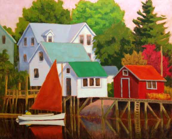
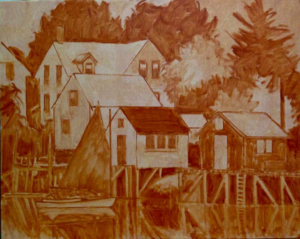
Bright Sail Cozy Harbor, finished and what's under the color What makes a painting good? What makes it grab your attention and hold it? Color can catch your eye from across the room, but when you get closer to the painting, it’s the pattern of different shapes, their values, and how they fit together that creates the design/composition of the painting. And that’s what makes the work compelling.
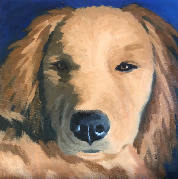
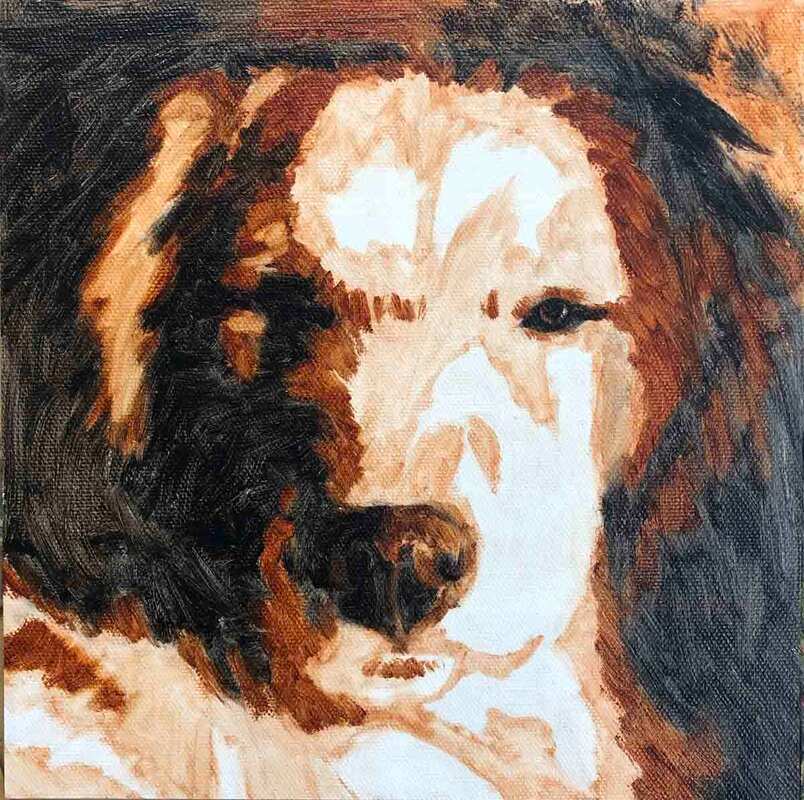
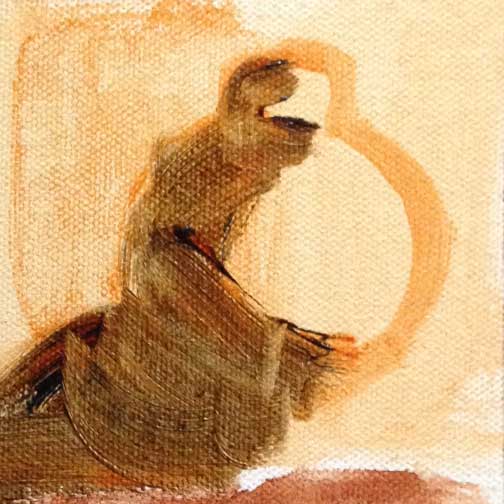
Teddy, finished and what's underneath the finished painting So what is this thing called value? Value is the relative lightness or darkness of those shapes. It’s what makes black and white photography and monochromatic artwork so compelling.
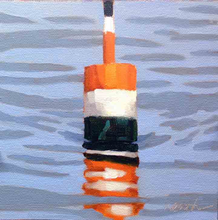
Buoy 10, finished and what's underneath There's a saying “value does the work and color gets the credit”. And it’s very true. We love color, it speaks to us. We choose our clothes based on the color. Likewise the fabrics and wall coverings in our homes. Value is actually one of the components of color, along with hue (the named color), intensity/chroma (how bright or dull the color is), and transparency (whether the color is opaque or transparent).
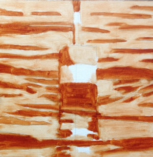
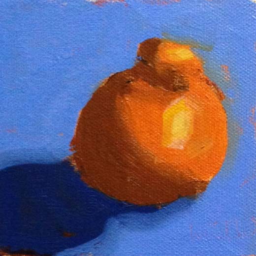
Tangerine demo to show students how to use the value under painting In creating a painting, value is the component of color that is most important in the overall design. And it can be a great help to have the values laid out on the canvas before adding the color. I do that by making a “value underpainting”, also called a value map. I then paint over the value underpainting with color, using it as a guide to create the desired color with the appropriate value. What makes this work is that if we close one eye and squint with the other, the view before us looses its color and becomes monochromatic. So we can place a dab of the proposed color on the underpainting, squint, and determine if its too light, too dark, or just right.
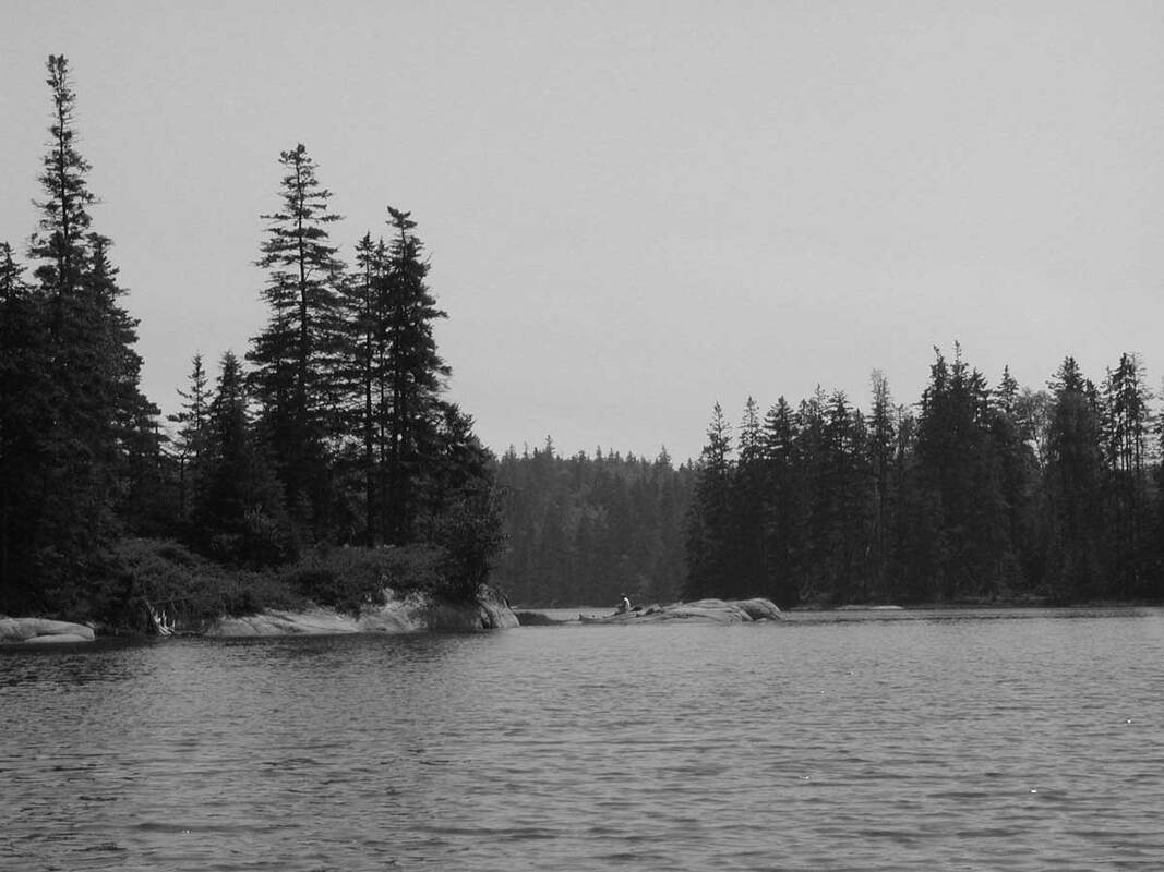
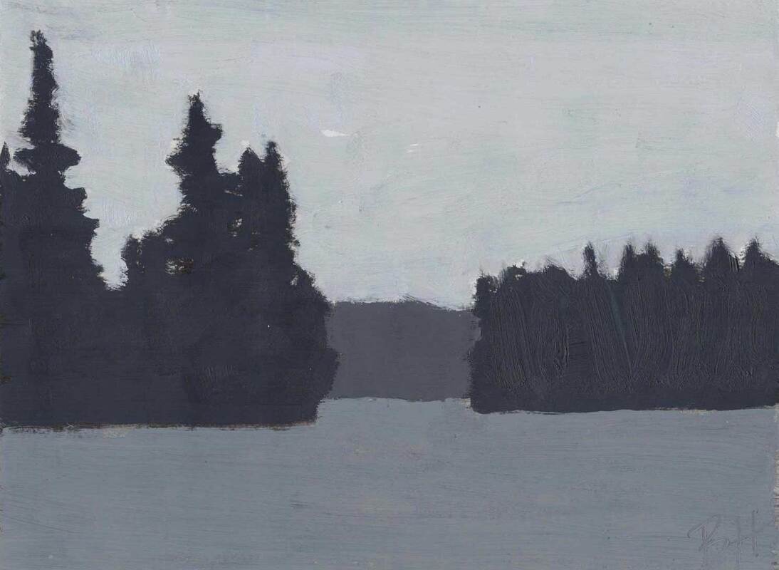
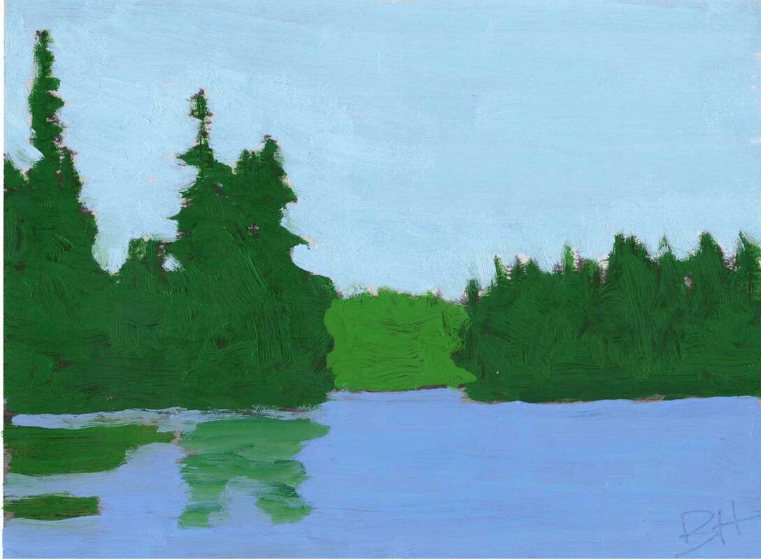
The images above show an exercise students always enjoy in my painting classes. We start with two printouts of the photo on the left. In the middle, we've matched our black and white paint to the values in the photo, and painted over it. In the image on the right, we've done it again, but this time using color. (And adding some reflections just for fun.) I think there are a couple of reasons why this exercise is popular: first it's easy because there's no drawing, and more importantly, it makes the concept of values concrete.
To answer my original question, color gets the credit, but value does the work.
1 Comment
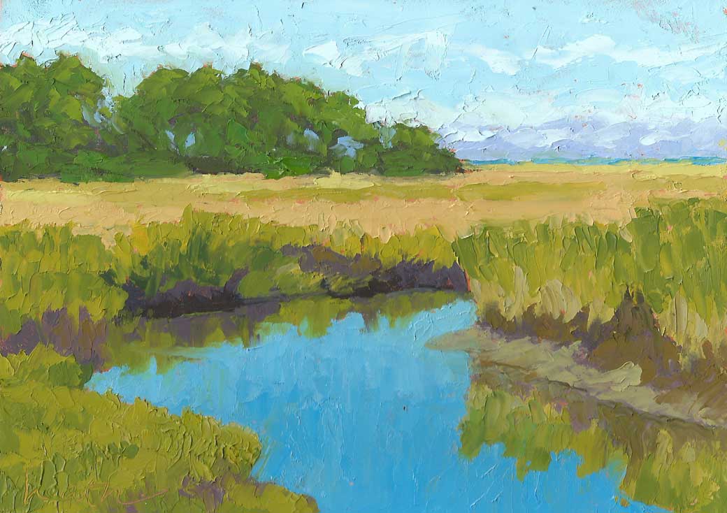 Truro Marsh 5"x7" oil on cradled gessobord - available $185 Marshes are one of the most popular subjects for coastal landscape painters. The edge of the sea is so appealing, and marshes especially so to artists, because the shapes are constantly changing. 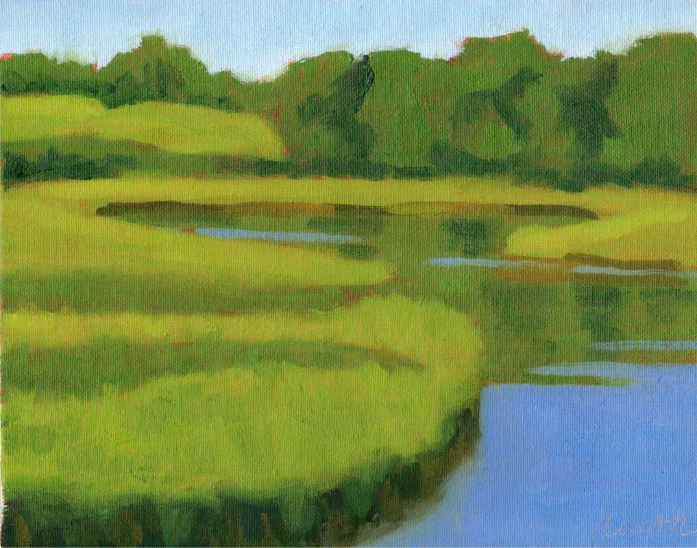 Marsh Scene 8"x10" oil on canvas panel - available $340 - demo for the final exercise in my online beginner painting class Marshes, having a low gradient with the ocean, are strongly affected by the tide, and thus the water to land ratio varies tremendously during the day. There are three components: the water, the mud that is uncovered as the tide goes out, and the marsh grass that grows in the intertidal region. And in some cases, there is also a reflection laid over the water. These give the painter many shapes to use to create a compelling composition! 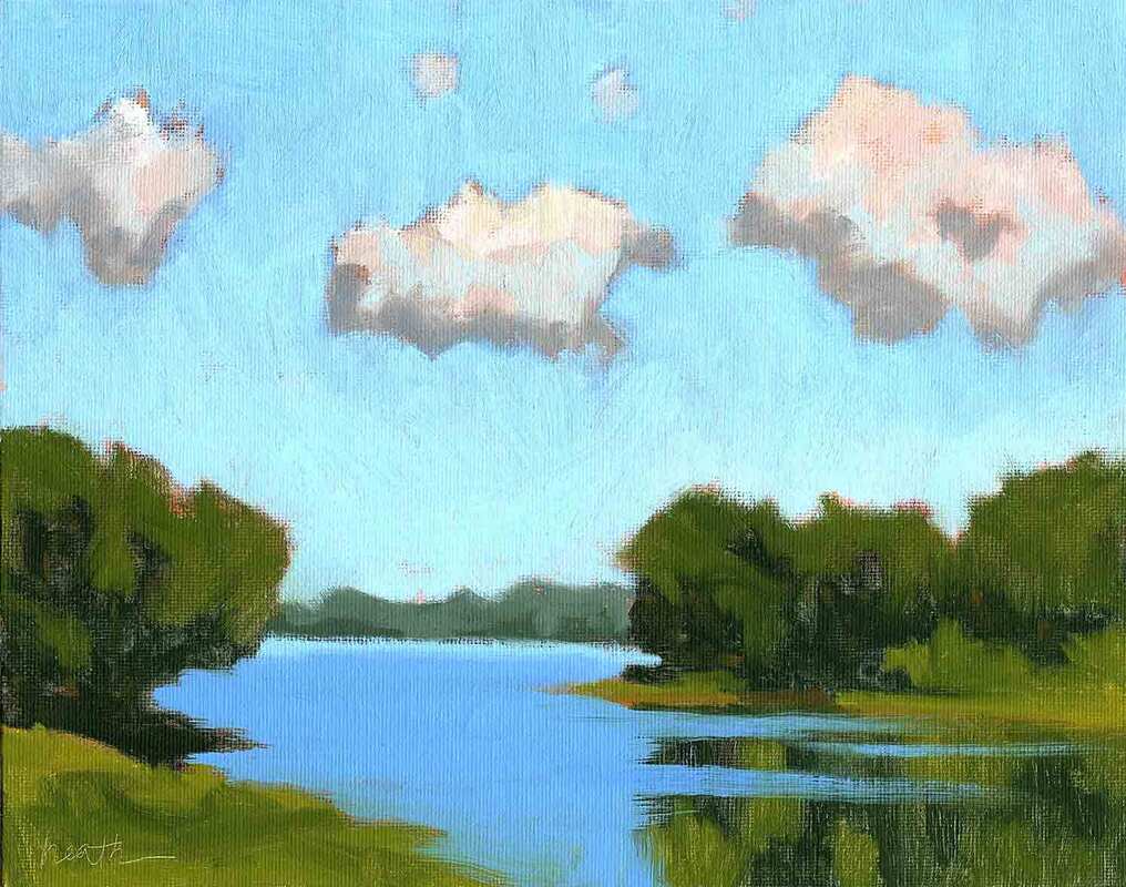 Tidewater Clouds 8"x10" oil on canvas panel - available $340 Another appeal is the large expanse of sky you get over a marsh, because there are no nearby trees and buildings to get in the way. Clouds come and go and bring infinite variety in themselves. Add a sunrise or sunset, and the possibilities are endless. 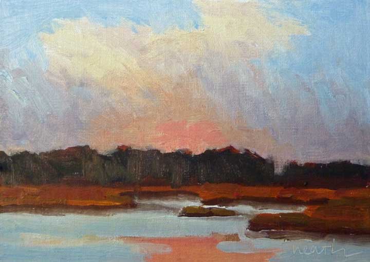 Wells Marsh Sunset 5"x7" oil on linen panel Saltwater cord-grass is what we see in New England salt marshes between low and high tides, with salt-hay in the area between mean high tide and the spring high tide. One of my favorite plants is sea-lavender, which we see at the edge of protected areas in Casco Bay in Maine. 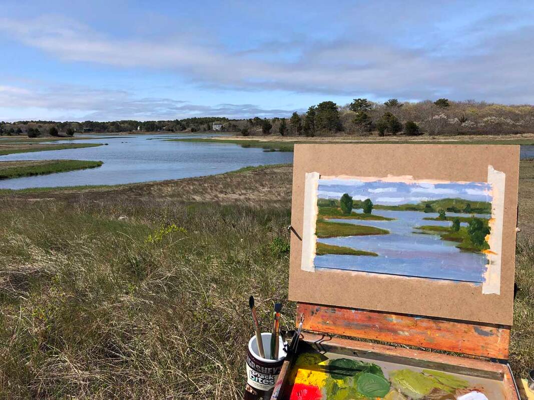 My first plein air experience of 2022 - Little Harbor, Wareham, MA - mid April Here in Wareham the salt marsh grasses were just coming out when I went out for my first plein air session of the year. I enjoyed how the grasses added a beautiful green to the blues of the water and sky.
|
AuthorBobbi - Painter. Sketcher. Teacher. Boat and Dog Lover. Archives
July 2024
|
 RSS Feed