|
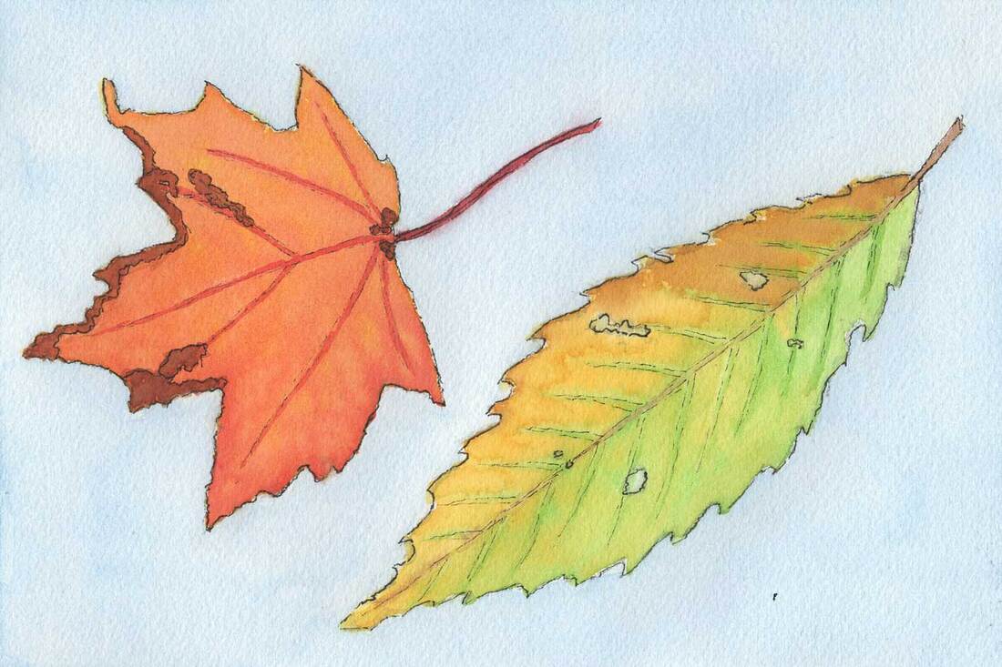
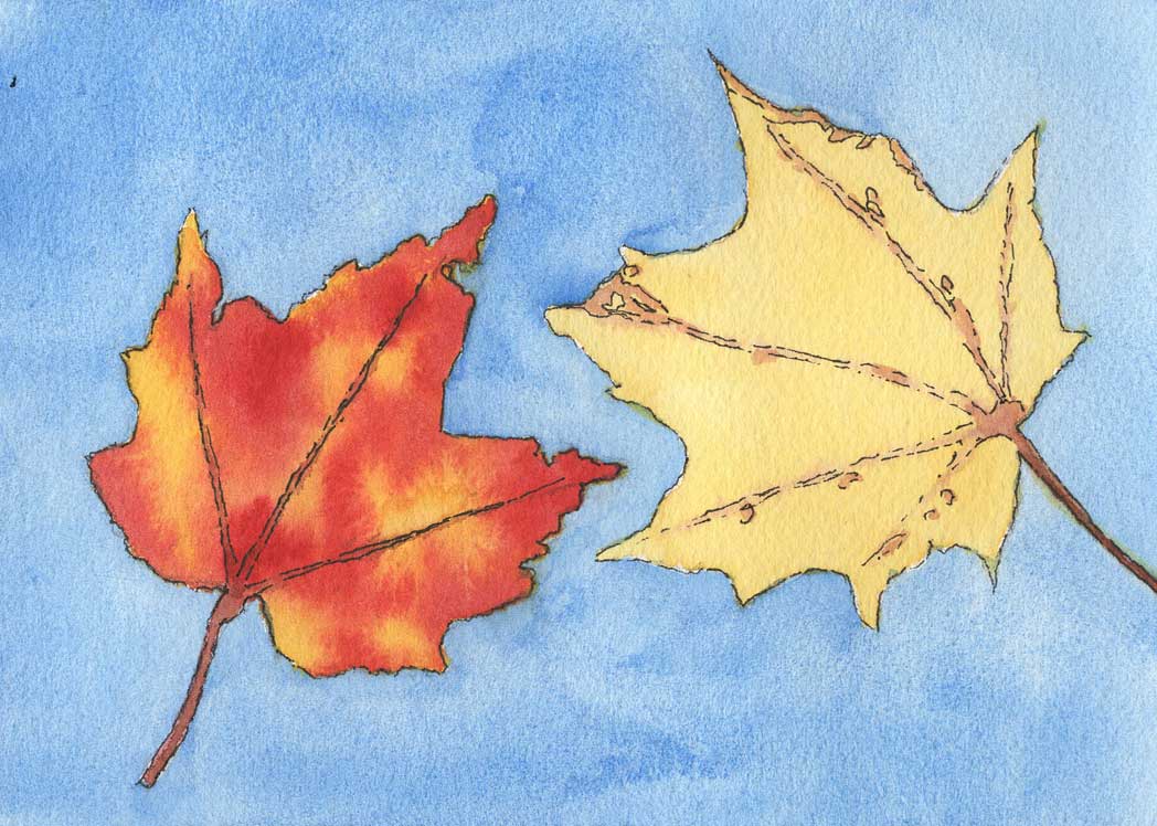
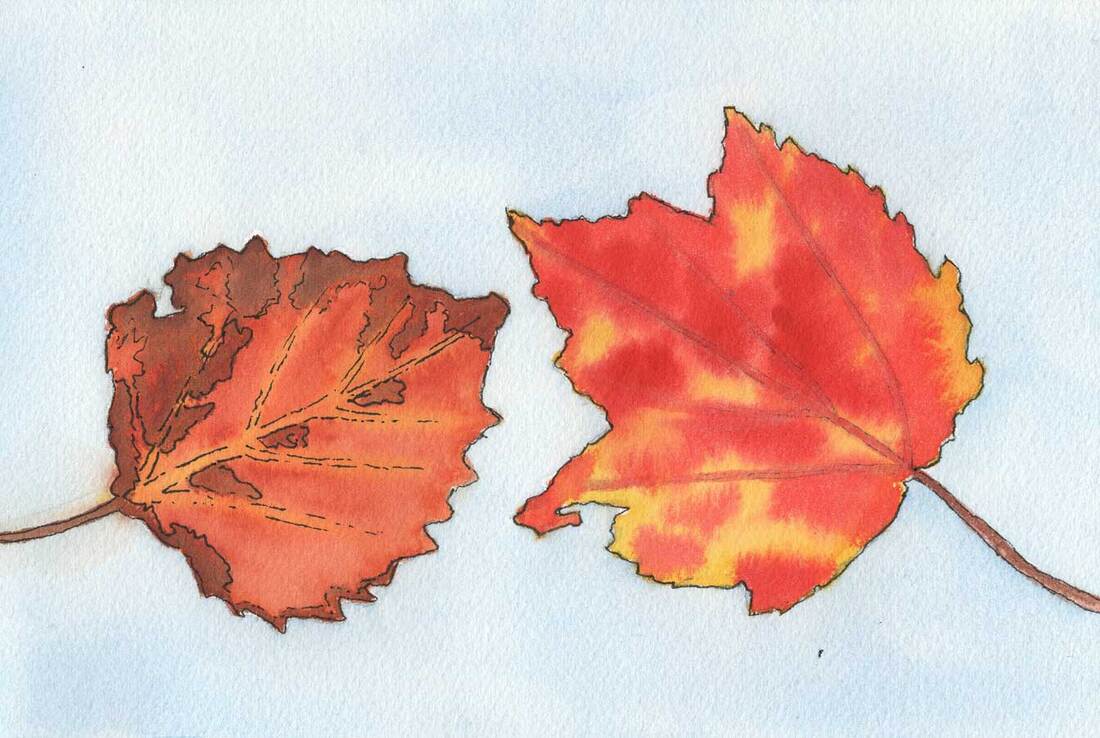
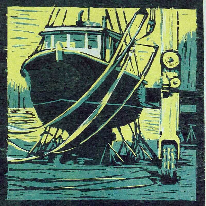
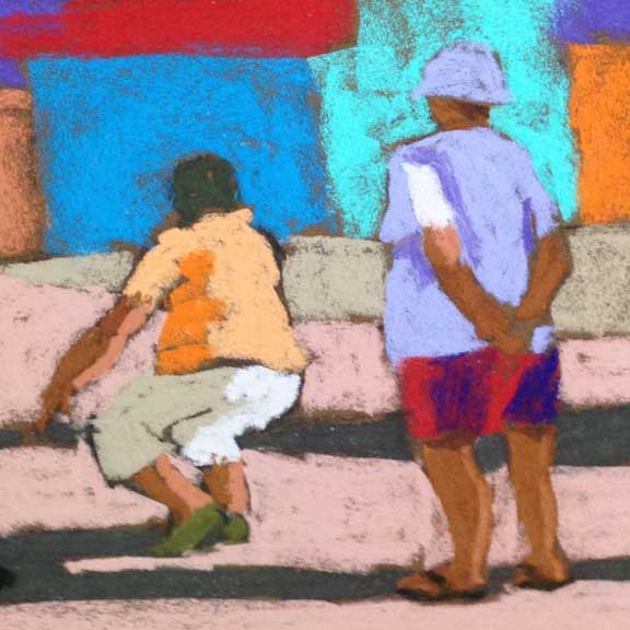
Green and Orange Leaves 6"x9" watercolor on cold pressed paper Sometimes, mixing it up is the best way to go forward. When we work with the same process over and over, it can become rote, the fun gets lost, and we start to lose interest. This summer, I took my watercolors out to our boat, thinking it would be easier to paint with them in the tight quarters, and a lot easier to store the finished paintings while we were underway. What I wasn't thinking about was what I'd learn in general about making a painting, and how that could help my oil painting. What I stumbled on was basically the concept of cross training. Two Leaves 5"x7" watercolor on cold pressed paper We're all familiar with cross training in sports. Benefits include improved strength, endurance, and fewer and faster recovery from injuries. Let's see if we can relate that to painting in different mediums. When I paint with watercolors, I usually sit, while painting with oils I stand. That means I'm using different muscles in my legs, back, shoulders, and arms. It's probably good for overall fitness and strength. There are plenty of people who stand when they paint in watercolors, so that's simply a personal preference for me. Speckled Leaves 6"x9" watercolor on cold pressed paper But what about cross training for your mind? I was interested to learn that cross training is a thing for writers. There are even course offered in writing for that very purpose. I'm imagining a novelist writing haikus and limericks! A major difference between painting in watercolors and in oils is that watercolors are applied lightest to darkest and in oils we go the opposite direction. The reason is that for watercolor white is created by lack of paint on the white paper, and in oil painting you've got a tube of white. So it's a big head shift to go from one to the other. But the concepts of composition and value are the same. Another difference for me, is that my oil painting is done alla prima, meaning all in one go so all of the paint is wet until I'm done. In watercolor a series of washes is built up to create the picture. It's common for watercolor painters to use a hair dryer to speed up the process between layers. The Irish Piper woodcut on paper and detail of A Serious Game pastel on paper I've also done a bit of cross training making woodcuts and using pastels. Once again, the composition and values are the same as with oils or watercolor. In a woodcut, there are a limited number of layers, so the values and colors have to be simplified. In a pastel, it's almost the opposite, though you are constrained by the number of pastels you own. If you know an accomplished pastelist you've probably seen the hundreds of beautiful pastels they use. That's quite different from the way I mix each color I want in oils using a limited palette of two of each primary color and white.
Learning comes from trial and error, and I find that I learn most from the failures. Working in different mediums expands the opportunities for that learning. When I can let go and not worry about the outcome good things happen. Spending some time making paintings in a different way makes all my paintings better.
0 Comments
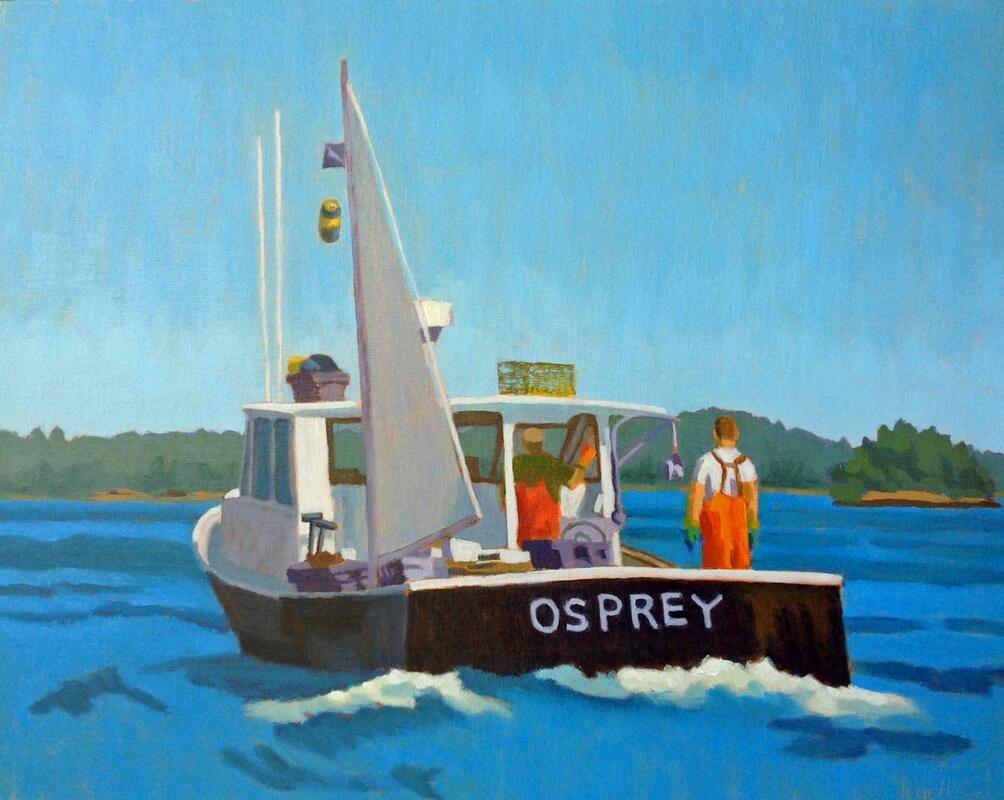
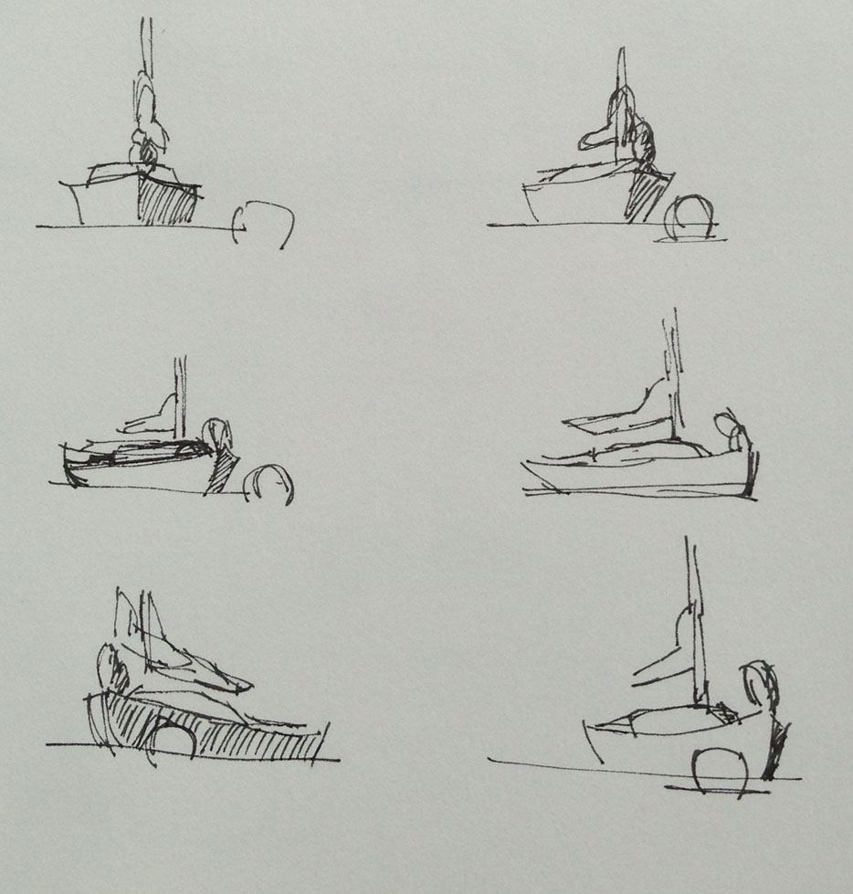
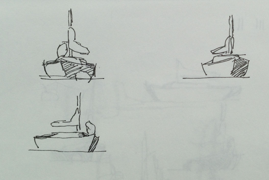
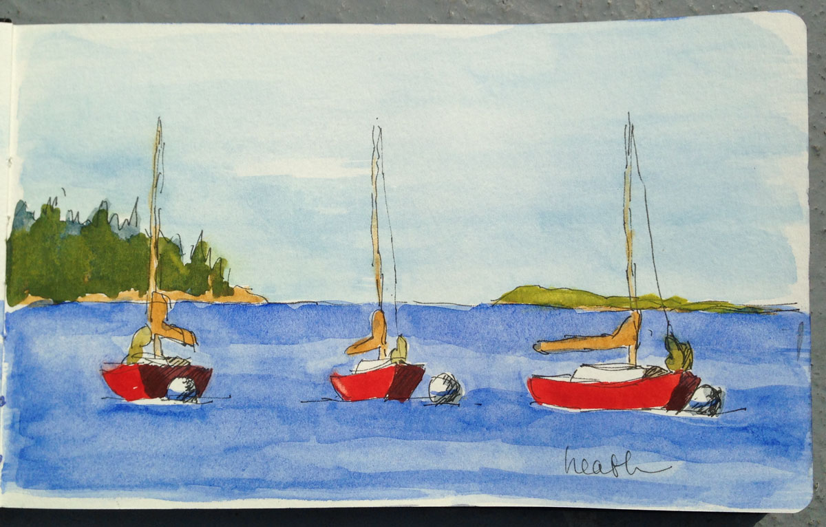
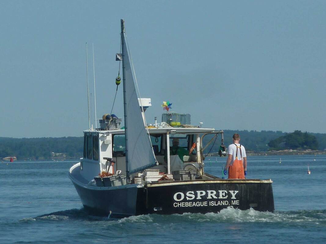
The Sternman 16"x20" oil on linen panel Last month we were on the water with the owners of my painting of the Osprey lobster boat, shown above. As we neared Chebeague Island I saw her on her mooring, so we thought we’d take look at the real thing. She’s a classic. Our guests were surprised at how long she is, since the painting was done from a photo taken off the stern on the port side. As you watch the video below, you can see how the shape changes as we go around the stern. There are so many views to choose from! the Osprey last month as we went by on our boat I love to sit on the dock or on our boat and sketch other boats on their moorings. They turn as the wind and tide fight for dominance, sometimes with almost a 180 degree swing. It’s such a great sketching exercise. And I think it's the secret to painting boats. It's not about what kind of boat you're looking at, though an appreciation for that makes it more fun to be around them. When painting a boat, it's the drawing step that's the most important. And sketching them as they float is key to learning to make a good boat drawing. The little red sailboat in the drawings above is moored in Boothbay Harbor, and I've spent a lot of time sketching her as she swings on her mooring. Each of these drawings took only a minute or two. And there are many more. One afternoon, sitting in our cockpit still watching the little red sailboat, I took the best of the above sketches, and from them made a little water color in my sketchbook. I don't remember whether I did the ink or the water color on this piece first, but I like the sketch-like look that the ink gives it. So you can see the simplification that goes into making the larger oil painting, here's the reference photo I took of the Osprey in 2015. It was taken from our boat using a point and shoot Nikon with a zoom, nothing fancy, but better than a cell phone. Painting boats is one of my favorite things to do. The challenge is in the drawing, but the result is usually worth the effort.
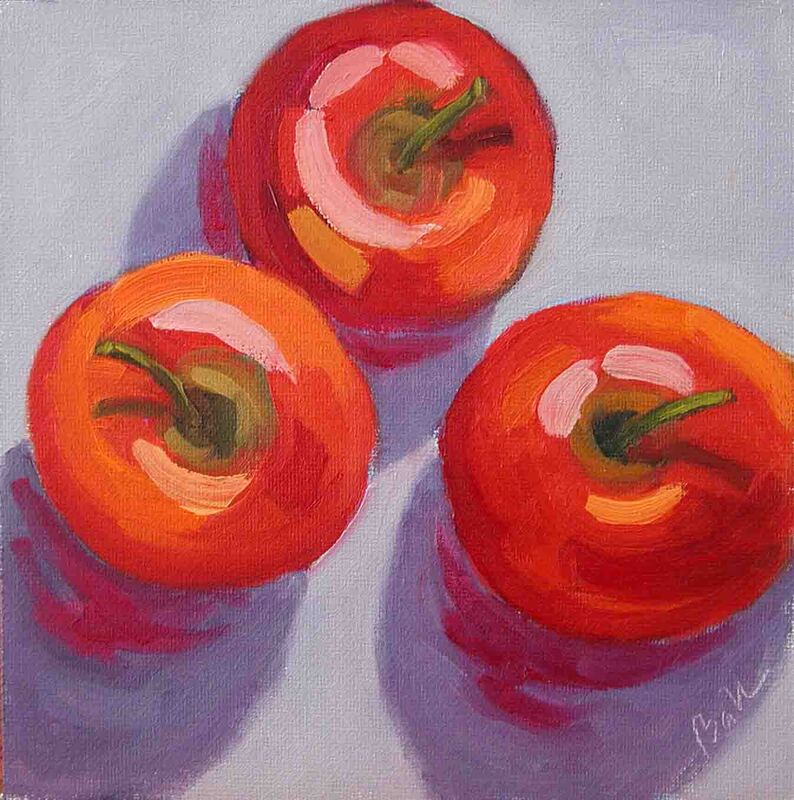
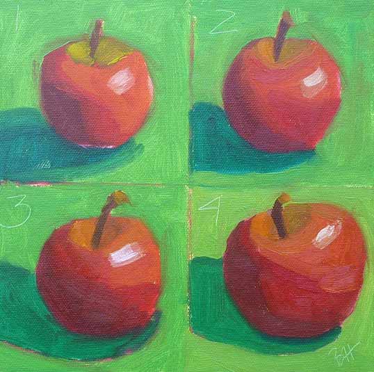
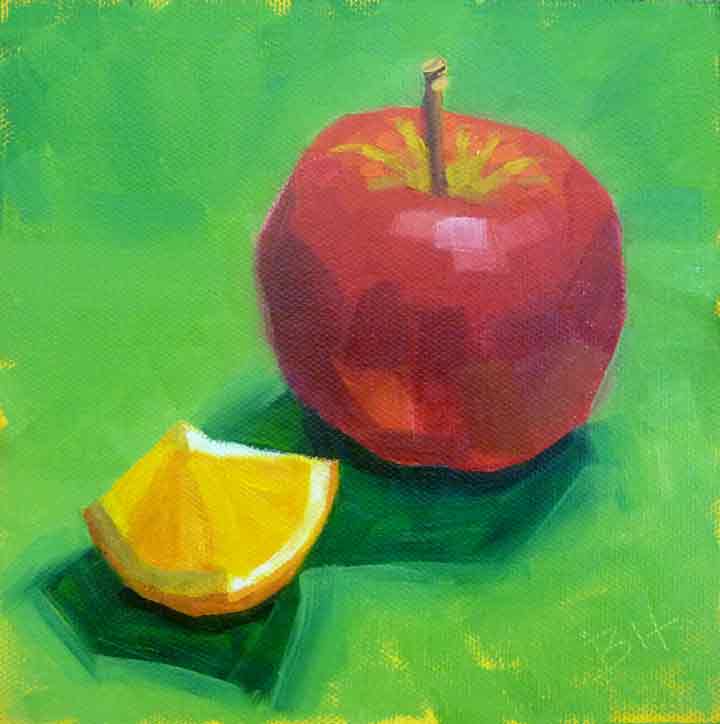
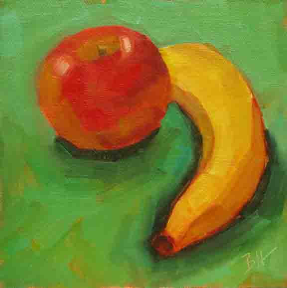
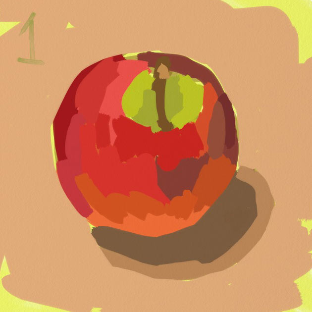
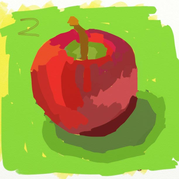
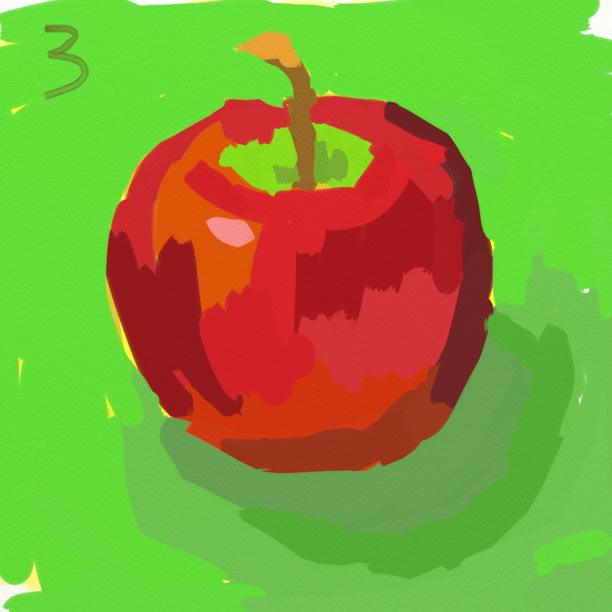
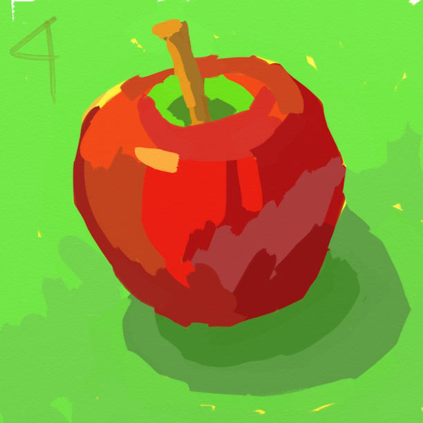
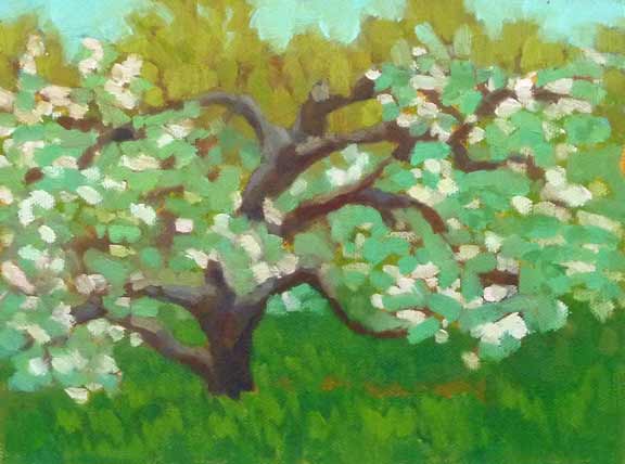
Apples in Oil 2009 I think this might be the first painting of apples I ever made. It was in 2009, before my first workshop with Carol Marine. It turns out she's a great lover of painting apples, and using apples as the subject in exercises to learn to paint better. 10 minute apples (10 minutes each not counting set up and mixing time) I'm a big proponent of painting from life. For me, the transformation from three dimensions to two is key to making a good painting. Apples are good for that, because they have a nice shape (not perfectly round like a ball), they come in beautiful colors, and they last for a while. Carol taught me the 10 minute apple exercise above, which I use whenever I feel rusty. You mix your colors first, then give yourself 10 minutes to paint the apple, mix the colors again and paint the next one, until all four are done. It's a lot of fun after the first time, when it's kind of scary! Apples sharing the stage with other fruit Apples go well with other fruit. And I like to paint them on a green background, because the complementary colors red and green really set each other off. What I learned from painting these still lifes was the beginning of my journey to painting out of doors, or was we say, en plein air. If I had gone directly from painting from photos to painting outside, it would have been much much harder. Apples painted on my iPad When I don't have a lot of time, I'll set up a few apples in the kitchen and paint them from life on my iPad. I used the Art Rage app to paint these. The clean up is sooo easy. Don't you think they look better with the green paper underneath? Drew Farm Apple Tree 8"x10" oil on canvas panel And then there are apple trees, I like to paint them too. And my favorite way to do that is while standing right in front of them. It's such a treat to be among these beautiful trees on a spring afternoon when they're in bloom.
But now back to autumn and apples. There always seem to be lots to chose from at my favorite farm stand. In recent years I've discovered Honey Crisp and Autumn Gala (my current favorite). There's a lot to love about the apple. |
AuthorBobbi - Painter. Sketcher. Teacher. Boat and Dog Lover. Archives
July 2024
|
 RSS Feed