|
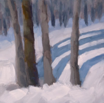
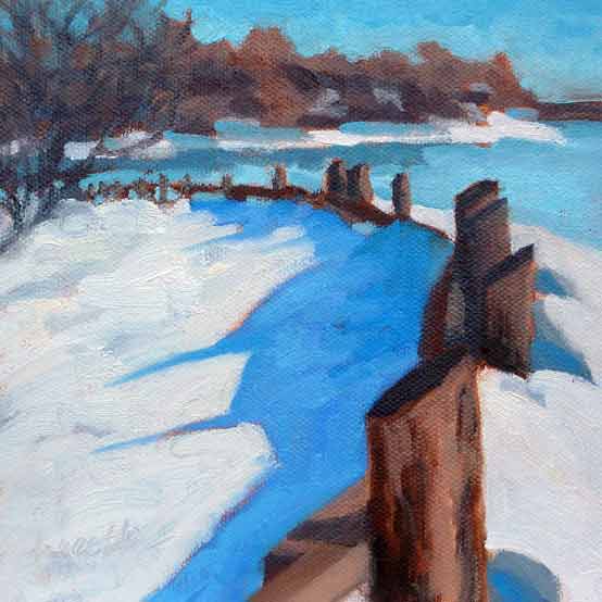
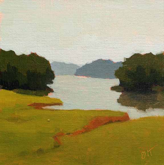
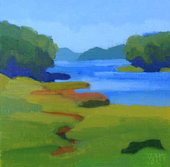
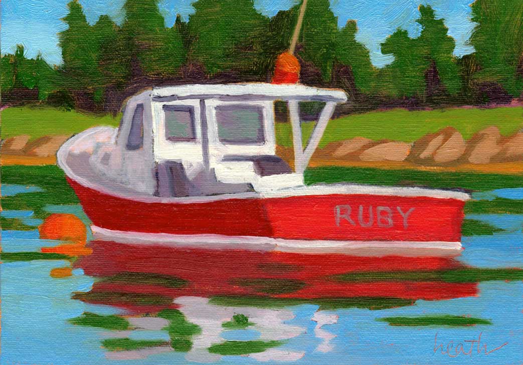
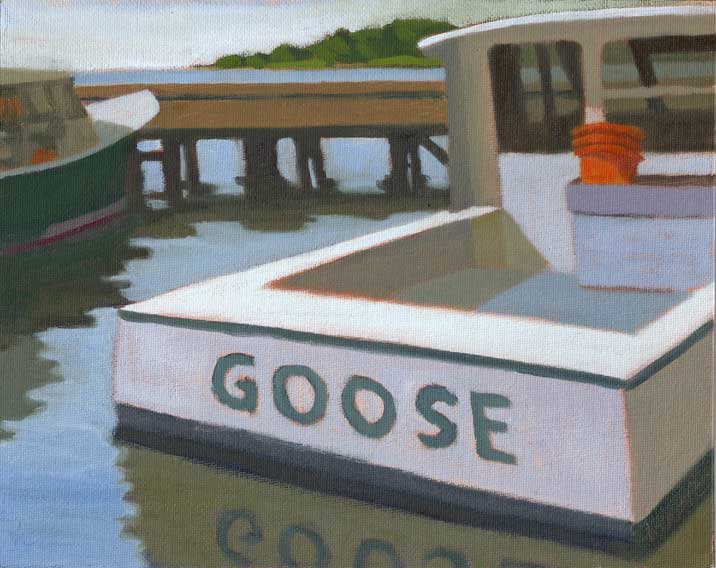
Two paintings of snow, both using the same color scheme, of blue, white, and a dark. The painting with four trees uses neutrals and the painting with the fence uses bright colors. Before my latest painting class, I asked my students to let me know what they were currently having the most trouble with. I was pleased to see that values and mixing colors were low on their lists, because that meant that my lessons on those subjects had hit home. Most of them told me that their biggest problem at the moment was simply deciding what colors to use. The overcast sky in the first painting limits the saturation, while the sunshine in the other painting means the colors are brighter. Of course, one answer is to literally match the colors that you see before you in the scene, and many painters work hard to do that. But it’s interesting and fun to use nature as a starting point, and make your color choices part of your painting style. One painter who did this very successfully was Alfred (Chip) Chadbourn. He often predominantly used the secondary colors (orange, green, and purple) in his paintings. Google "alfred chardbourn paintings images" to see what I mean. Above, I deliberately was going for bright colors in Ruby, and for neutrals (except for the buckets) in Goose. Once again, the bleak sky in the first painting calls for neutral colors, while the sunshine in the second is asking for bight saturated colors. As a part of a color scheme, we needed to look into another characteristic of color, which is saturation. Saturation is the brightness of the color, brighter is more saturated, and as the color becomes less saturated we call it a neutral. In most paintings there will be some more saturated and some more neutral colors, depending on the mood and conditions that are being portrayed. For our lesson we created two paintings of the same subject, one where we used very saturated colors, and another where we used neutral colors. I think it was the most popular lesson in the 6 week session. Do you have a preference for bright colors or for neutrals? My students were surprised how much they liked the neutral paintings that they created. I myself, as you will have probably guessed, love bright saturated color.
0 Comments
|
AuthorBobbi - Painter. Sketcher. Teacher. Boat and Dog Lover. Archives
July 2024
|
 RSS Feed