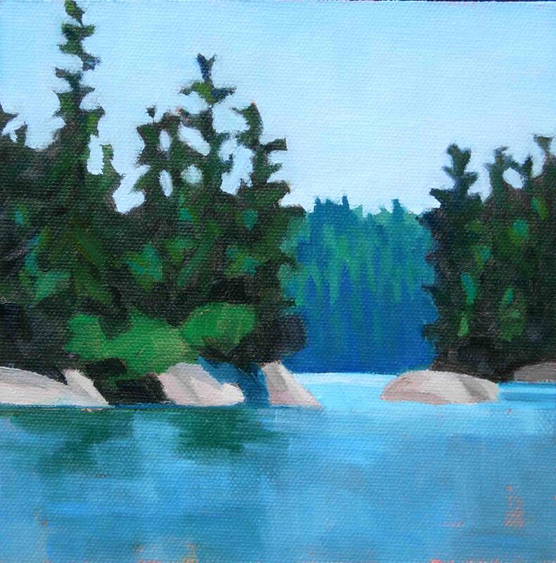
 Backdoor To Seal Bay 6"x6" oil on canvas Have you ever walked across a room to look at a painting because the color grabbed your attention? That happens to me a lot. Bold bright color, I love it! But there’s more to a painting than the color. Think about the wonderful black and white photos you’ve seen displayed on walls. They can be very striking. They’re pared down to the essentials, and the most basic of essentials is a pleasing value pattern. It's value that does the work, even if color gets the credit. 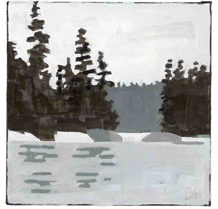 Backdoor to Seal Bay Value study What do I mean by value? Value is the lightness or darkness of a shape. A compelling value composition is a pleasing collection of interconnected shapes of different values. Picture a jigsaw puzzle with varying sized pieces in varying shades of black, white, and gray. When I started painting, I thought the composition was the drawing. But lines all by themselves don’t make a composition. It’s the shapes that the lines describe, and the values of the shapes that do that. And when the composition is pleasing, you have winner. The secret is: It doesn’t matter what colors you use, as long as each one has the right value. 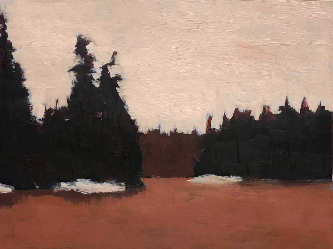 A later Backdoor to Seal Bay Value Study A few weeks ago, my friend Carol Douglas challenged me to paint a landscape scene using the opposite colors of those found in nature. These are called the complementary colors (purple, green, and orange), and they appear on the color wheel in between the three primary colors; red, blue, and yellow. To accept Carol’s challenge I started with the value study above, basically a monochrome version of the scene. As long as I got the values right, I could use any colors I wanted. 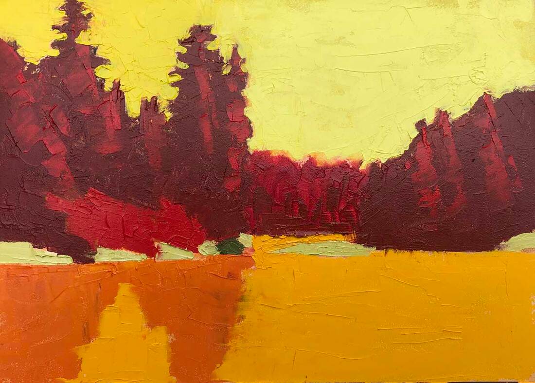 Backdoor to Seal Bay 5"x7" oil on gessobord (using complementary colors) I replaced the greens of the trees with reds, the blue of the water with orange, and the light blue of the sky with yellow. The result is above. What do you think?
4 Comments
9/25/2020 10:30:46 am
eI like the complimentary version! It's so interesting to do this with portraits. I've been working on that since taking your class. 10/5/2020 09:44:57 am
Wow, doing the complementary thing in a portrait is really interesting. I look forward to seeing the results. 9/25/2020 10:47:40 am
I never remember the difference between, hue, value, and tone. Probably because the application is different when I'm using glazes not paint. Now, I think got value down and remembered. 10/5/2020 09:46:48 am
That's great, Marina! I keep wondering if no one explained it to me during my first years of painting, or whether they tried and I just didn't get it. I hope my students aren't getting tired of hearing the words. Leave a Reply. |
AuthorBobbi - Painter. Sketcher. Teacher. Boat and Dog Lover. Archives
July 2024
|
 RSS Feed