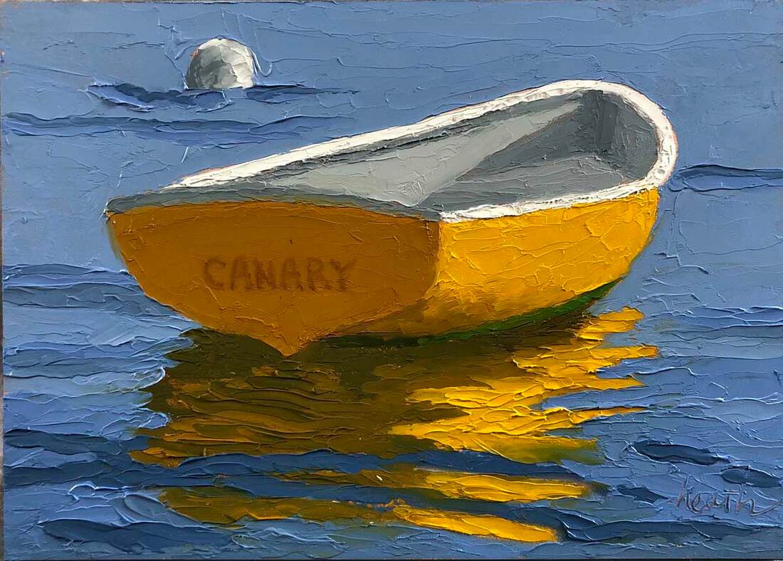
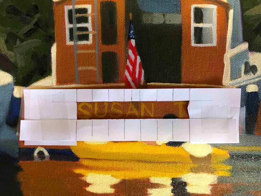
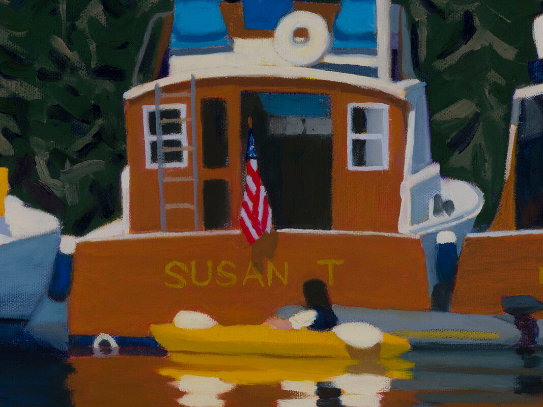
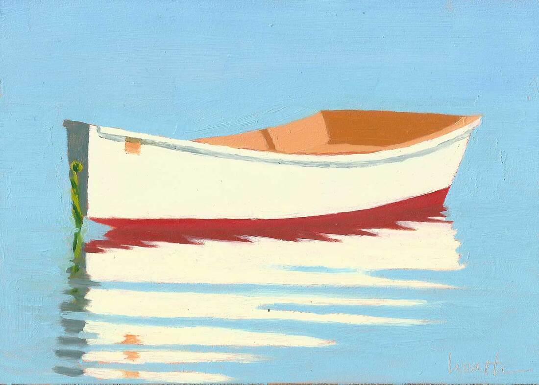
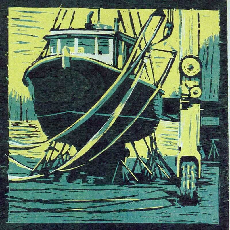
 Canary 5"x7" oil on panel The Naming of boats is a big deal, especially for the owners! When I paint boats, I often change their names, unless I’m painting the boat for its owner. And for me the naming of boats is fun. I can choose whatever name I want, and it gives a bit more mystery and a little bit of a story to the painting. At this point, I like bird names, they are often short and very descriptive. What could be more yellow than a canary? 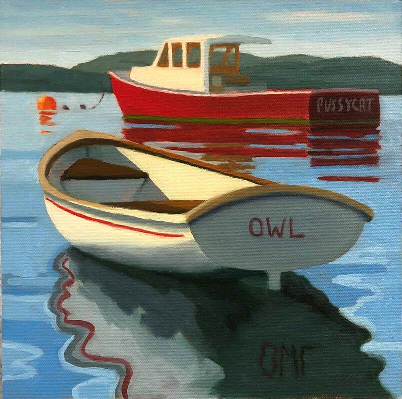 The Owl and the Pussycat 10"x10" oil on canvas panel So, how do I paint the names onto the boats? There are two approaches. Since I paint alla prima (wet paint into wet paint) the first option is to paint the name into the wet paint, the way I do the rest of the painting. I did that for the Owl in The Owl and the Pussycat, above. Alternatively I can scratch the name into the wet paint, like I write my signature. I’ve tried this, but haven’t so far liked the look. Perhaps a bright color to scratch into would help. 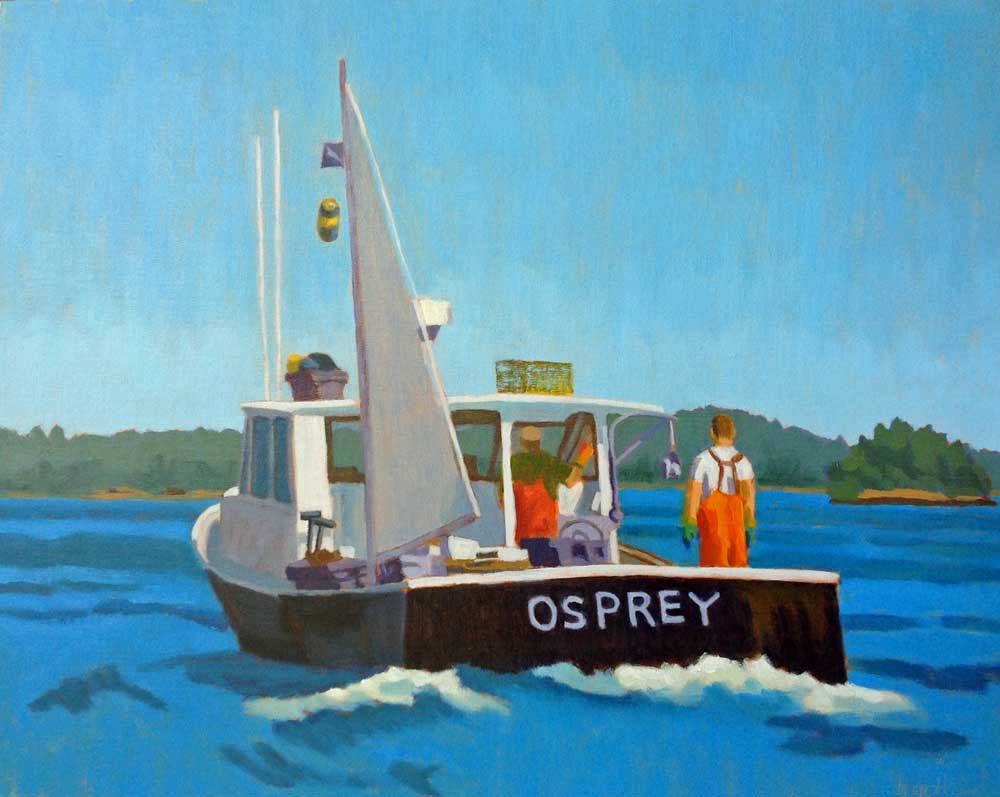 The Sternman 16"x20" oil on canvas The tried and true method is to wait for the painting to be dry and paint the name over the dry paint. This is the easiest approach. And If the paint is really dry,the name can be wiped off if it doesn’t turn out right the first time. I used this approach for the Osprey in The Sternman, above. And with this approach I can make a pattern for the name and tape it to the painting, so that I get it straight with even spacing between the letters. I used that method on some of the boats in Rafting Up, in the example below.
Changing the name of a boat is an even bigger deal than naming it in the first place, with special rituals to remove any bad luck that could be associated with doing that. For example, I’ve heard of people scraping off the name, throwing the scrapings over the transom and backing over them, to remove the bad luck from changing the name. And you need champagne to do this properly!
7 Comments
 If you’re a boat person, you’ve probably seen a boat that grabbed your interest and held on. The same can happen if you’re a car person or a bird person. You catch a glimpse of something interesting, and then pow! It’s just so perfectly proportioned, a wonderful color, and you want to get closer and see more. That’s what happened to me when we picked up our morning for the night in Buck’s Harbor last summer. I fell in love with someone else’s dinghy. But that’s OK, because I don’t want to own it, I want to paint it! I’ve shown you some drawings I did of this special boat a few posts back. It’s time for some paintings. 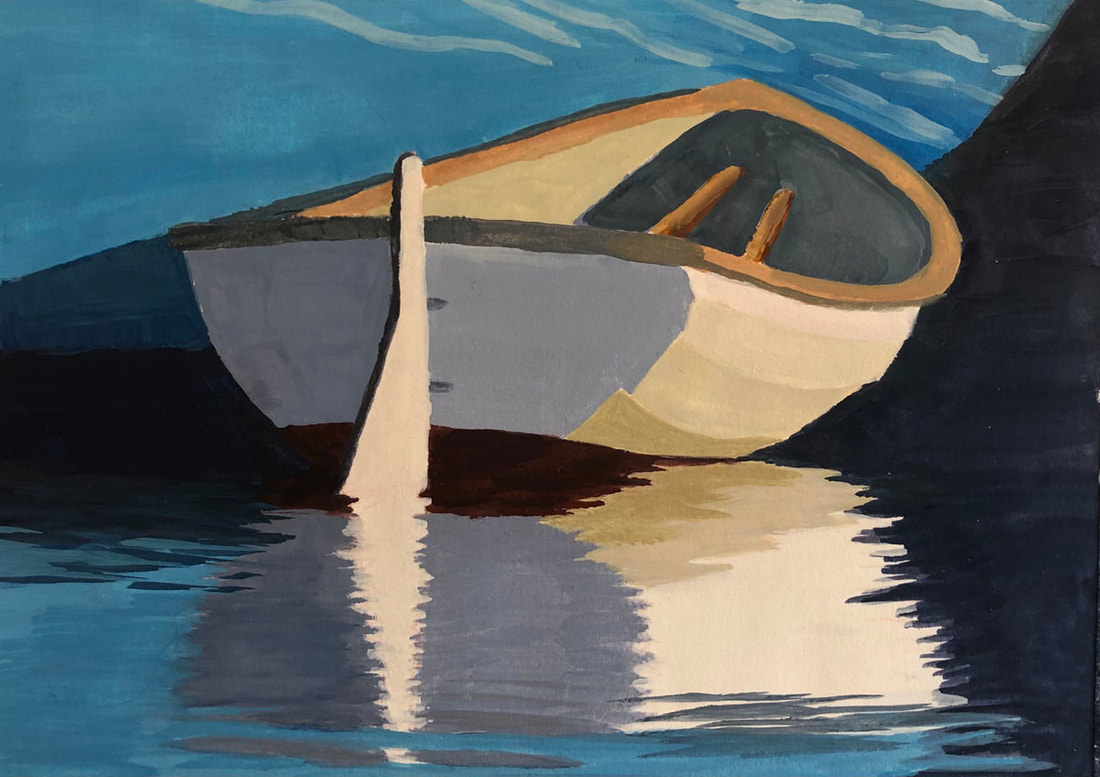 Lapstrake Dinghy 5"x7" gouache on paper My first attempt was a gouache on paper study that was a blast to work on. Gouache is a water based paint, a lot like watercolor, except that it’s opaque. I’ve used it on and off for years, and it felt right for my first painting of this boat. I took the liberty of changing the color of the big sailboat that she came in with for a more interesting color scheme. 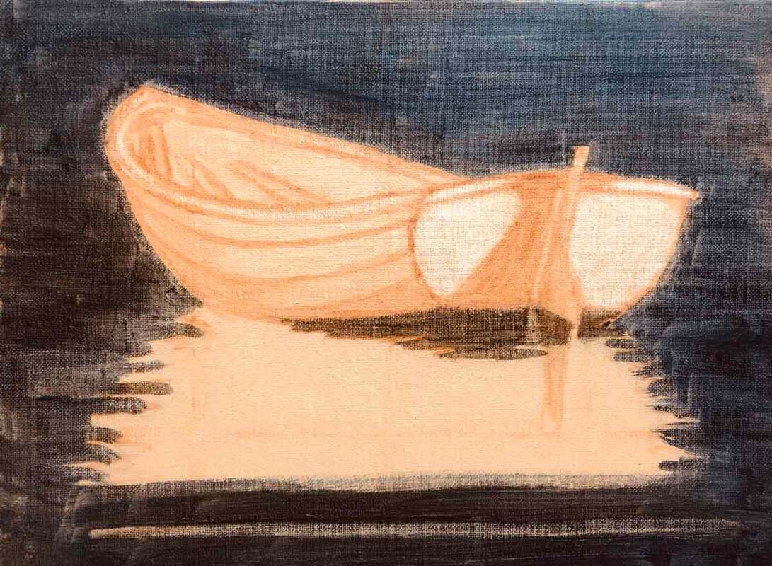 Next I decided to go bigger with a 9”x12” oil painting, and started with a value underpainting, above. While that was drying a few other boat paintings came and went, and when I got back to this one I was in knife painting mode. First, I painted the boat, and then started on the reflection. In the video above, I show how I work with the knife to paint the reflection, using a jig I made to hold the painting so that I can turn it around while I work. And in this video, you get a closeup view of the painting so that you can see the texture created by the knife strokes. To me, they add a whole new dimension to the work.
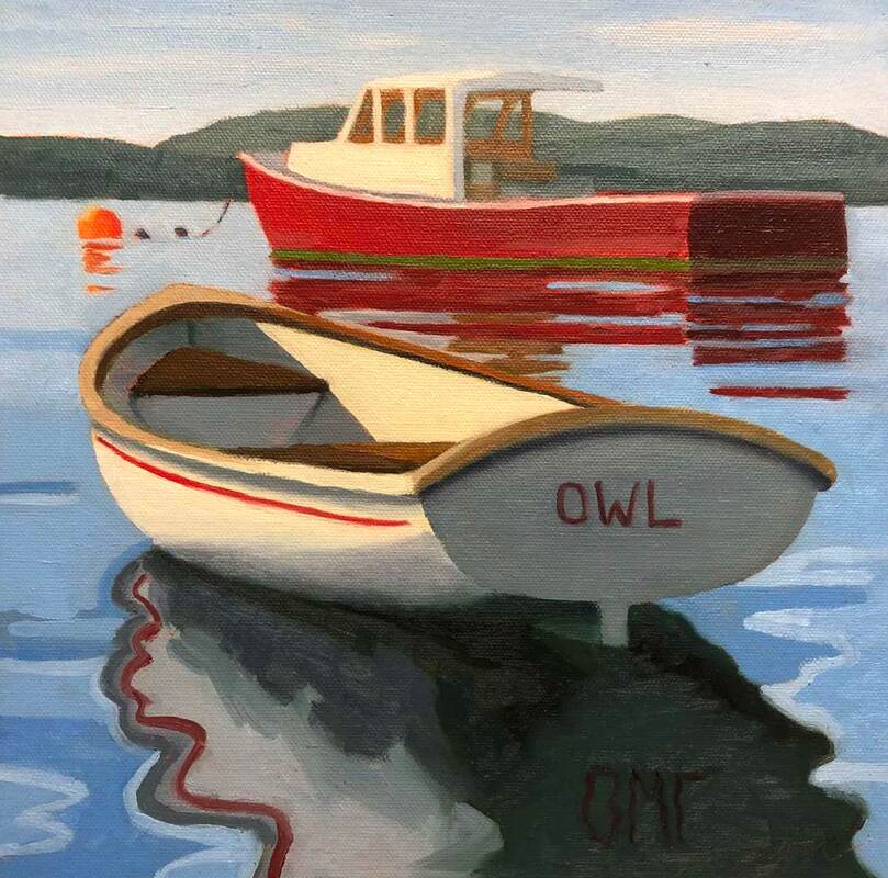 The Owl (and Maybe) the Pussycat 10"x10" oil on canvas panel Last time we visited the town of Ilseboro on Little Cranberry Island I got a good photo of this lovely rowboat with a nice lobster boat behind her. The rowboat is quite the classic. When I posted the finished painting on Instagram, I learned that she's a Jarvis Newman design built by the Newman and Gray Boatyard on Great Cranberry Island, just across the passage. It's always a treat to find out these details. Sometimes, I change the color of boats when I paint them, but these two looked interesting as they were. And I also sometimes change the boat names, as I did here. 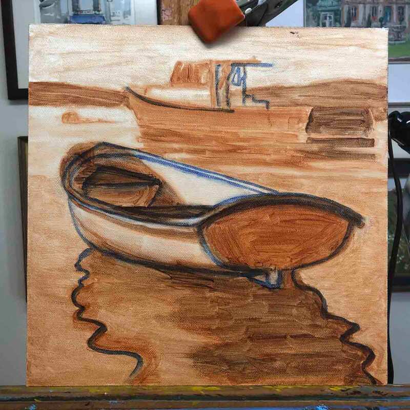 My value underpainting with revised drawing I frequently start a complex painting with a value underpainting. That's a monochrome painting where the shapes have different levels of light or dark, which we painters call values. Having the value shapes rather than a simple drawing makes it easier to apply the colors with the correct values. In this case, I put the piece aside for a while, and when I came back to it, I decided the shape of the rowboat wasn't quite right, and adjusted it with the blue painted lines. A video showing how I paint from a black and white photo. Painting from a black and white rather than color photo is another approach that helps me to get the value of each color right. I generally start with the darkest colors and the most complicated shapes in the middle of the painting, in this case, the boats and the reflection, and work my way outwards. 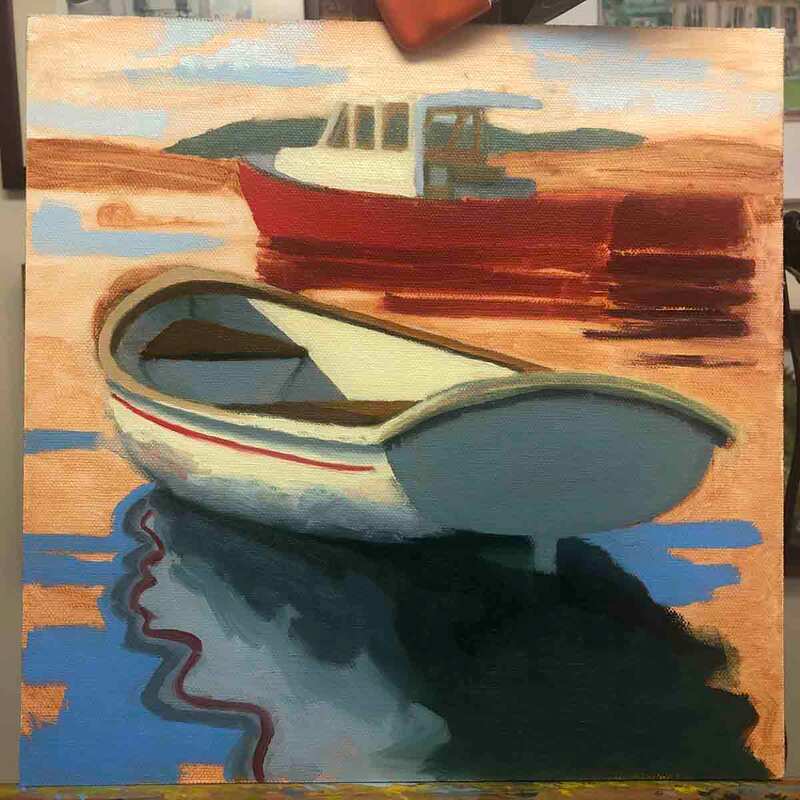 Testing the values in color of the water and sky Once I have the boats and reflection done, I start on the water, testing the values in the nearest and farthest water, and begin filling in the darkest colors first. In this case, I also put in the farthest land to make sure the value was right against the boat, and tested some color in the sky.
Having decided to name the rowboat Owl, it was pretty clear that the lobster boat will become the Pussycat. I'll wait until it's dry before lightly painting the name. 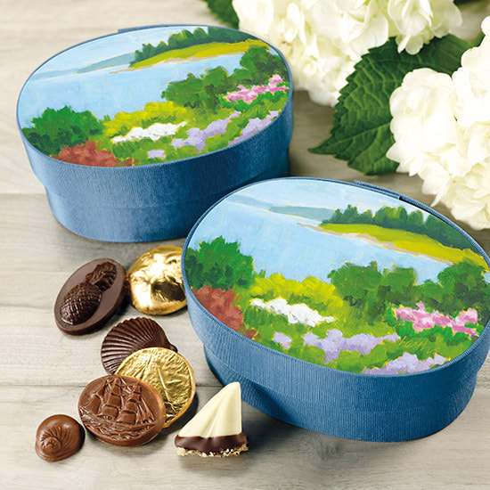 Harbor Sweets Seaside Garden Candy box for Valentine's and Mother's Day 2021 Little did I know in 2014 when I painted Bev’s Garden that the painting would have multiple lives. My friend Bev is quite the gardener, and she has a beautiful location to work with. 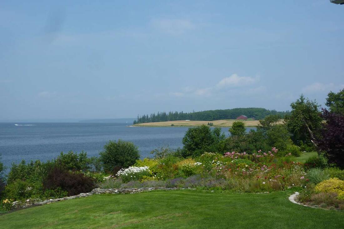 The view from Bev's backyard over part of her garden It was my second year at the Castine Plein Air Festival and I’d found my rhythm. During the 2.5 days of painting at the festival, I created 9 paintings. Some were better than others, but Bev’s Garden was my favorite. 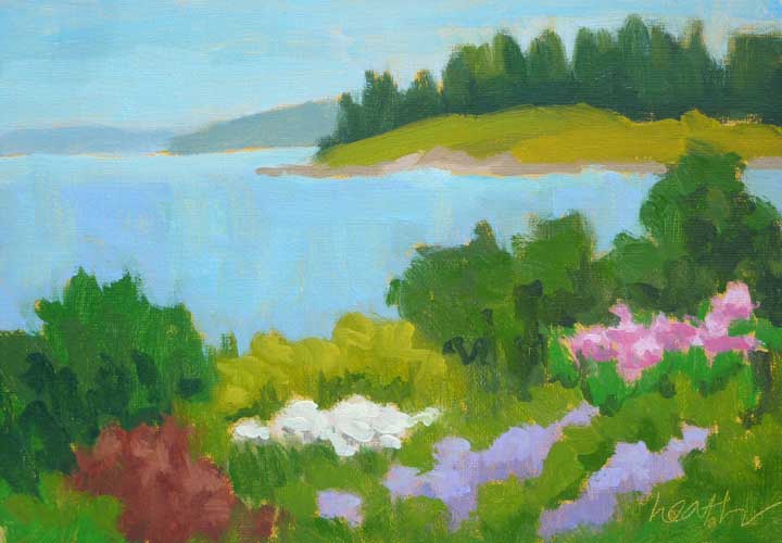 Bev's Garden 5"x7" oil on canvas Things didn’t start out too well, with a rainy morning the first day. I painted from the back of my minivan until the weather improved. The real treat though, was working on the two paintings that I did in Bev’s backyard. It was my first year to stay with her, and her dog and cat, and that was such a treat. I stayed with Bev for the festival every year after that. She’s one of my favorite people, and I met her through painting. How great is that?  Sentinel 7"x5" oil on canvas, also from Bev's backyard Last fall, I was contacted by the Harbor Sweets company from Salem, MA, whose wonderful chocolates and Sweet Sloops (toffee) are my special treat and “go to” for a wonderful hostess gift. They do a couple of special candy boxes each year with paintings from local artists on the boxes, and they wanted to use one of mine. I sent them several to choose from, and Bev’s Garden was the one they chose. I licensed the image to them, and the rest is history.
To get your own Seaside Garden box full of Harbor Sweets chocolates, visit Harbor Sweets here. 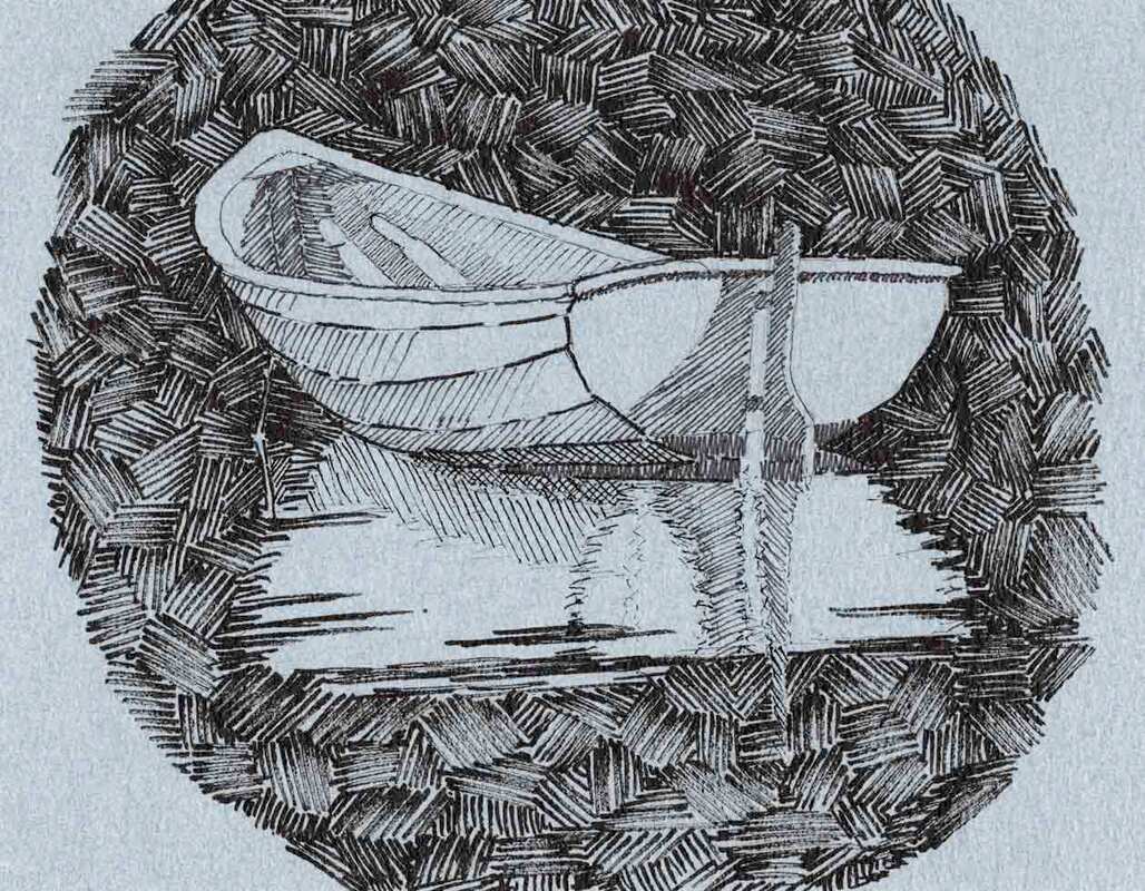 my third attempt at pen and ink with hatching The drawing is the bones of a painting for me, and also one of the most pleasurable parts to work on. When I draw on canvas I use a brush and paint rather than a pencil. It’s easy to wipe off the drawing and start over, so there’s not a lot of pressure to get it right the first time. And the gratification comes faster than when painting, where the end result takes a lot more time. 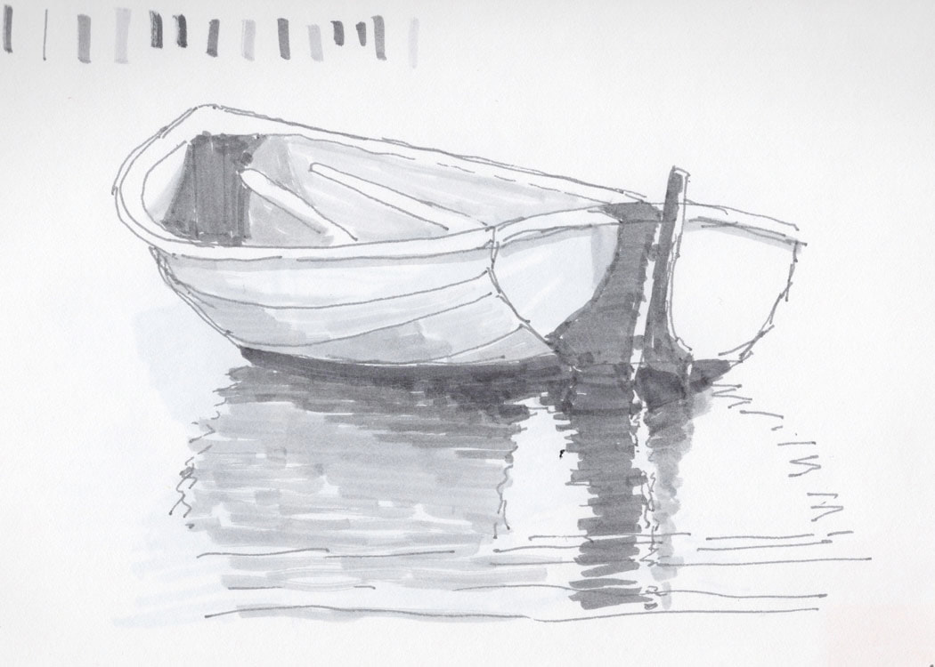 my first drawing of this little boat, made using Tombow felt tip pens But sometimes, I like to make a drawing that will stand on its own as a work of art. I particularly admire the drawings of Rob Adams, an English painter in several mediums who creates drawings well worthy of hanging on the wall. I have one of his paintings and one of his drawings, and in both cases I had the pleasure of watching him create them. Rob uses a pen and ink hatching technique to create different values and textures in his drawings. I decided to learn it. 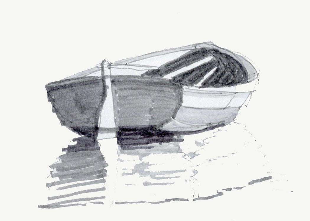 a different view for my second drawing with the felt tips I started in my comfort zone, using felt tip pens of different values and some photos I took this summer of a beautiful wooden dinghy that we saw in Bucks Harbor. I’ve often used these pens to create a value sketch, which is a monochrome drawing that shows the pattern of light dark in the scene. I made several value sketches from photos taken as the boat moved around in the current. 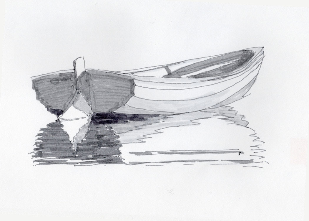 and yet another view drawn with the felt tips This little boat is a real classic. It was made using the lapstrake or clinker technique, where the planks overlap each other, giving the boat strength as well as its rounded shape and characteristic striped look. The approach has been beloved since Viking days for stability and maneuverability. 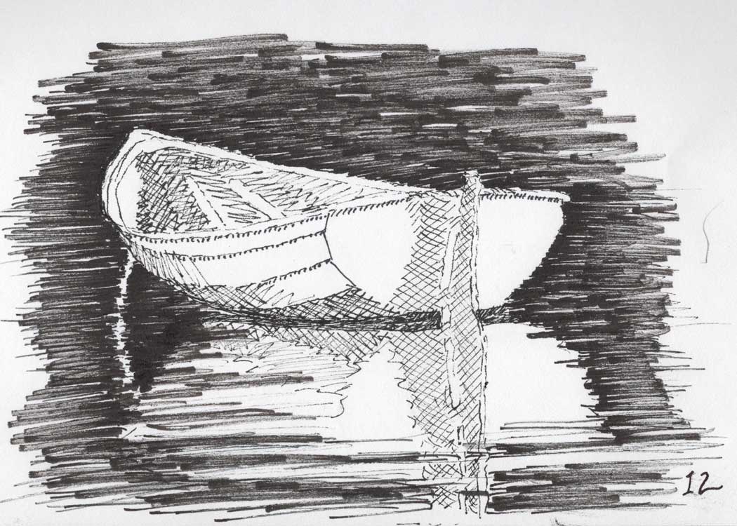 my first traditional pen and ink attempt, though I went back to the felt tip for the water From the value sketches, i chose one and tried it in pen and ink, to get a feel for the medium. The feeling of the pen on the paper is different than with the felt tip, and also this ink is permanent. I did the line drawing in pencil, went over it with the ink, and erased the pencil after the ink was dry. But I wasn’t quite satisfied with this approach, and studied Rob’s work again to try and better understand the hatching.
The drawing at the top is my third attempt at hatching this image. I tried it first (not shown) on the same sketchbook paper as the other drawings in this blogpost, and finally on some fabulous blue paper made in France that Rob recommended to me. I think I'm getting the hang of it.  A Clean Glass 6"x6" oil on canvas board Is it too late? I don’t think so. I actually like New Years resolutions. I like the new year giving me a chance to start again. And I make different kinds of resolutions. A favorite every year is to learn more about wine. That sends me to wine tastings (remember those?), podcasts (I like Wine for Normal People), to the bookstore, and maybe even some vineyards. Experts say that it’s easier to make a resolution that adds or changes a habit, something that you can do every day. And the less time it takes, the easier it is. I have one artist friend that did a drawing every day last year. That’s a great habit! Just 10 minutes a day drawing makes a big difference. I’m going to do that one this year, even though I'm starting a little late.
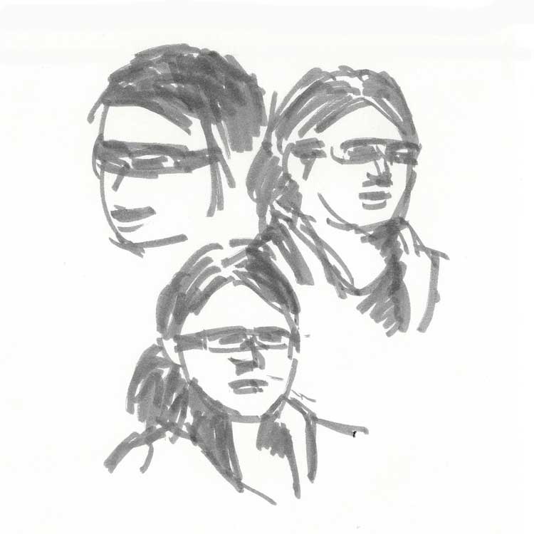
Above are quick sketches using a Tombow pen. The markings in the middle sketch test different pens. Online challenges are being offered in the new year to keep us motivated for those habit changing resolutions. Seven Day and Thirty Day Challenges are the most popular. They range from money management to thankfulness, with everything in-between. This year the New York Times is hosting one about eating less sugar! Often you can sign up and get a prompt each day to remind and inspire you. And you can use the challenge hashtag on your favorite social media site to post your results and see how everyone else is doing. Several times I’ve done Thirty Day Painting challenges. Those are harder to do than a drawing challenge, because of the time involved. It's very rewarding to see your skills improve over the month.
Mini-paintings from a challenge in 2017, oil on paper But for me, the best resolutions are the ones about learning something new. If you’ve always wanted to paint, or gotten stuck with your painting and put it aside, this is a great time to dive back in. Because of the pandemic, there are a host of online painting classes being offered now, some of them by me! Check out the Classes page.
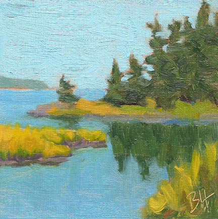
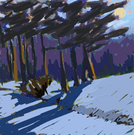
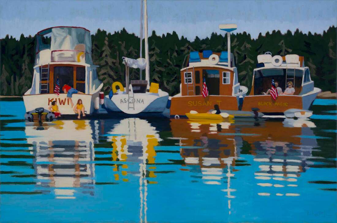 Rafting Up 20"x30" oil on canvas (Vinalhaven, Maine) 2020. In years to come we won’t want to remember it. There was deprivation, sickness and hunger, and for some, loss of loved ones or dear friends. There was the constant worry about what any cough, ache, pain, or runny nose might mean… And there were heroic deeds and long hours put in by those trying to keep us all healthy and safe. But for many of us, it was a mostly a matter of changing the way we do things, to mostly less convenient ways of doing them with less satisfying results. Not a lot of fun.  Mill Pond 16"x16 oil on canvas (Massachusetts) I’ve been thinking about what I’ve learned this year. About what is most important to me and what I missed the most. Though I already knew it, the need to be in the natural world came front and center. If I hadn’t been able to walk the trails of Westford, MA, especially those at East Boston Camps, with a stream, lakes, ups and downs, deciduous and pine forest, I don’t know what I would have done. In the summer, my daily walk to the town landing in Yarmouth, ME was just as good. If I hadn’t learned to teach painting via Zoom, I would have lost all interaction with painting friends at the easel. That was a very special time for me each week. It was a time without pandemic worries, of true friendship and of helping those friends learn something new. It made me happy.  Entrance to Seal Bay 5"x7" oil, applied with knife (Vinalhaven, Maine) We still got to do our boat trip down east this year, but it was different. We had a little take-out instead of visiting our favorite harbor restaurants, and we stayed away from the island villages, figuring they didn’t need people visiting from away during the pandemic. But overall it was still a special treat, spending time in beautiful harbors, occasionally with friend’s boats nearby. I think what I missed most was having friends over for dinner. That was less of a problem in the summer once our boat was in the water, because we could still social distance in the cockpit with two guests. Those lunches and dinners on the water were treasured.  Delivering the Catch 9"x12" oil on canvas board (Stonington, Maine) And of course, I missed travel. As recently retired people, that’s how we want to spend a lot of our time. I made three trips in January and February, an awesome start to a travel year. And also the end of the travel year… My sisters and I made our annual visit to Florida and I had the pleasure of teaching a workshop in Tarpon Springs. My husband and I visited friends in Scottsdale and spent ten days on the south coast of Massachusetts and Rhode Island, which was a total treat. We were even able to have lunch outside in New Bedford on our last visit in October. But our trip to France for Christmas was canceled. Typical 2020.
I’d love to hear about what you learned and missed in 2020. Let me know in the comments. Here’s to 2021! 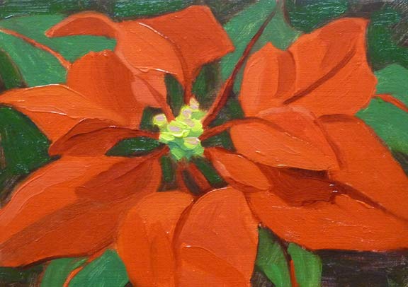 Poinsettia 5"x7" oil on linen panel I've had a hard time getting into the holiday spirit this year. After our "Not" Thanksgiving, it just didn’t feel right. Thanksgiving is my favorite holiday. For more than 20 years we’ve spent it at our cottage in Maine, with long time friends. It’s a cooking event where everyone participates. The following day, we have a “bits and pieces lunch”. Not Thanksgiving leftovers, but cheeses, pate, ham, fresh breads, raw vegetables and several wines. We eat in our porch room with the heat cranked up and enjoy the scenery, the company, and the food. 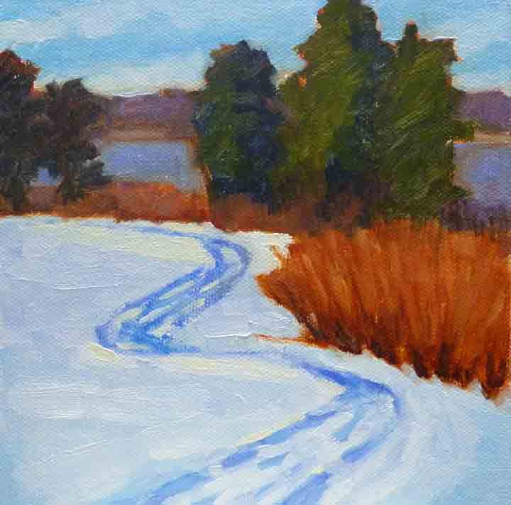 Gilsland Snow Field 6"x6" oil on canvas panel This year, with social distancing and quarantines, we were at home for Thanksgiving, just the two of us. We made a nice dinner, but tried some new foods, and it just wasn’t the same. So I decided to go for the traditions for Christmas. We've made my mother-in-law's cookies, the two of us at our house and our son at his. I’ve gone overboard on the Christmas stockings, perhaps unwittingly creating a new tradition. 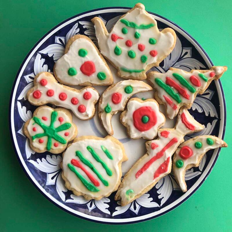 Our 2020 holiday cookies from my mother-in-law's recipe We have a beautiful wreath on the front door. I chose three of my favorite paintings and had holiday cards made. Two are traditional snow paintings and one is a small boat. I asked my friends on Instagram which one they thought was best for a holiday card. Interestingly, though the snow scenes were the most popular, the little boat got a good number of votes. People said it reminded them of me, which I take as a compliment. I mailed the last of the cards yesterday. And I'm starting to feel like it really is Christmas.
The holiday cards I had made for 2020 On Christmas day we’re having our classic holiday breakfast, eggs Benedict, followed by a roast chicken with stuffing for Christmas dinner. The last few years we’ve been doing this at our son’s house and enjoying being with his friends. But this year, he'll do his and we'll do ours separately. We’ll have a quick masked unwrapping of the gifts and stockings together. But we won’t be able to visit my mother-in-law, as we usually do, because of quarantines. There will be zooms with both our extended families.
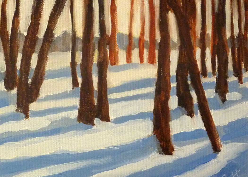
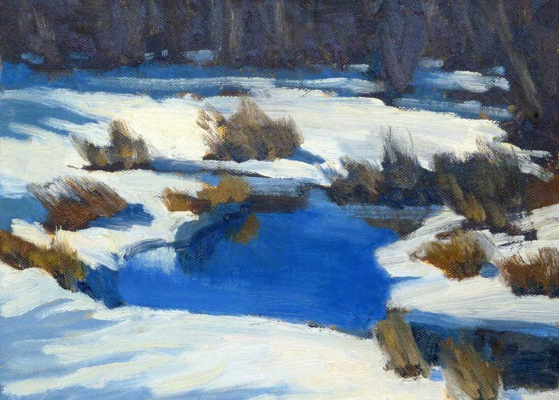
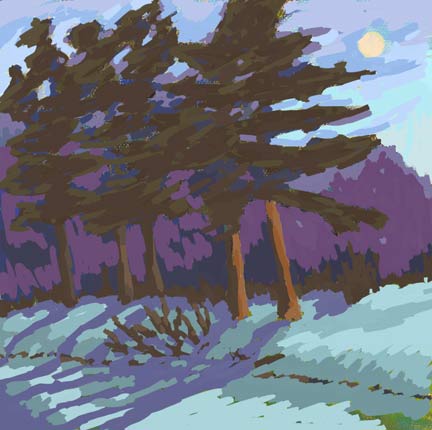
I think it will feel like Christmas, different, but still full of food and family, even if there has to be a tech assist. I hope yours will feel that way too!  Icy Brook 8"x10" oil on canvas We’ve had our first snow of the season here in New England and the second is on it’s way. And this week in my zoom class we are going to paint snow. Painting snow is a bit different than a non-snow landscape. As you might expect, values are still the most important thing, the challenge is being able to see them. 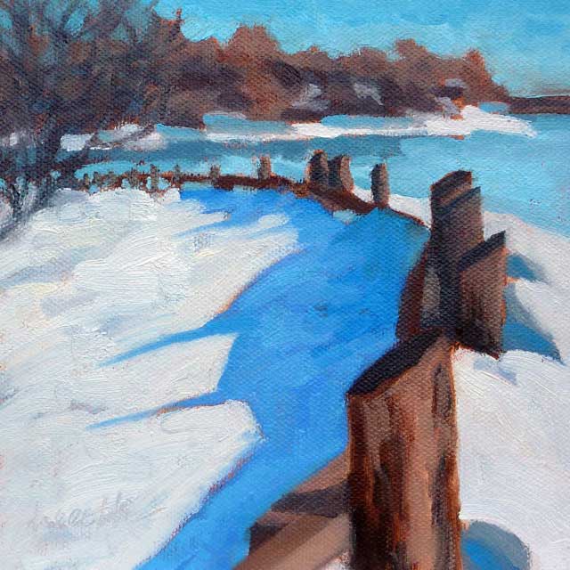 Snow Fence 6"x6" oil on canvas panel - Available The prominence of shadows in snow scenes gives the artist a wonderful design element, with their strong geometric shapes in the ground plane, and the color options. What drew me to the scene above was the interesting shadows cast onto the snow covered park by the slanted tops of the fence posts.
Sometimes I’ll try out ideas using the ArtRage app on my iPad. The above images were created that way by “painting” on top of the photos of summer plein air oil paintings. 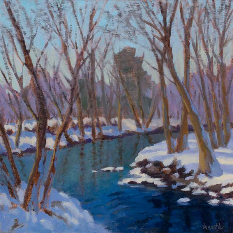 Snow on the River 12"x12" oil on canvas - Available Color is the fun part of a snow painting. The traditional approach is make the shadows cool and the lighted areas warm. Typically we think of the colors on the blue side of the color wheel as cool and those on the orange side as warm. In the above painting, I've used a whole spectrum of blues in the snow, water, and sky. The trees bring in a warm element.  Strawberry Banke 5"x7" plein air oil on canvas panel Plein air painting in the snow is a real challenge. There’s the weather to contend with. You have to keep warm, but still be able to move around. The paint gets very stiff. And the shadows seem to move even faster than in the summer. And then there’s the parking. I know, that sounds weird. But in New England many lovely public open spaces where I like to paint don’t plow their parking lots in the winter, so options are limited unless you want to add a snow shoe trek to the project!
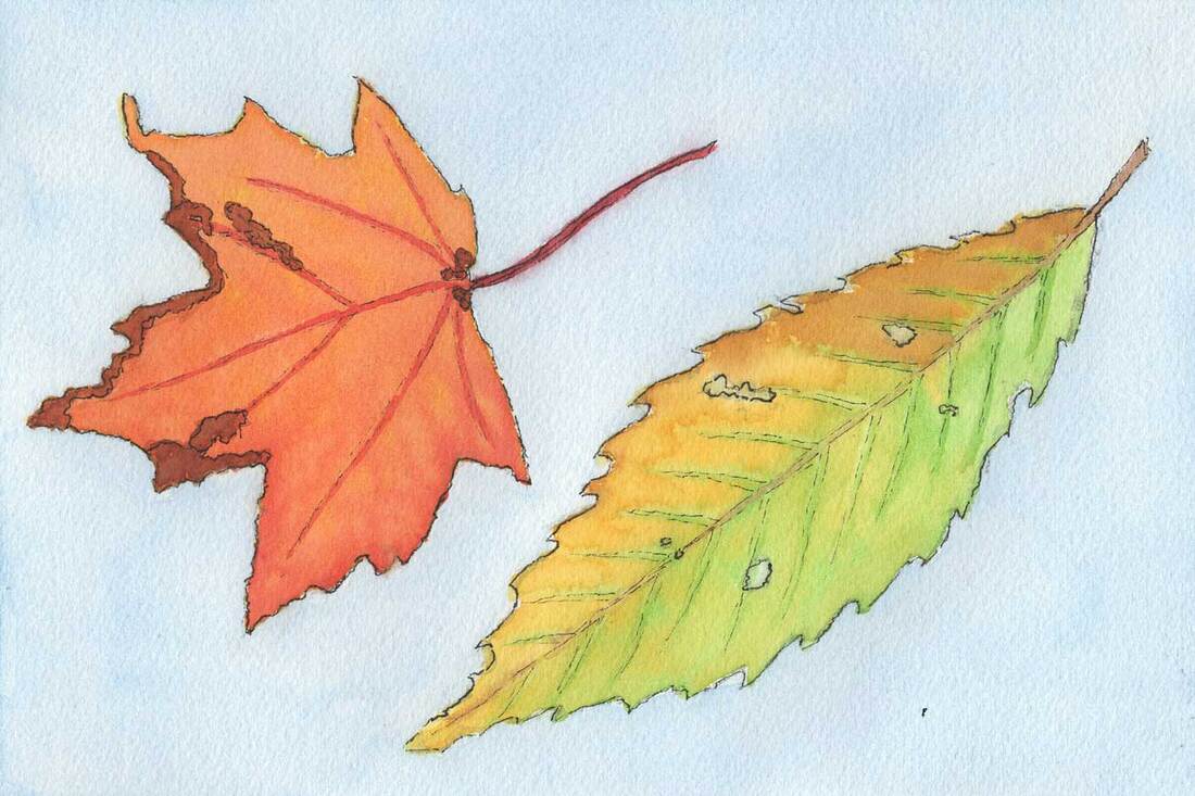 Green and Orange Leaves 6"x9" watercolor on cold pressed paper Sometimes, mixing it up is the best way to go forward. When we work with the same process over and over, it can become rote, the fun gets lost, and we start to lose interest. This summer, I took my watercolors out to our boat, thinking it would be easier to paint with them in the tight quarters, and a lot easier to store the finished paintings while we were underway. What I wasn't thinking about was what I'd learn in general about making a painting, and how that could help my oil painting. What I stumbled on was basically the concept of cross training. 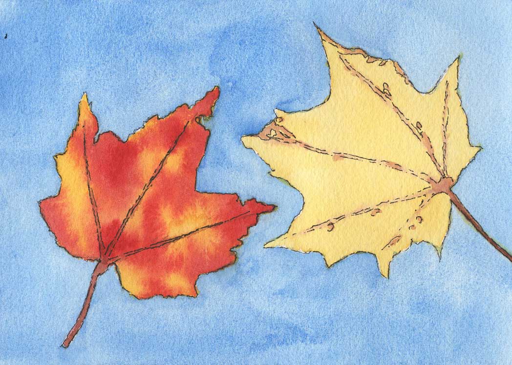 Two Leaves 5"x7" watercolor on cold pressed paper We're all familiar with cross training in sports. Benefits include improved strength, endurance, and fewer and faster recovery from injuries. Let's see if we can relate that to painting in different mediums. When I paint with watercolors, I usually sit, while painting with oils I stand. That means I'm using different muscles in my legs, back, shoulders, and arms. It's probably good for overall fitness and strength. There are plenty of people who stand when they paint in watercolors, so that's simply a personal preference for me. 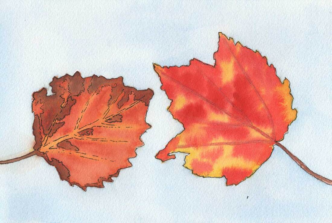 Speckled Leaves 6"x9" watercolor on cold pressed paper But what about cross training for your mind? I was interested to learn that cross training is a thing for writers. There are even course offered in writing for that very purpose. I'm imagining a novelist writing haikus and limericks! A major difference between painting in watercolors and in oils is that watercolors are applied lightest to darkest and in oils we go the opposite direction. The reason is that for watercolor white is created by lack of paint on the white paper, and in oil painting you've got a tube of white. So it's a big head shift to go from one to the other. But the concepts of composition and value are the same. Another difference for me, is that my oil painting is done alla prima, meaning all in one go so all of the paint is wet until I'm done. In watercolor a series of washes is built up to create the picture. It's common for watercolor painters to use a hair dryer to speed up the process between layers.
The Irish Piper woodcut on paper and detail of A Serious Game pastel on paper I've also done a bit of cross training making woodcuts and using pastels. Once again, the composition and values are the same as with oils or watercolor. In a woodcut, there are a limited number of layers, so the values and colors have to be simplified. In a pastel, it's almost the opposite, though you are constrained by the number of pastels you own. If you know an accomplished pastelist you've probably seen the hundreds of beautiful pastels they use. That's quite different from the way I mix each color I want in oils using a limited palette of two of each primary color and white.
Learning comes from trial and error, and I find that I learn most from the failures. Working in different mediums expands the opportunities for that learning. When I can let go and not worry about the outcome good things happen. Spending some time making paintings in a different way makes all my paintings better. |
AuthorBobbi - Painter. Sketcher. Teacher. Boat and Dog Lover. Archives
February 2024
|
 RSS Feed