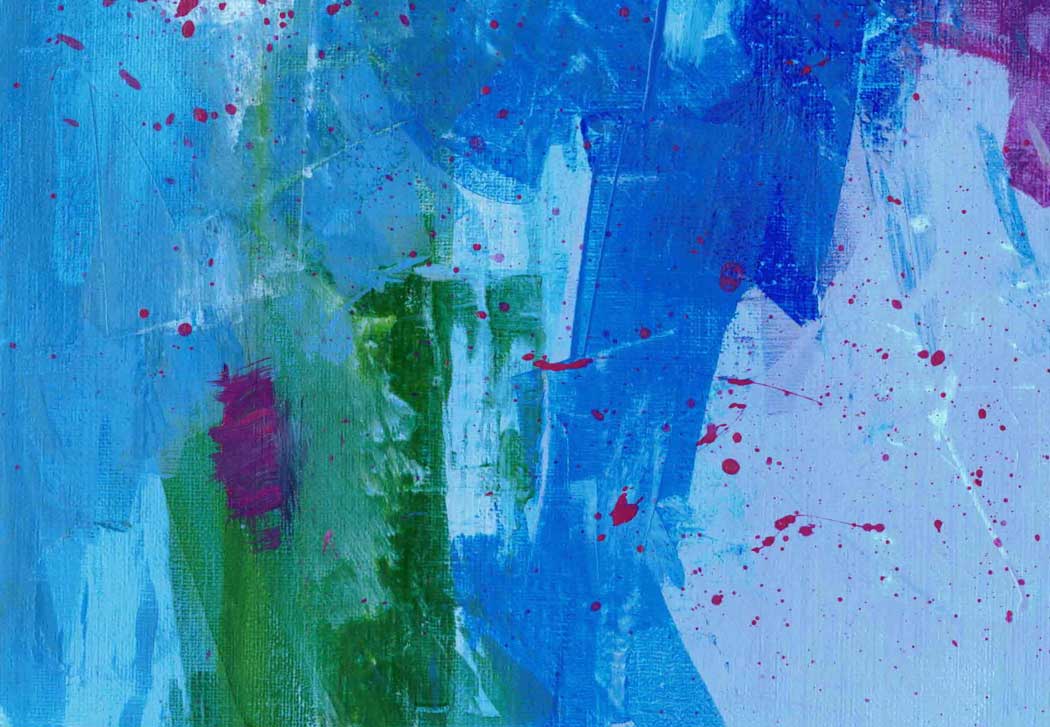
 Blue Green Abstract - 5"x7" acrylic on paper I’ve painted in a number of mediums: oils, gouache, water color, and pastels. But when I’ve used acrylics, I haven’t been excited with the results. Until recently. What made the difference? Realizing that they aren’t oil paints.
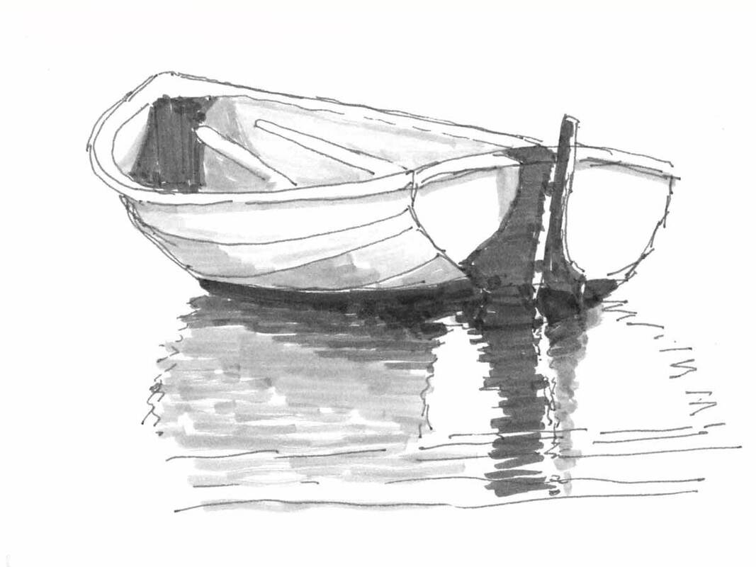
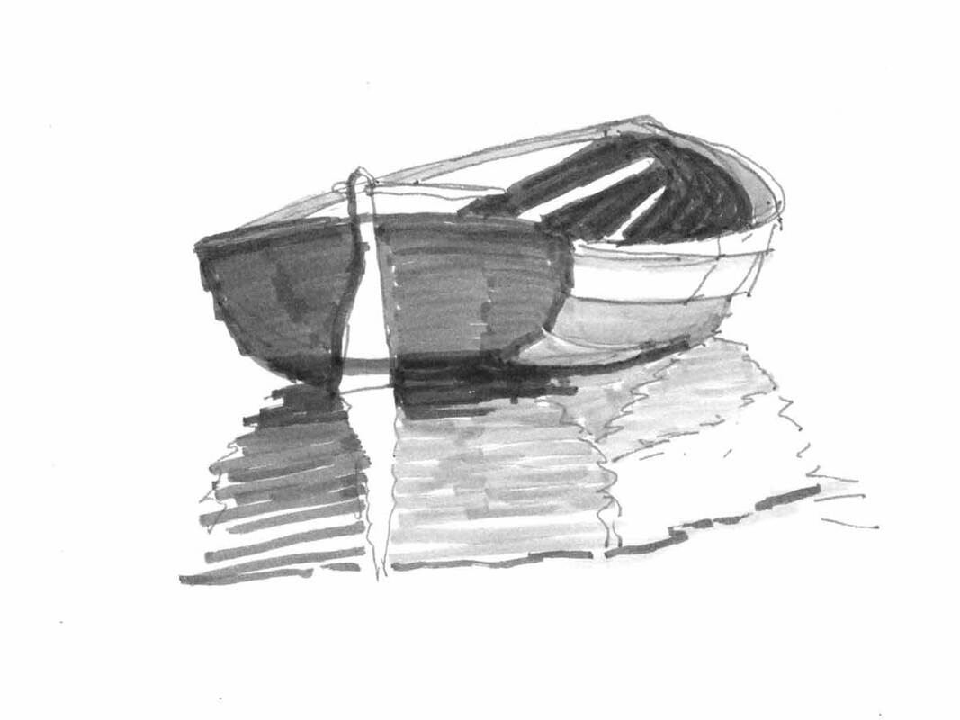
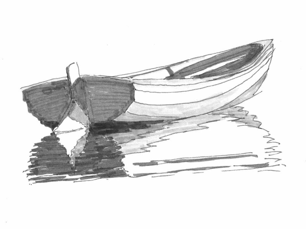
Red Sailboat Boothbay - 6"x6" oil on canvas left, acrylic on paper right Last fall I took a painting class that wasn’t about a specific medium or painting techniques. It was about finding joy in your work, with painting as the work. Louis Fletcher, the teacher, believes that when you’re struggling the work shows it. And when you’re enjoying yourself, and you love the results, your unique style comes out. I love this idea and will return to it in another post. 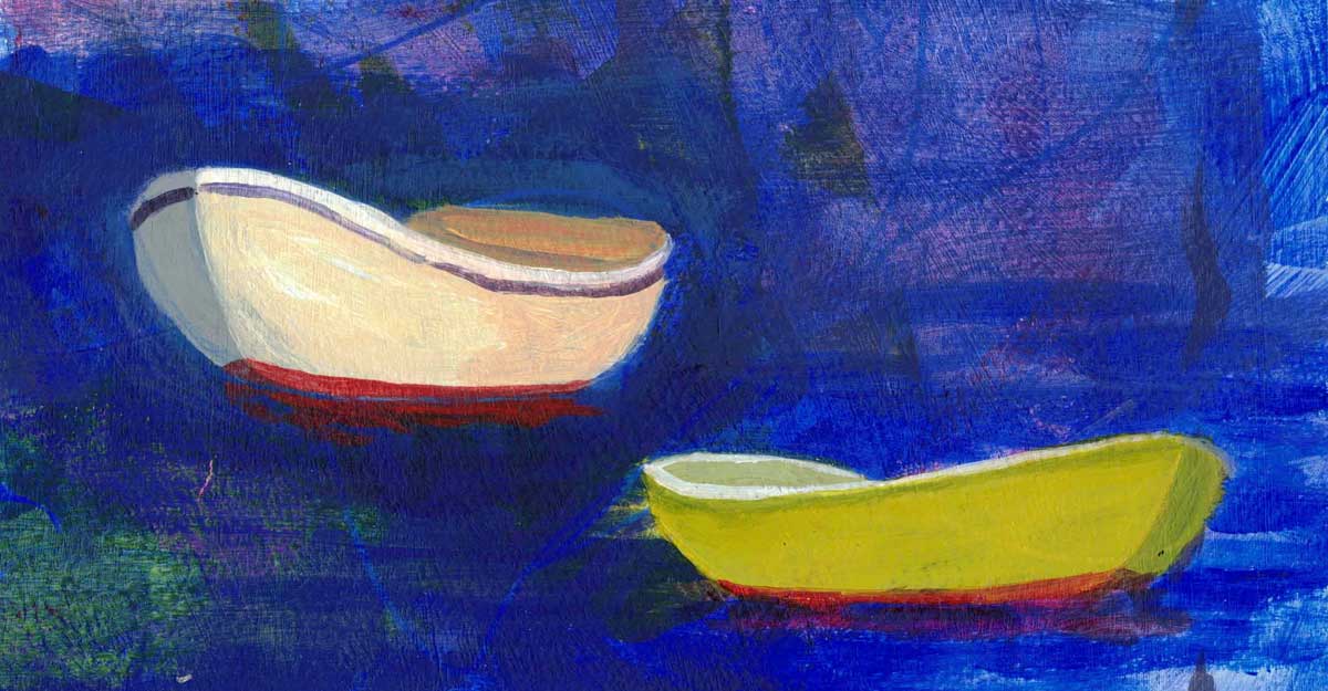 Boats drawn from figure 8's - acrylic on paper I decided to do Louise’s exercises in acrylics because I wanted to avoid using solvents inside the house when it’s too cold to open the windows. But I was still thinking about acrylics as oil paints with water as the solvent. And I think that was what was getting in my way in my acrylic painting. I wasn’t treating it like a new medium, with different possibilities. 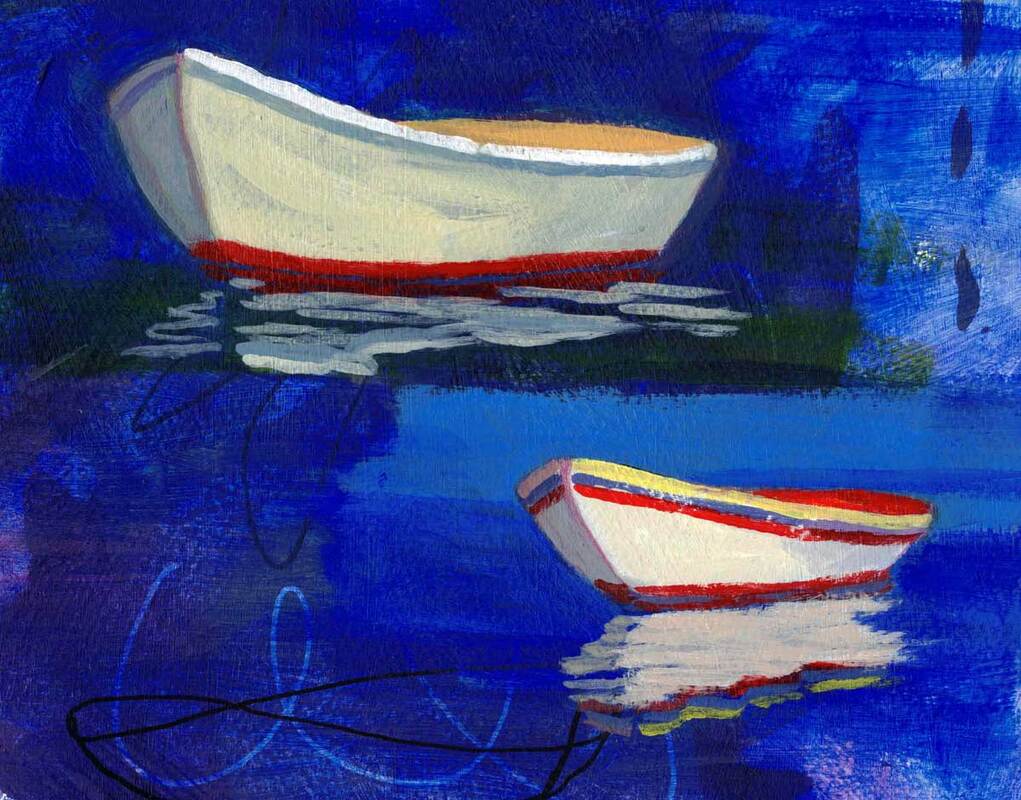 More figure 8 boats - acrylic on paper While the class had demonstrations in multiple mediums, there were lots in acrylics, and I was able to learn about layering and the benefits of a fast drying medium. And there was so much experimenting! It’s been fun to see what I can do with these paints. In these dinghy paintings, I painted over colorful backgrounds made using up extra paint from previous paintings I love the added depth and texture. For how to draw Figure 8 boats, look here. 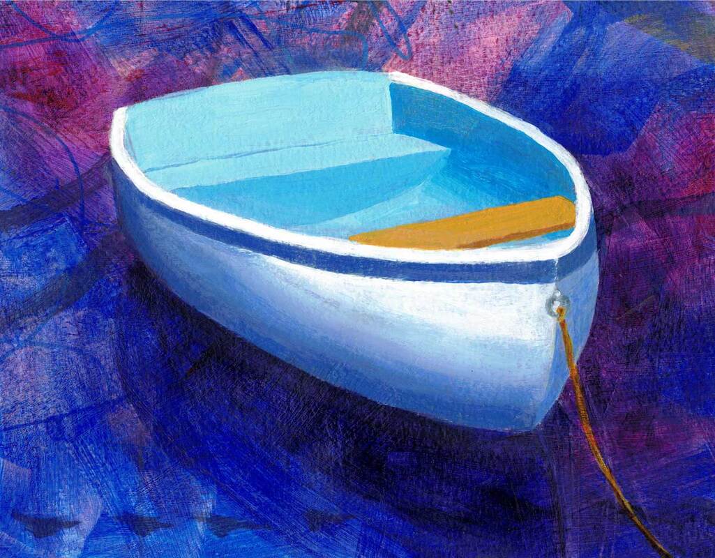 Great Island Dinghy - 8"x10" acrylic on paper I’m sure there are analogies to my experience with acrylics in other areas, like moving from a camera to the one on your phone, using a new material in construction, or cooking with a new gadget. We need to let go of the old ways, and what we know, and spend some time exploring the potential of the new material or gear. And learning from others via YouTube, a class, or a generous friend, can be a big help.
0 Comments
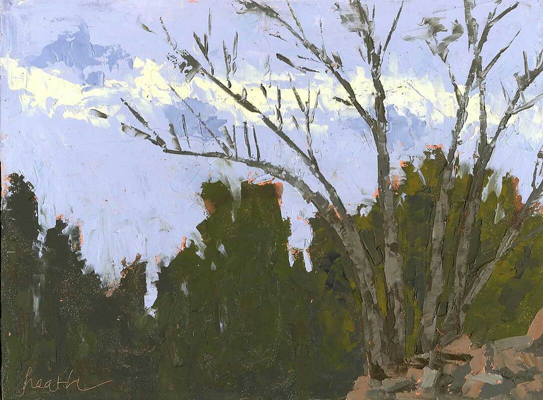 Nature's Grace - 5"x7" oil on panel, with knife Sometime back the Boston Globe posted an article on how the interior-design world has turned against the color gray. How do you feel about that? Are you done with gray walls? Or maybe done with gray period? We’ve never had gray walls in our house, ours are mostly white or off white to allow for lots of light and flexibility in hanging paintings. 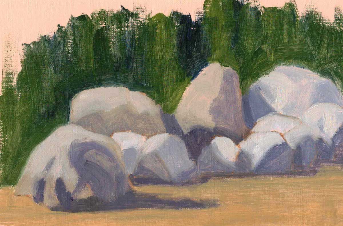 Isle-au-Haut Rocks - 5"x8" oil on treated paper And while I’m glad to see the departure of gray walls, I find the colors of gray useful in painting. I say the colors, because gray comes with lots of variations: blue gray, purple gray, red gray, green gray, etc. Since I paint with a limited palette and no black, my grays often lean towards one or other color. These grays and their neutral brown counterparts are useful in balancing the bright colors that I like to paint with. 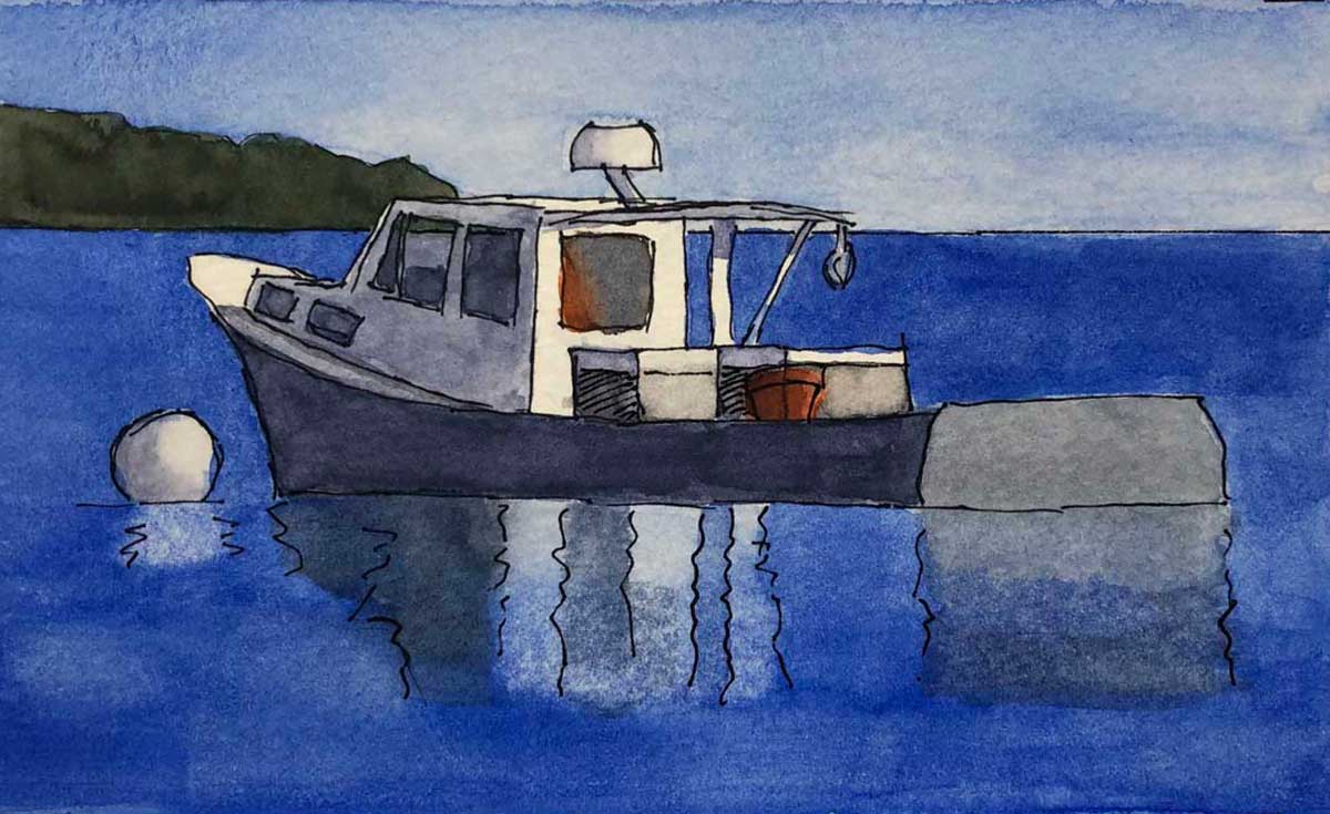 Bucks Harbor Lobster Boat - watercolor on paper ~ 3.5"x5" Sometimes there’s an object in my painting that is well, actually gray. Like this lobster boat that I enjoyed painting from the wheelhouse of our boat when we were moored nearby. 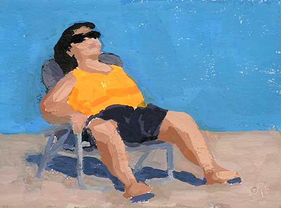 Sittin in the Sun - 4"x5" gouache on paper And often there’s already a lot of color in a painting, so some neutral gray is a good supporting actor while the bright color takes center stage. In Sittin in the Sun, the chair the woman is lounging in gives us that contrast. And note the blue gray of her shadow on the sand. 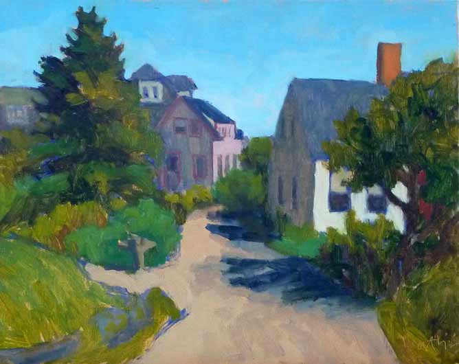 Downtown Monhegan - 8"x10" oil on canvas panel The neutral grays and browns in the buildings in Downtown Monhegan provide a place to rest our eyes from the bright color of the trees, sky, and the sunlit side of the building on the right side of the painting.
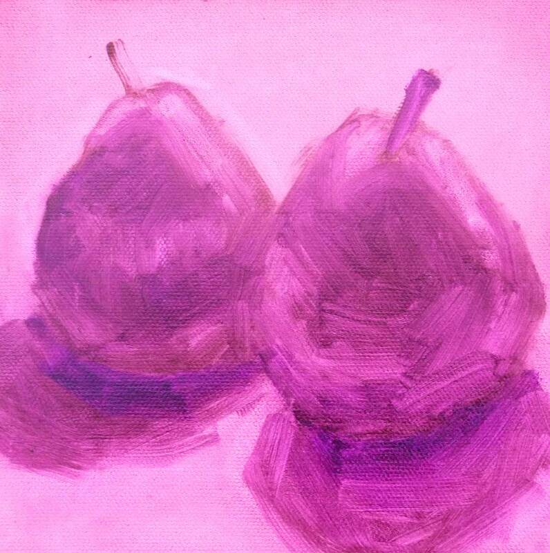
I guess what I’m trying to say is that we do need grays in paintings, to offset the story we want to tell in brilliant bold color. But a little goes a long way, and I won’t be painting any walls that color any time soon. Enjoy the color (and the grays) in your life! 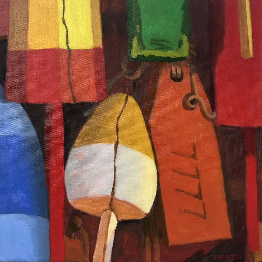 Buoys - 12"x12" oil on canvas When a painting catches your eye from across the room, it may well be the bright colors that have attracted your attention. But I believe once you walk over and take a good look, it’s a solid composition that will keep your attention. A composition is more than a line drawing, it’s about shapes, how they fit together, and their values (how dark and light they are). 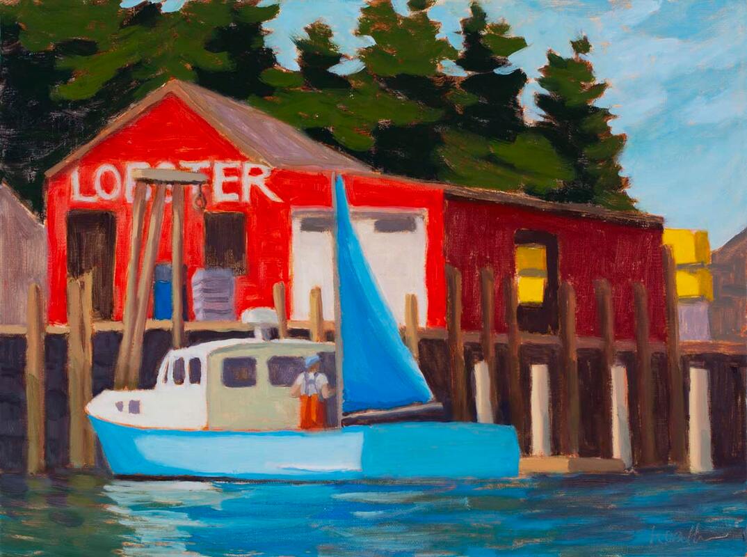 Delivering the Catch - 9"x12" oil on canvas panel What does composition do for the painting? A good composition will let your eyes move around in the painting, discovering more as you go. It neither pulls your eye outside the painting or lets it get stuck anywhere inside the painting. What makes a composition interesting? Asymmetry! It turns out that our brains like asymmetry. That’s why you see design pundits recommending an odd number of objects in a still life, and an uneven spacing of objects as well. The rule of thirds in landscape painting comes from this (more about that later). 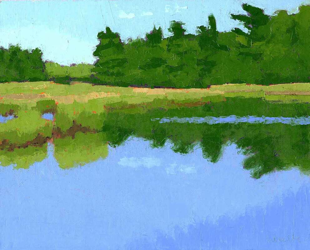 Summer Marsh - 8"x10" oil, knife, on panel see below for photo cropping options How does the painter create a solid composition? When composing, whether from life or from a photo, we pay attention to a few guidelines like those above, and when we break them, we do it consciously and make up for it in some other way. For example, in general, placing an object smack dab in the middle of a painting isn’t a great idea. But if the area around the object can have lots of asymmetry, all is still well. Shadows in still life paintings are great for this. 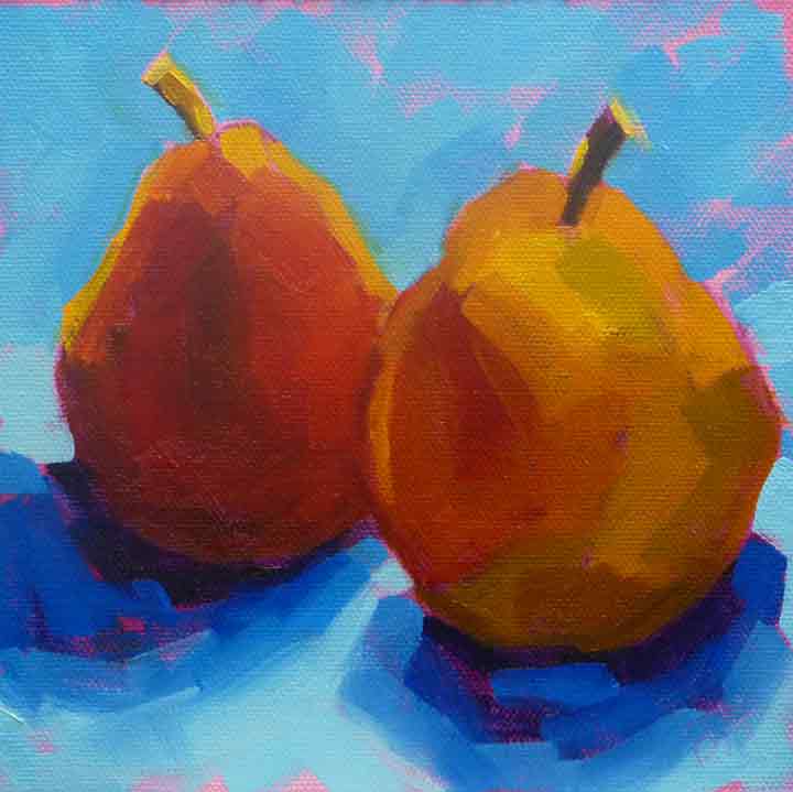 Pears in Blue - 6"x6" oil on canvas panel the asymmetry of the shadows make up for the two objects placed in the center What a focal points? That’s a term we hear a lot. A focal point occurs when there is a sharp (not blended) edge that has a strong contrast of light and dark on either side. The truth is, there will almost always be at least one focal point in any photograph or painting, and likely more than one. The trick is to place them where you want them and not let them be stoppers for the eye.
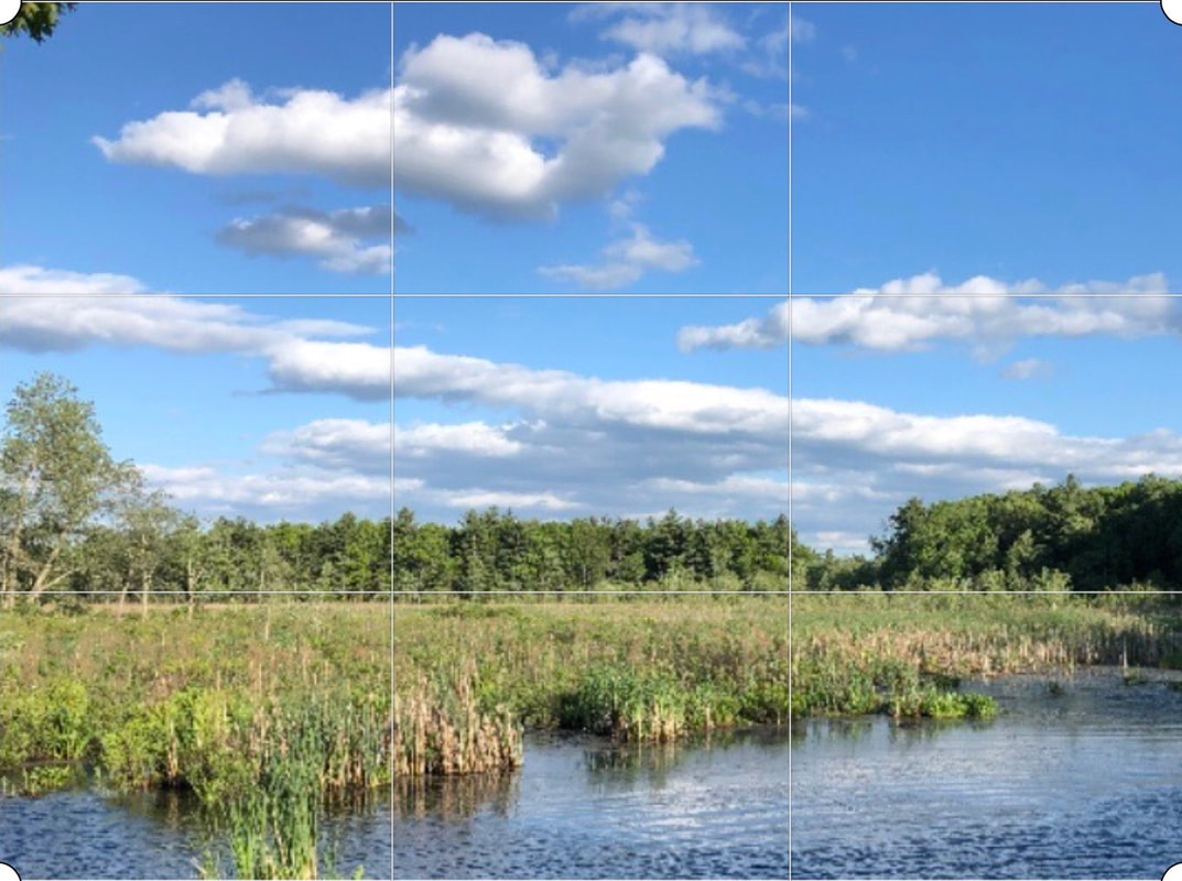
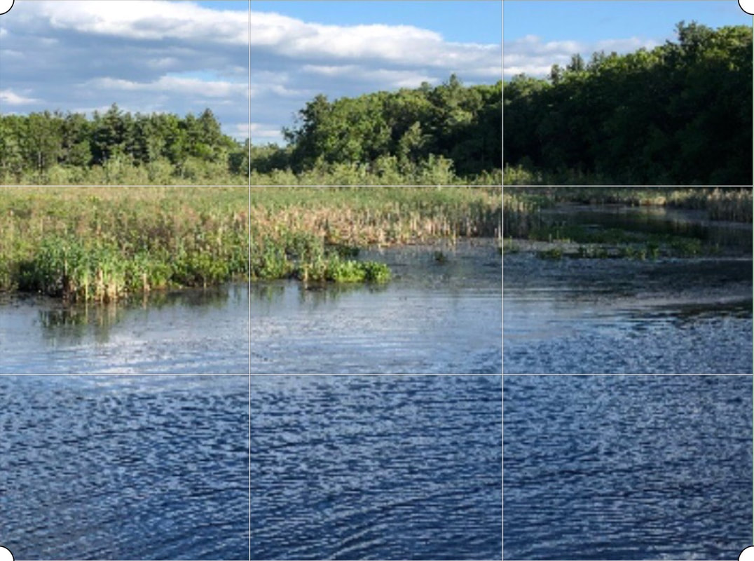
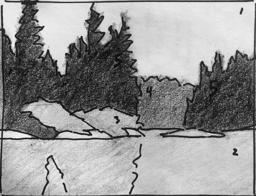
Two crops of the same image showing the horizon 1/3 from the top and 1/3 from the bottom - applying the rule of thirds What tools do artists use to create a good composition? For a still life, we can arrange the objects and the point of view (whether looking straight at the objects, or down or up at them) as we like. We are composing in the creation of the set up. For landscapes, the rule of thirds, which recommends placing the horizon and focal points a third of the way from the edges of the painting, is helpful. Cropping, whether painting outside or from a photo is key. I recommend not doing it with your camera, because you limit your options later when actually in front of the canvas.
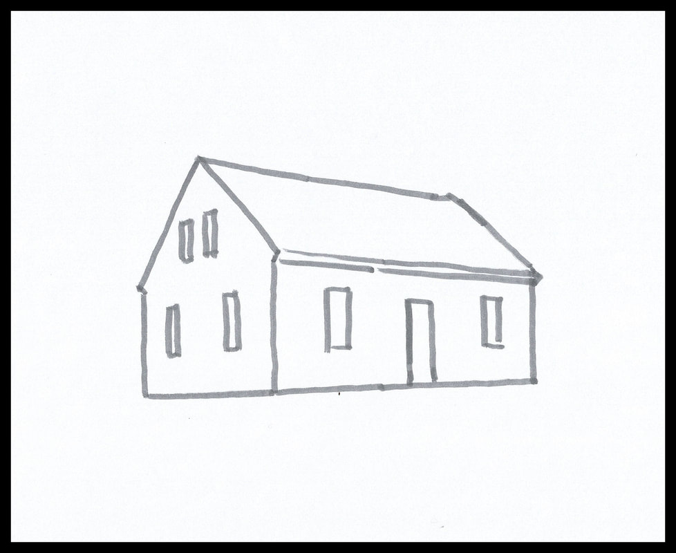
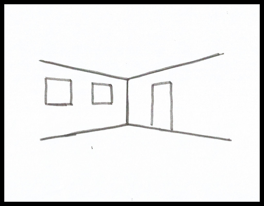
Simple perspective applied to the exterior and interior of a house Perspective is also part of composition, it’s what lets us place a three dimensional scene onto a two dimensional surface like paper or canvas. Basic perspective isn’t hard to understand, and will take you a long way.
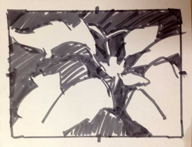
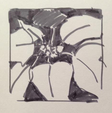
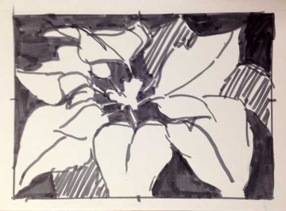
Thumbnail composition options for a poinsettia painting The most useful tool when composing is the thumbnail sketch. That approach with a pencil or markers, and three or four values, lets you try out your design quickly, before committing in paint. It’s a good idea to try two or three options for any painting. And it's an idea that I don’t always follow, leading to many lessons learned!
 A Clean Glass - 6"x6" oil on panel We’ve all probably made some New Year’s resolutions over the years. My favorite is to learn more about wine, and I make that resolution every year. But beyond that one, I prefer to focus on opportunities rather than resolutions. 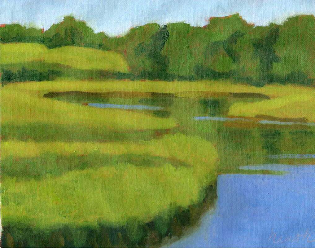 Marsh From the Bridge - 8"x10" oil on panel Final Assignment in my Beginner Oil Painting Class I’m almost always up for opportunities to learn something new. And there are so many ways to learn these days. We can take in-person classes or live Zoom classes in everything from fitness to painting to playing a musical instrument. There are also self-paced online classes and YouTube videos. Teaching with Zoom has been a great addition to my practice. It means that people who don't live nearby can join my classes. I've made some wonderful new friends with this expanded audience. Demo of rocks from one of my live zoom classes in 2023 There are so many learning opportunities available to each of us. From hobbies to personal growth, fitness, sports, and jobs, I can't count them all. And they are more accessible than ever. Perhaps we have pandemic ingenuity to thank for that. I teach painting both online and in person. Online, I have self-paced classes in addition to live Zoom classes. I restrict those to 6 students at a time, so that everyone gets personal attention. And I also teach plein air workshops in person. My students have particularly enjoyed those in Yarmouth, Monhegan Island, and Provence. 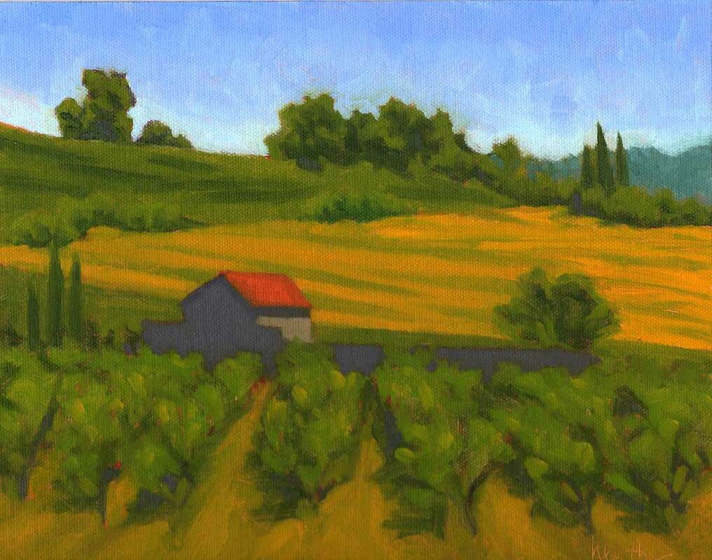 Visan Vineyard - 8"x10" oil on panel - final demo from my plein air workshop in Provence - I've been thinking about the opportunities I'd like to take advantage of this year. What do you want to learn? I’d love to hear about it. 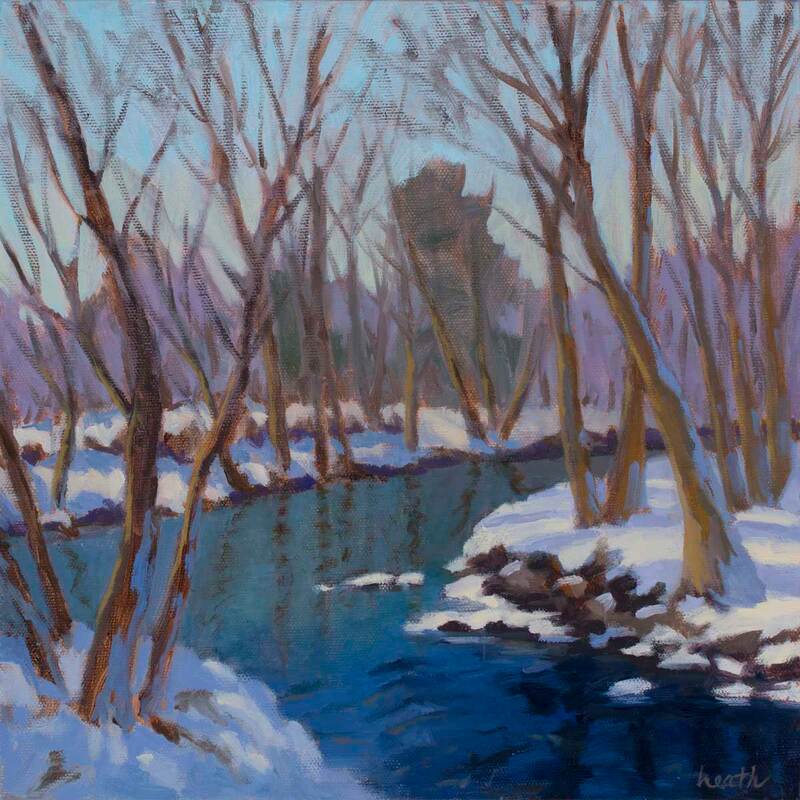 Snow on the River 12"x12" oil on canvas I'm not much of a winter plein air painter, but I do love snow scenes. What intrigues me is all the different colors of snow. Yes, there's some white, but there is sooo much else. The starting point for Snow on the River was a photo I took in Fairfield, CT. I used it as a framework to explore shades of blue and purple. 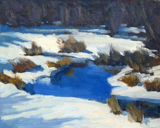 Icy Brook 8"x10" oil on canvas panel Icy Brook was also painted from a photo, taken with some risk since the bridge over the brook was pretty icy, and I had to dodge the cars driving by. Below I've included the photo, so you can see that it was really only a jumping off point for the composition, the colors and positioning of the grasses and shadows are all mine. 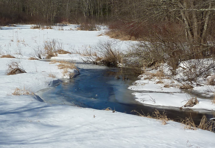 Icy Brook Photo I did have an opportunity to paint snow from life at our previous house. We had a bit of lawn behind the house and then some nice trees. The french doors and the screened porch both gave me a sheltered location to paint from. 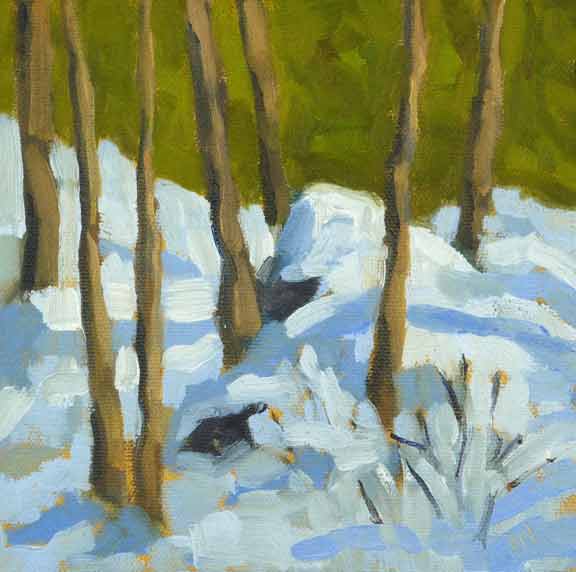 Backyard Snow 6"x6" oil on canvas panel I've painted this same backyard snow several times, in oils and in water color. We don't get as much snow here on Buzzards' Bay, but I'm on the lookout for opportunities to paint snow from life in my new neighborhood. 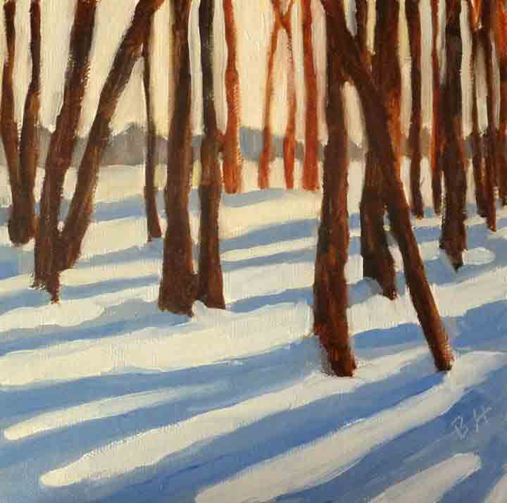 Thomas Point 6"x6" oil on canvas panel Sometimes simple is best, and that's what I found with Thomas Point, a photo taken by my painter friend, Joelle Feldman. It's one of my favorite snow paintings ever.
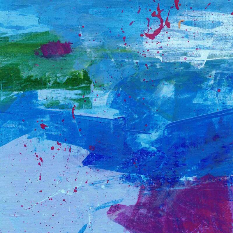 Abstracted Exercise #2 - acrylic on paper My paintings are mostly realistic. They aren’t photorealism, because they don't look like photos. They're just a little abstracted, in the sense that I simplify. I’d love to get some other kinds of abstraction into my paintings, and I’d also like to learn to paint with acrylics. To these ends I’ve been taking an interesting painting course online with British artist, Louise Fletcher. And I’ve made a lot of progress with acrylics. It’s great to be able to use them indoors without having to worry about the ventilation that is needed for oil paints. 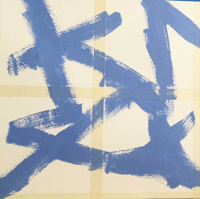 First Step in Creating 4 Abstract Exercises (note the masking tape) 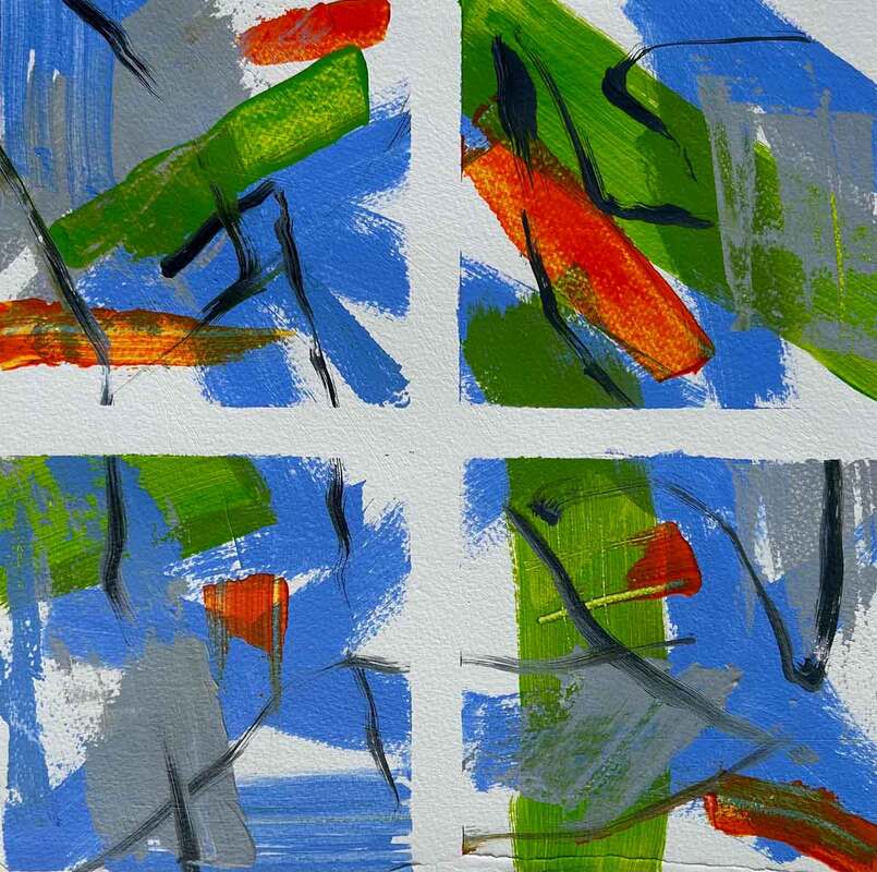 Completed Exercises (note the tape has been removed) In order to learn different ways of abstracting I decided to take the class as if I was an abstract painter. The paintings here are some of the results. 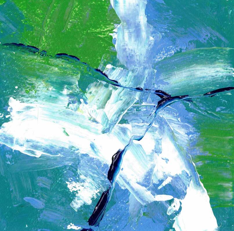 Abstract Exercise #3 - acrylic on paper I've enjoyed using different tools to make marks, not just brushes and knives. I tried an old credit card, a crumpled tissue, and a Princeton Catalyst wedge, among other things. And I loved removing paint by scratching and scraping. 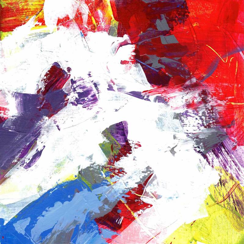 Abstract Exercise #4 - acrylic on paper It’s also fun to hear things that you have a lot of experience with from a completely different perspective. For me this was values, color, and composition. There is always more to learn! My next step is to experiment with these techniques and approaches in my landscape paintings. Once I’ve understood that, I can move on to abstracted boats.
 Cozy Harbor Inlet, 11"x14" oil on canvas panel Have you ever wondered what makes a painting good? And I’m not talking about whether you like the painting or not, because that may be more about your connection with the subject than the quality of the work. If the subject means something to you, you're more likely to love the painting. But what if you want to make sure that it really is a quality painting before you buy it, or if you’re painting it, before you declare it finished?
On the left, a neutral dark knife painting, on the right a light bright boat painting, hopefully both with solid compositions There are lots of aspects to a painting: the subject matter, the color scheme, abstract versus realistic, the overall lightness or darkness (which affects the mood of the work), the level of detail, the medium, the type of paint application (for oil and acrylic, think brush versus knife), etc. All of these things are about style.
Cozy Harbor Inlet - underpainting and finished painting But what about quality? To my mind the most important thing a good painting has is a strong composition, and that composition is made up of two things: drawing and values. The drawing delineates the edges of shapes. And the value of each shape and how they fit together make up the composition. You could also call it the design. You might like one color scheme over another, but if you see two paintings with the same subject and color scheme, and one has a stronger composition, I’ll bet you’ll like that one better.
Seal Bay Ccmplements, thumbnail and 5"x7" oil on gessobord So how does an artist create a solid composition? It’s easiest to do that at the start, on a piece of paper, in monochrome. It's called a thumbnail, and is almost always a lot smaller then the intended painting. Most good paintings that are not abstract are started this way. Abstract paintings can be as well, or the composition can come about organically during the process. But the composition still needs to be strong for the painting to be appealing.
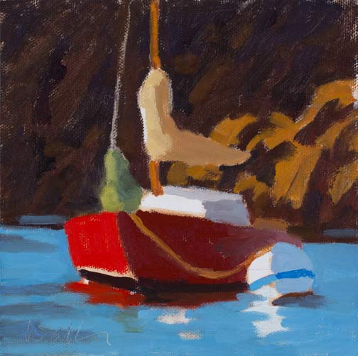
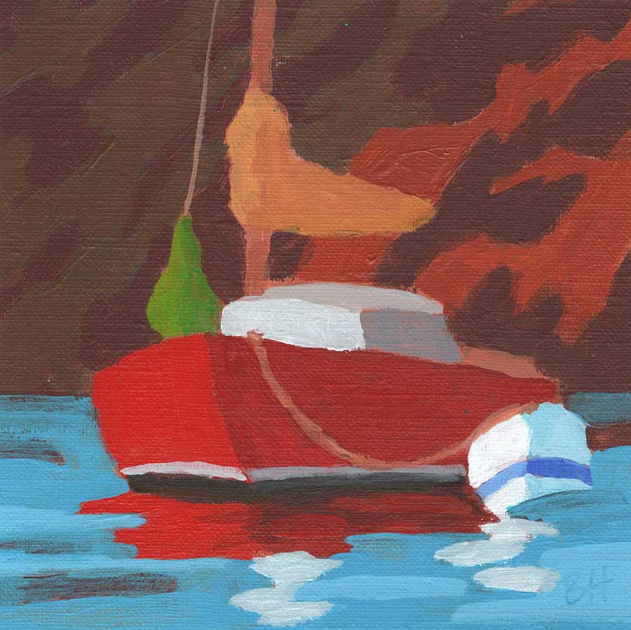
Pears in Blue - 6"x6" oil on canvas board, note the pink underpainting A surefire way to make sure that the original composition doesn’t get lost as color and detail are added to the work, is to create a value underpainting on the canvas first. This is basically a value map. Traditionally these were called grisailles, gris is gray in French, since they were often done in gray tones for engravings. Today painters create grisailles in different colors, some very bright. Little bits of the grisaille often show through, giving a bit of pizzaz.  Apples in monochrome with dabs of paint to make sure the values of the color layer are correct It can be hard to create the intended value once you start to mix paint for the colors you want to use in your painting. The value roadmap is super helpful for this. Once you think you have the color mixed to the right value, you can put a spot of it on top of the underpainted canvas. Then squint. When you squint, you loose the color in your vision. If the color dab is too dark or light you’ll be able to see it and you can adjust your mixture and try it again (see above). It’s also a lot harder to loose your drawing, when it is actually a value map of shapes rather than lines. The value underpainting, value map, or grisaille is a wonderful tool for the painter. 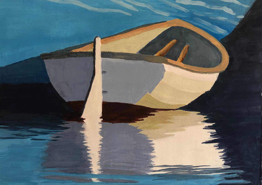 Lapstrake Dinghy - 5"x7" gouache on paper Every once in a while, you're bound to come across something that fascinates you. For me it was a beautiful lapstrake (or clinker built) dinghy tied to a sailboat that was on the mooring next to us in Bucks Harbor. I love this beautiful and well protected spot on the western end of Eggemoggin Reach in Penobscot Bay, in Maine. I took lots of pictures, because in a situation like this, you never know how long the light will be good. Or when someone will come along and hop into the dinghy and row away. Or the sailboat will simply drop the mooring and head out. I tried to be discrete, and hopefully the owners didn’t see me lusting after their dinghy. But I totally was.
Two drawings with felt tip pens in 4 values When we got home, I made some drawings from the different viewpoints that I found in my photos. These were freehand, first with pencil and then over that with felt tip pens and ink. Such an enjoyable way to spend an evening! I even made a drawing using various cross-hatching techniques on fancy blue paper from Ruscombe Paper Mill. Thanks to Rob Adams both for the cross-hatch lesson and introducing me to this lovely paper.
More drawings, including pen and ink on blue paper ~ 5"x7" Then I began to paint. The gouache painting came first. It was kind of a “let’s try this out, it will be fun” exercise. I decided to paint the sailboat to which the dinghy was tied a nice blue. Yesterday, I found this painting when looking through some canvas panels. I thought I’d lost it in our move, and was very happy to find it again. Gouache is an interesting medium. It feels a lot like oil paint during the painting process, despite being water based. But it does need glass when put into a frame. 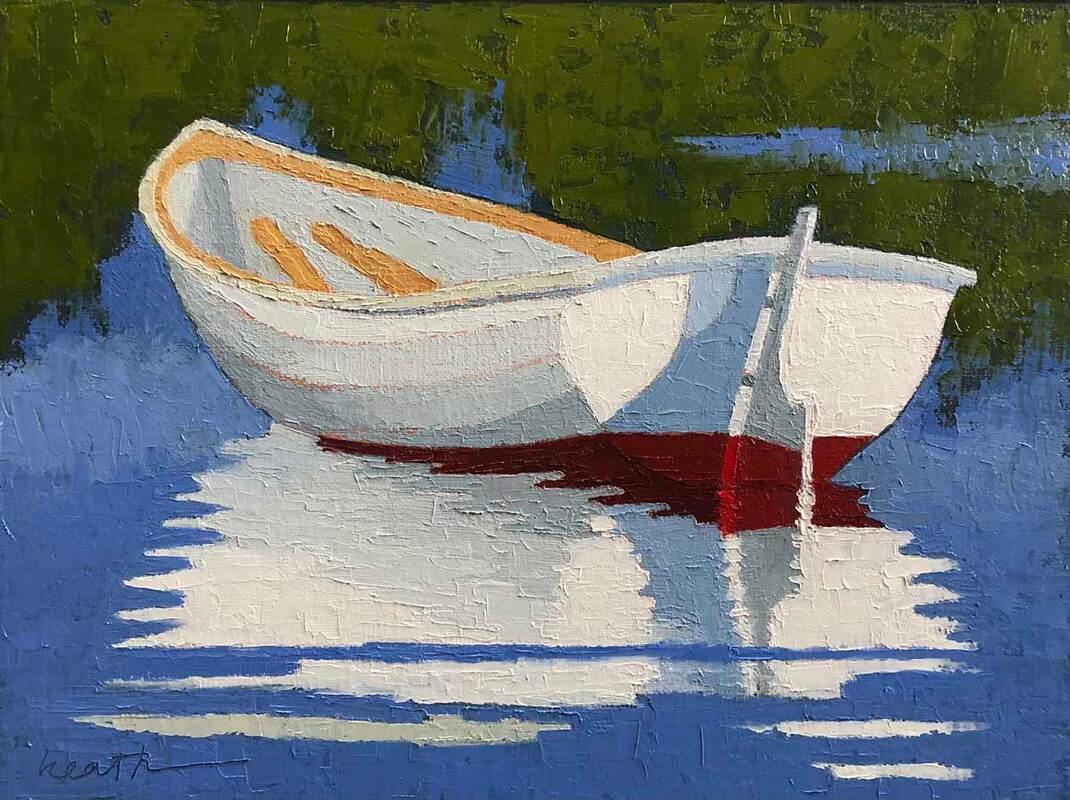 Lapstrake Dinghy - 9"x12" oil on linen panel with knife Next was a larger oil, painted with a knife. I used one of my other photos for reference this time, and left out the sailboat altogether. I was eager to try the reflection with a knife. I like the texture of the knife and the ease of changing color. All I have to do is wipe it off, no brushes to wash. I don’t use an easel when painting with a knife, but lay the painting flat in a jig, either on my lap or on a table. This allows me to turn the painting around so the knife can spread in whichever direction I need. 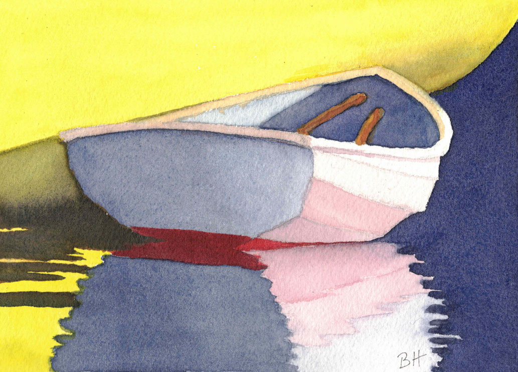 Lapstrake Dinghy - 5"x7" watercolor on paper Next was a watercolor version, where I left out the rudder for a more simplified version. I also changed the color of the sailboat again. The bright yellow added a warmth to the panting that I liked. Watercolor is a great medium for something quick, and for an easy cleanup. I also love the way it looks, and using the white of the paper rather than white paint. 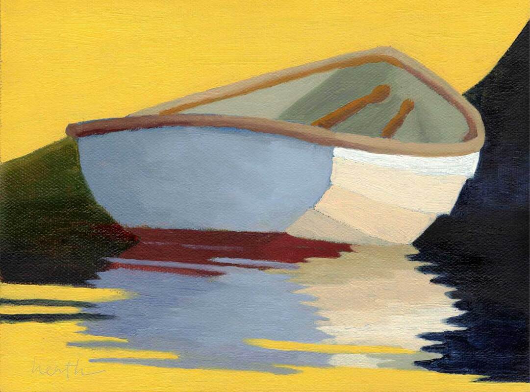 Clinker Built - 6"x8" oil on canvas panel Last fall, I painted Clinker Built, the same view of the dinghy, but in oils with a brush. Once again I used a yellow for the sailboat. I’m not sure that it even matters what the sailboat shape is, or that non-boaters recognize it. But I do think the blocks of yellow really show off the classic lapstrake dinghy.  The Blue Sailboat's Dinghy - 16"x20" oil on linen panel Finally, this spring, I decided to go big, 16"x20", four times the area of the previous version. The dinghy got a blue boat again and her rudder cam back. She continues to fascinate me!
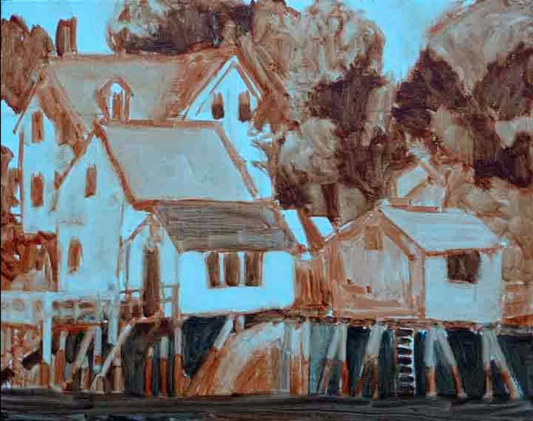
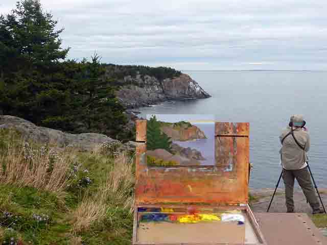
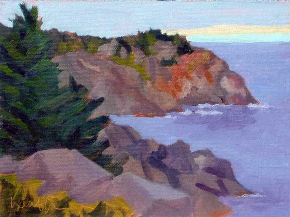
 Downtown Monhegan, 8"x10" oil on canvas panel I don’t have a good count of the number of islands in Maine you can visit by ferry (no bridge). There are quite a few in Portland Harbor, and many more as you head downeast. Of those, I’ve been to Isleboro, Vinalhaven, North Haven, Swans, Isleford (Little Cranberry), Isle au Haut, and Frenchboro Long Island. Every one was a special treat. One of the most iconic and farthest out, is Monhegan, ten miles off the midcoast Maine shore. It's nicknamed "The Artist's Island", so it's no surprise that I'm a big fan. In the summer, you can visit for a day, or stay a while. 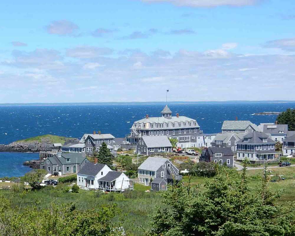 Monhegan Skyline from the Lighthouse "Monhegan" comes from the Algonquian Monchiggon, meaning "out-to-sea island." It was first visited by Europeans in the early 17th century and became a British fishing camp and trading post. The island was caught in the conflict between Britain and France for control of the region, but even during the times when the island was not inhabited, the protected harbor was a stopover for ships. The current lighthouse was built in 1850, after its 25 year old predecessor was damaged by storms. There is a wonderful museum in the Lighthouse Keeper's cottage.  White house, Monhegan - 4"x5" watercolor on paper By 1890 the island was established as an artist's colony, which continues to today. Edward Hopper, Rockwell Kent, and Jamie Wyeth are names you've probably heard. What inspires artists to paint here? The light and the subject matter. Many places that are surrounded by water are wonderful for painters because the light bouncing off the water is everywhere, sparkling and giving life to the shadows. As to subject matter, the island is made up of the village, the harbor, forests, meadows, and the dramatic cliffs on the ocean side facing the Atlantic. There's plenty there to paint, photograph or simply enjoy.
Black Head, Monhegan Eastern Shore - 8"x10" oil on canvas Monhegan is .7 mile wide and 1.7 miles long, and is not developed like the rest of the Maine coast. There are less than 100 year round residents, a working lobster fishing village, and a thriving artist's community. The island has no paved roads and visitors cannot bring cars, but if you are willing to walk, you are in for a treat. Two thirds of the island is protected as a nature preserve by the Monhegan Associates, "an island trust which has accepted the responsibility of holding and maintaining the land in its natural form, for all future generations to enjoy". Seventeen miles of natural trails encircle and crisscross the island, through meadows and forests, onto the headlands, and along the coves and ledges. Birdwatchers, nature lovers, and photographers will all find something to interest them. You'll likely see painters in both the village and on the ocean side cliffs. You can download a trail map of the island, courtesy of the Monhegan Associates, here.
House on Monhegan - 8"x10" oil on canvas My recommendation for a day trip is to take a walk through the village and then visit the lighthouse, where you'll get a fabulous view of the village at your feet and the island of Manana, which makes up the far side of Monhegan's harbor. If you have time, continue past the lighthouse and walk through Cathedral Woods to White Head on the backside. To get a beautiful view of White Head, turn right on the trail and walk to Gull Cove. Alternatively, the walk to Lobster Cove is beautiful, and your rewards is the rocky cove and the remains of the wreck of the D T Sheridan. And FYI, these walks are somewhat rugged.
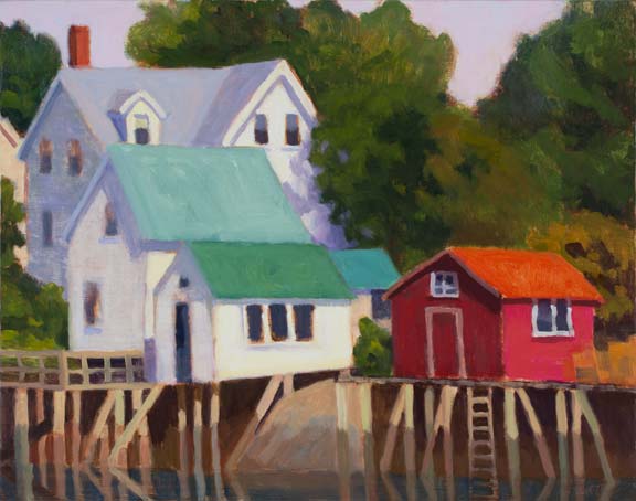
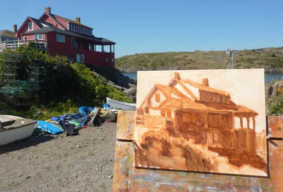
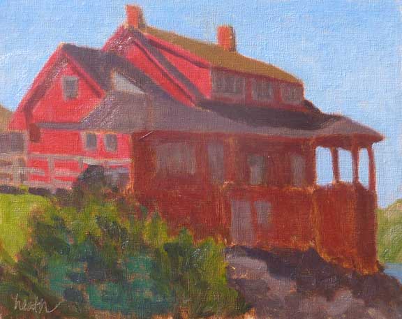
Red House, Monhegan - 8"x10" oil on canvas panel How can you get there? Monhegan is served by ferries from three Maine harbors, from southwest to northeast, BoothBay Harbor (Balmy Days Cruises), great for a day trip, and for a longer stay, Round Pond (Hardy Boat Cruises), and Port Clyde (Monhegan Boat Line). 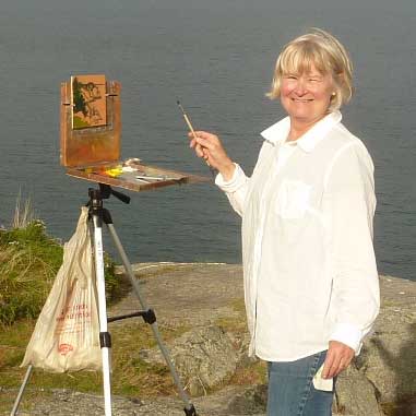 Me, enjoying painting on Monhegan Island Where can you stay? The largest hotels/BnBs are the Island Inn, the Monhegan House (my personal favorite), and the Trailing Yew, each offering an experience unique from the others.
I hope I’ve peaked your interest, and you get to visit Monhegan this year. Fall is a great time to visit. 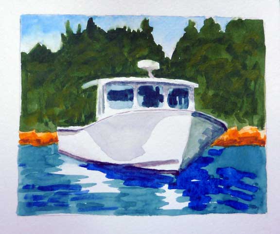 Martha Gayle - Port Clyde - watercolor on paper, in my sketchbook It's almost summer and I'm starting to think about this year's annual cruise down east on our boat. And of course, that reminds me of previous cruises, and the beautiful boats we've seen on our travels. (If you're wondering where down east is, check it out at www.bobbiheath.com/blog/what-does-down-east-really-mean.) 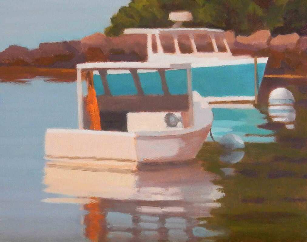 Sleeping In - Southport Island - 10"x12", oil on canvas panel It’s a special treat to be able to do this on your own boat. You get to decide the itinerary, and we like to alternate between quiet nature spots, often on islands, and pretty harbors, often with lobster boats. You know I love those! We also enjoy heading out with friends on other boats or meeting up with them at various times during the cruise. 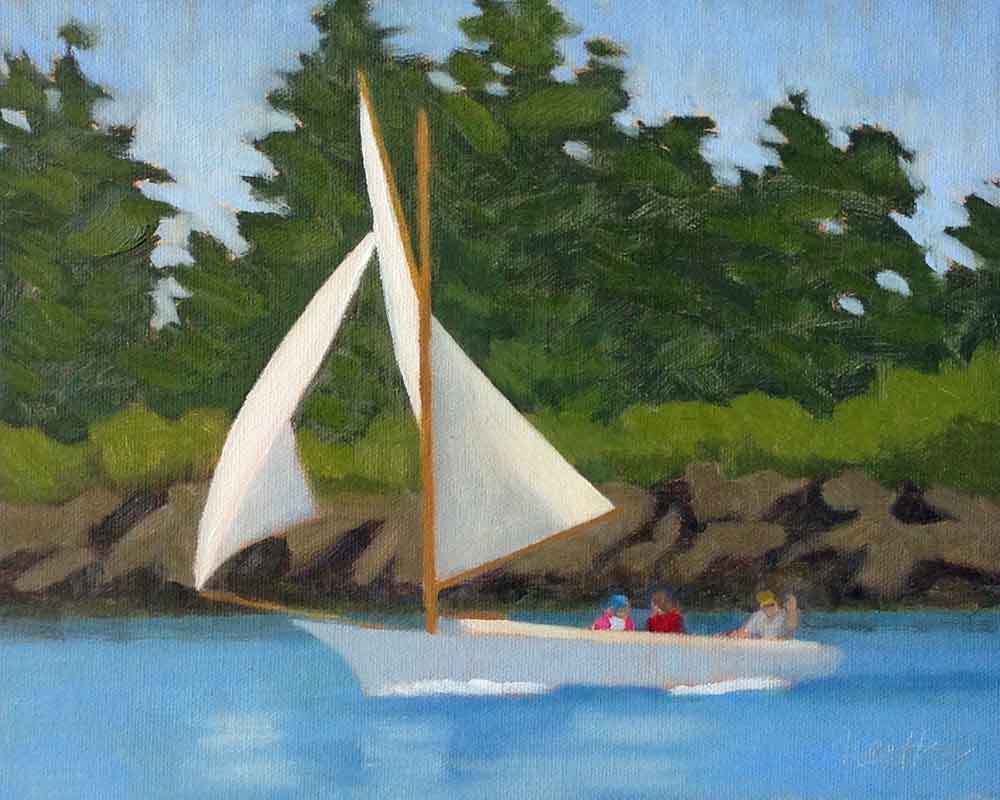 Friendship Sloop - Southwest Harbor - 8"x10", oil on canvas We see lots of boats on this journey, and I focus on them, taking photos, sketching, and painting, usually with watercolor. What catches my eye is color and style. And I prefer to be on the sun side, which sometimes means maneuvering our boat to get there. 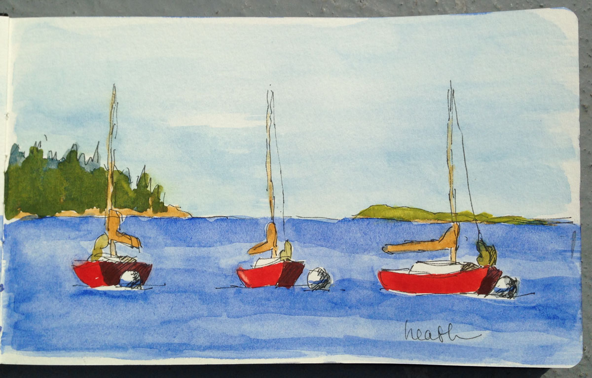 Red Sailboat 3 Times - Boothbay Harbor - watercolor on paper, in my sketchbook I’m particularly attracted to lobster boats. Drawing them is challenging and rewarding. And you get a different view as they move around on their moorings with the wind and the tide. Sailboats are fun too, showing the wind with the angle of their masts and sails. 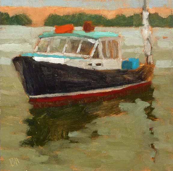 Diligence - Freeport - 6"x6", oil on canvas panel All of this is wonderful reference material for larger paintings in the studio in the months when the boats are no longer in the water.
|
AuthorBobbi - Painter. Sketcher. Teacher. Boat and Dog Lover. Archives
February 2024
|
 RSS Feed