 Nature's Grace - 5"x7" oil on panel, with knife Sometime back the Boston Globe posted an article on how the interior-design world has turned against the color gray. How do you feel about that? Are you done with gray walls? Or maybe done with gray period? We’ve never had gray walls in our house, ours are mostly white or off white to allow for lots of light and flexibility in hanging paintings. 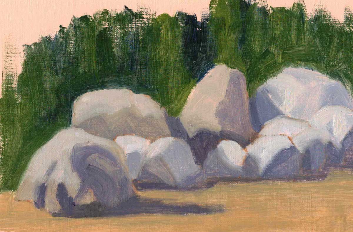 Isle-au-Haut Rocks - 5"x8" oil on treated paper And while I’m glad to see the departure of gray walls, I find the colors of gray useful in painting. I say the colors, because gray comes with lots of variations: blue gray, purple gray, red gray, green gray, etc. Since I paint with a limited palette and no black, my grays often lean towards one or other color. These grays and their neutral brown counterparts are useful in balancing the bright colors that I like to paint with. 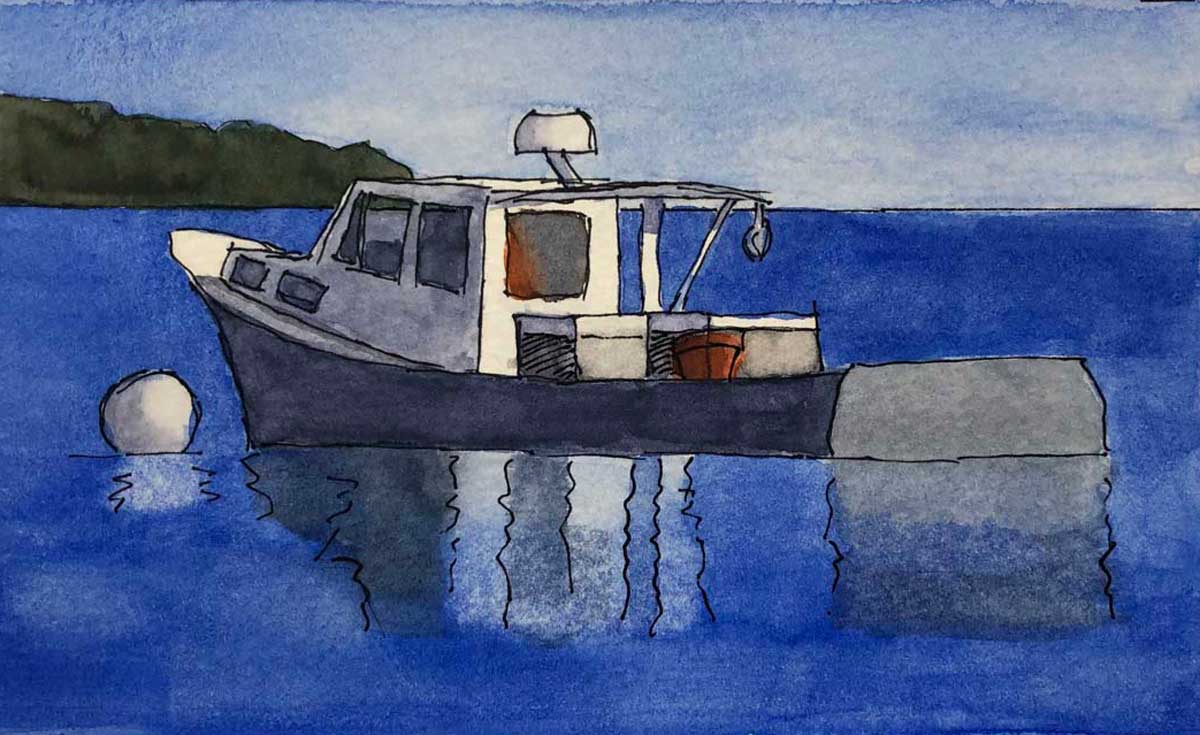 Bucks Harbor Lobster Boat - watercolor on paper ~ 3.5"x5" Sometimes there’s an object in my painting that is well, actually gray. Like this lobster boat that I enjoyed painting from the wheelhouse of our boat when we were moored nearby.  Sittin in the Sun - 4"x5" gouache on paper And often there’s already a lot of color in a painting, so some neutral gray is a good supporting actor while the bright color takes center stage. In Sittin in the Sun, the chair the woman is lounging in gives us that contrast. And note the blue gray of her shadow on the sand. 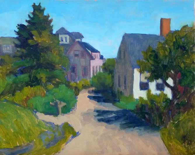 Downtown Monhegan - 8"x10" oil on canvas panel The neutral grays and browns in the buildings in Downtown Monhegan provide a place to rest our eyes from the bright color of the trees, sky, and the sunlit side of the building on the right side of the painting.
I guess what I’m trying to say is that we do need grays in paintings, to offset the story we want to tell in brilliant bold color. But a little goes a long way, and I won’t be painting any walls that color any time soon. Enjoy the color (and the grays) in your life!
0 Comments
Leave a Reply. |
AuthorBobbi - Painter. Sketcher. Teacher. Boat and Dog Lover. Archives
July 2024
|
 RSS Feed