|
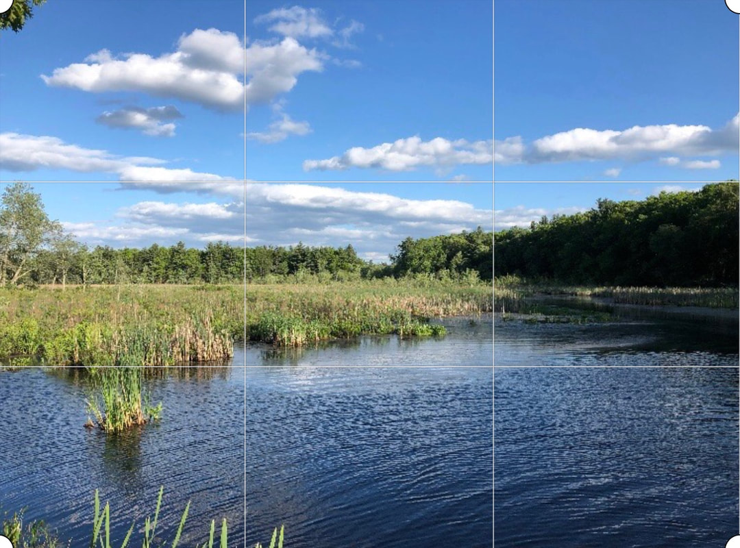
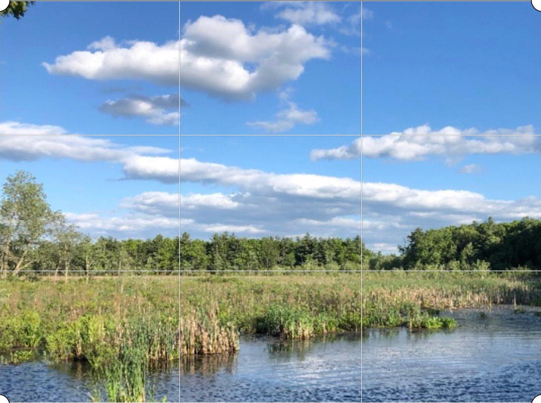
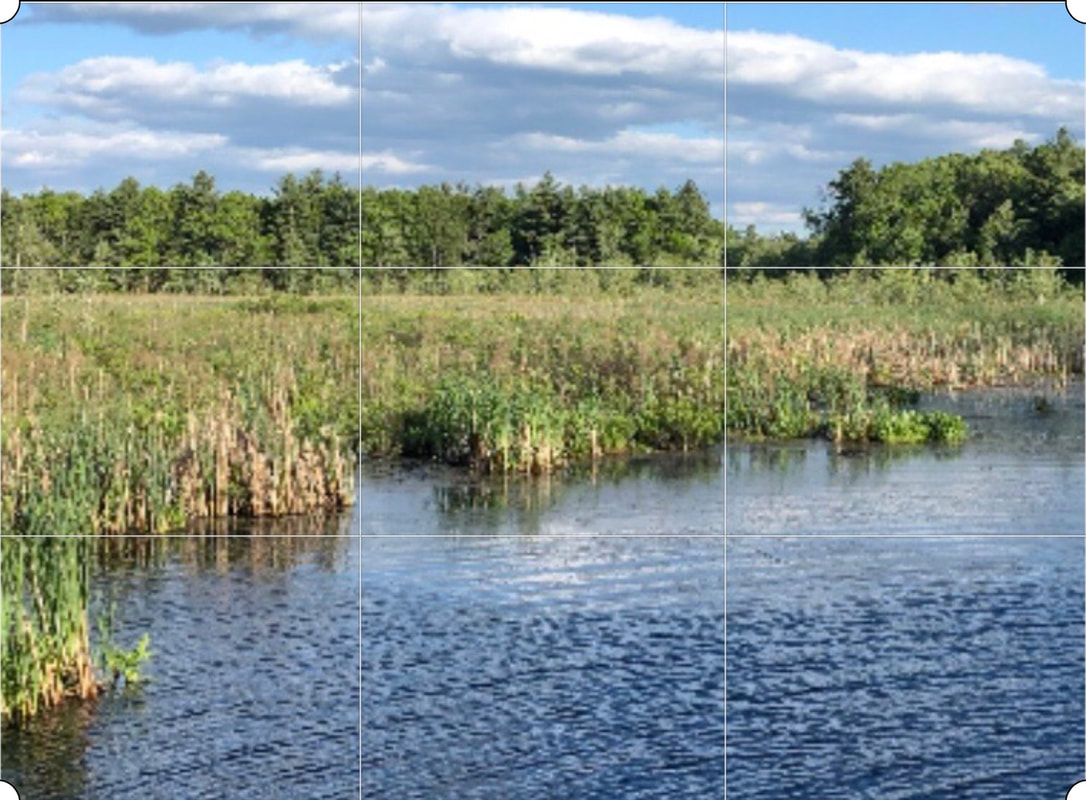
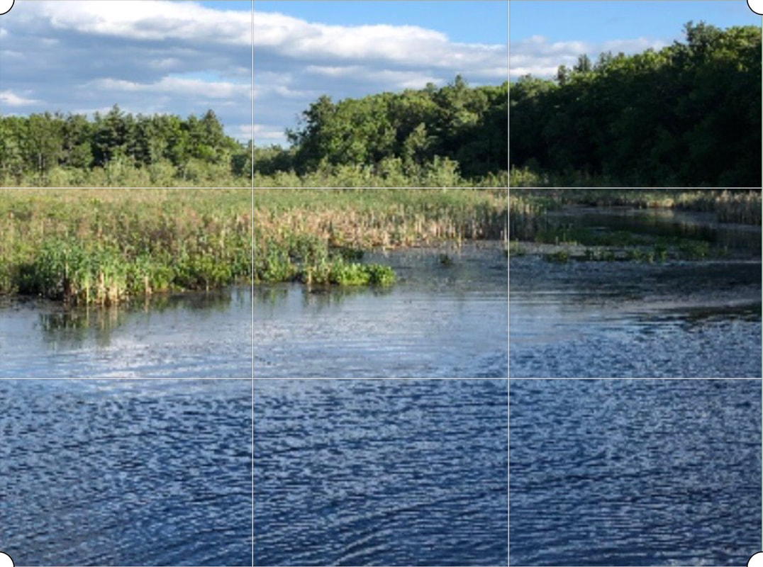
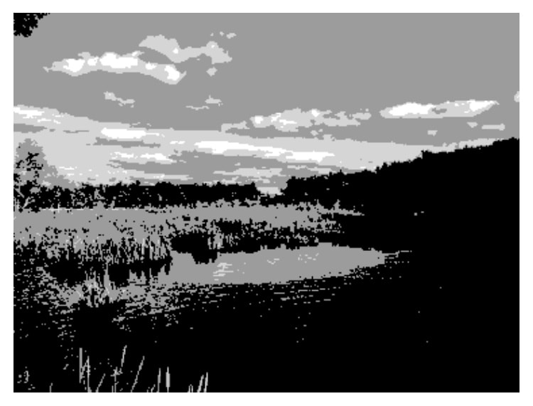
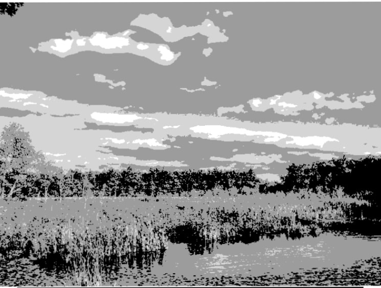
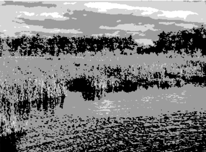
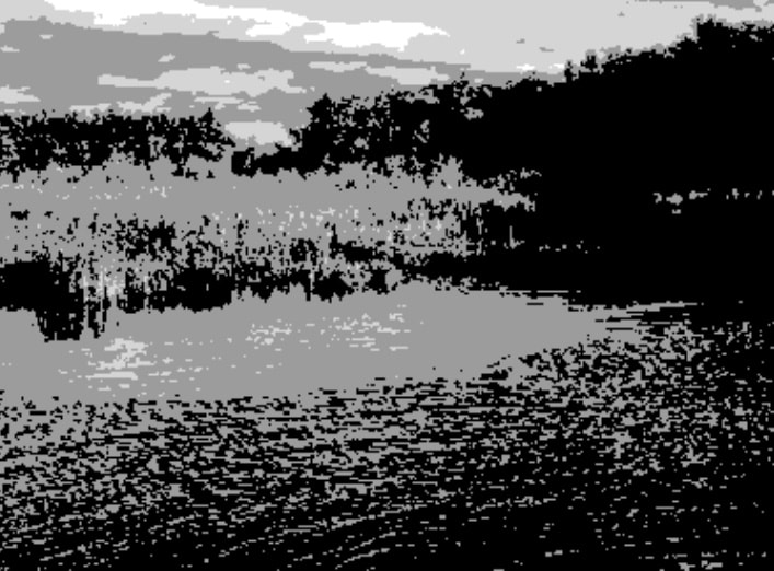
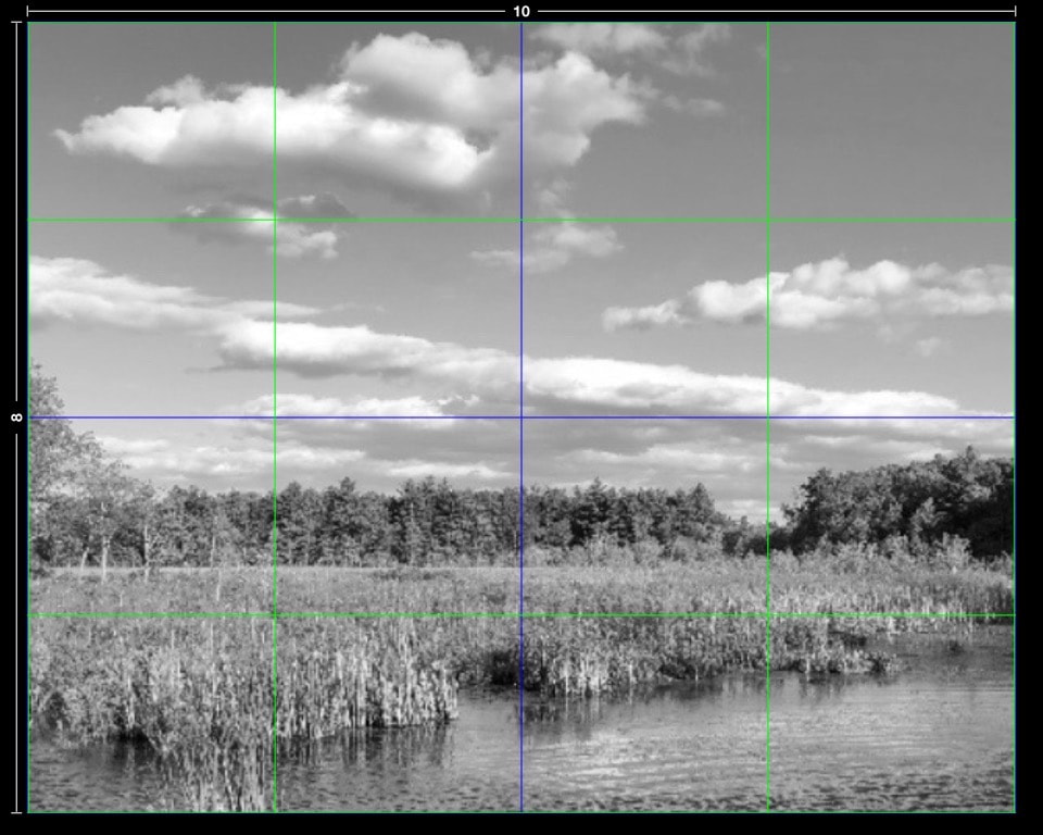
I took this photo with my phone on a beautiful summer afternoon. I'd like to crop it for a painting, and I want a compelling composition. I can see one problem already, the horizon is in the center. When looking at a photo or painting, our brain is attracted to the interlocking abstract shapes. And it is attracted most to assymetry, and irregular spacing. So a painting with half sky is less appealing that one that's mostly sky or mostly not sky. So I'll try cropping the photo to see what those two options look like. I've put a grid on the photo to divide it into thirds horizontally and vertically. A good way to avoid putting things in the center (symmetric = not compelling) is to use the rule of thirds, which says that placing important elements of the design 1/3 away from the edges is the most appealing to our assymetry loving brains. In the above image, I've cropped the photo to put the horizon on the bottom third line, and also placed the gap in the trees on that line where it crosses the right vertical third line. Now we've got a composition that's mostly about the sky. I could have lowered it even more to put the top of the trees at the bottom third line and gotten more of the clouds in the image. In the above image, I've put the horizon on the top third horizontal line. The gap in the trees is still on the top right. Now we've got an an image that's about the marsh. In the above crop, I've moved the gap in the trees to the left, bringing in more of the dark water and foliage. It's actually easier to see the interlocking shapes if we use a black and white image and posterize the values (meaning limit the number). I like to use 4 values. Above, the original photo in black and white, and posterized using the Pixlr app. For instructions, look here. Below are the posterized images of the cropped images above. Using both the photos and the black and white posterized versions, which composition do you find the most compelling? Note: While the rule of thirds grid is very useful in cropping for a good composition, a grid with an even number of columns and rows can be more useful for creating a drawing from the photo. Even making a grid with one vertical and one horizontal line through the middle of the photo will be a great aid to getting the drawing onto your canvas. And turning the gridded photo upside down also helps a lot, because you can no longer see the objects, but are simply drawing shapes. Below is an example for the mostly sky crop above. Note that you can put the grid on the color photo, black and white photo, or the posterized image, whichever is easier for you to use as a reference for the drawing. You can add a grid on your phone or tablet with Grid # on Apple and Artist Grid on Android. For an 8"x10" painting, use the app to make a 4 by 4 grid on your device and then save, or screenshot it and crop, and you are ready to go. You can draw from your device or print out the image with the grid. For larger paintings you may want more grid lines. The apps let you choose the number.
0 Comments
Leave a Reply. |
AuthorBobbi - Painter. Sketcher. Teacher. Boat and Dog Lover. Archives
July 2024
|
 RSS Feed