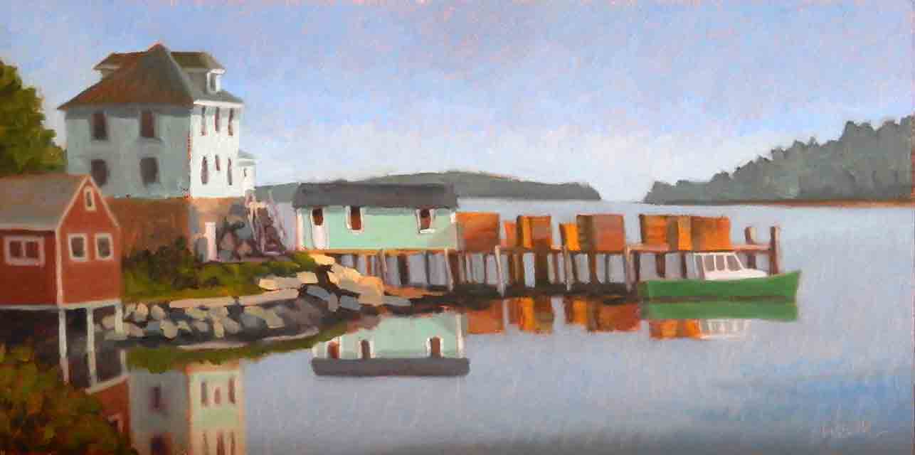
 Stonington Green final 6"x12" oil on canvas board 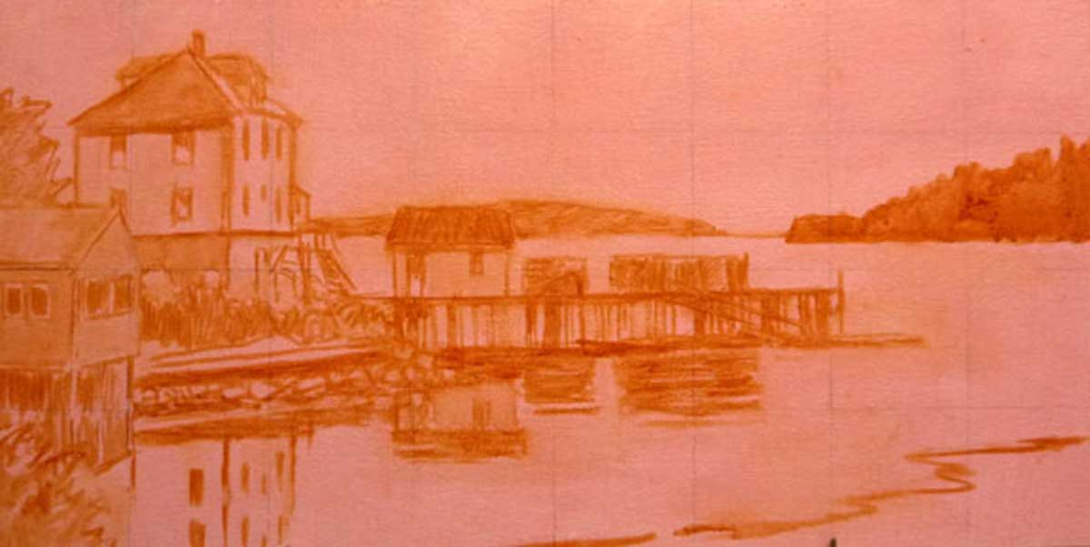 Stonington Green drawing in paint on a toned canvas A splash of color in the landscape grabs your attention, doesn't it? A red barn in the midst of green corn fields, a bright orange boat on blue water, or brightly colored houses by the sea, they are all eye catching. I love finding those splashes of color. And I love including them in my paintings. But there's more to creating color in paintings than what's on the top layer. I often prime my canvas with complementary colors to those that will be predominant in the painting. For example, an orange or red color for landscapes, to complement the blue sky and green foliage. Little bits of this under layer will show through in the final painting, which makes the colors in the top layer pop. I think you can see that in the example of Stonington Green above. 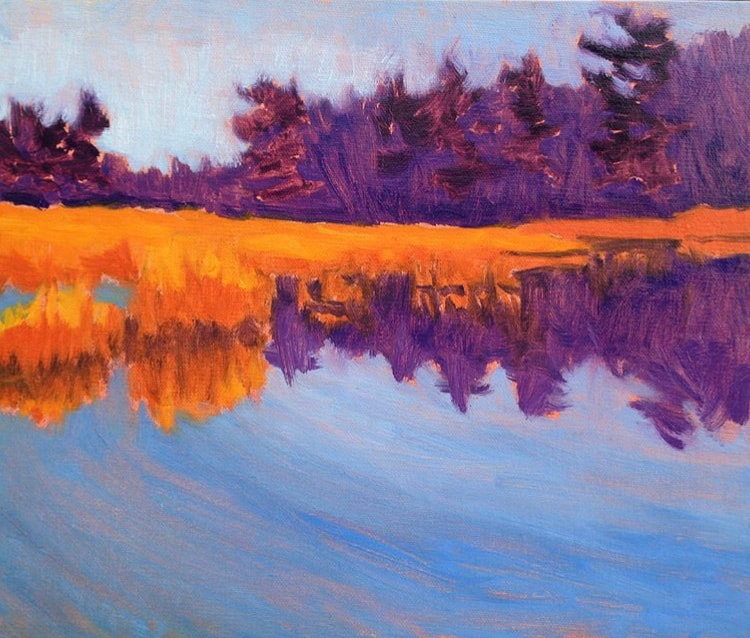 Summer Marsh underpainting 8"x10" oil on linen panel What's even more fun, is to block in the structure of the painting in bright colors as an underpainting. Once again, little bits of this underpainting will show through in the final painting. I used this process on Summer Marsh. The orange, purple and blue version above is the underpainting. 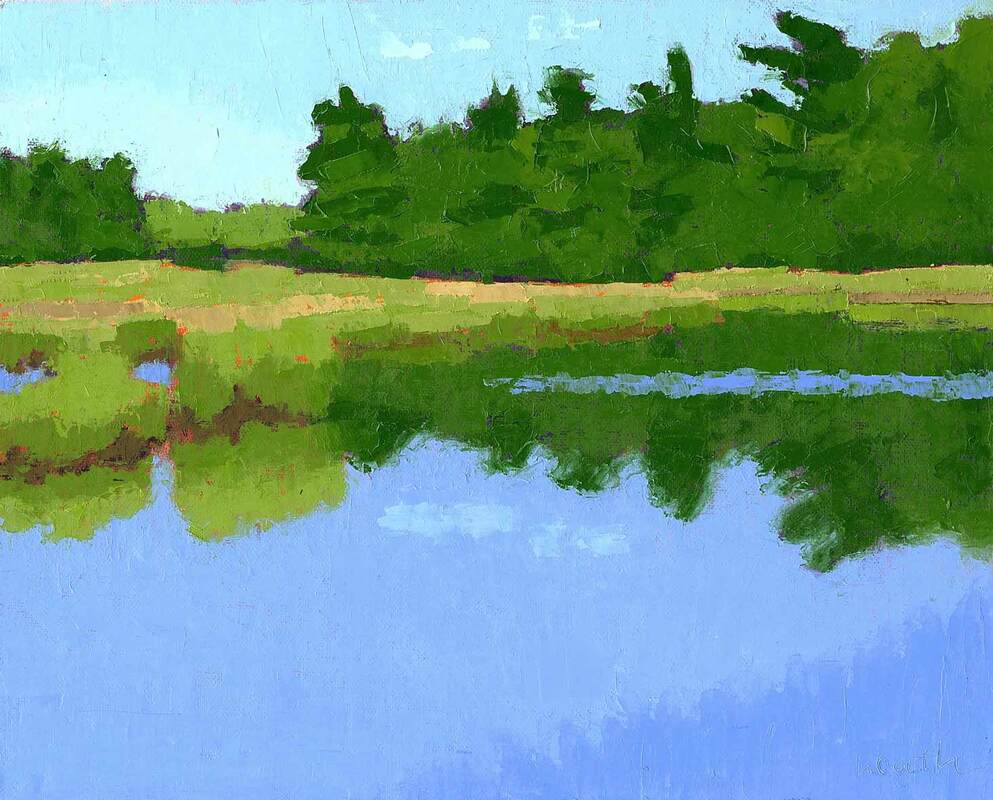 Summer Marsh final 8"x10" oil on linen panel Can you see little bits of the underpainting showing through the final version above? 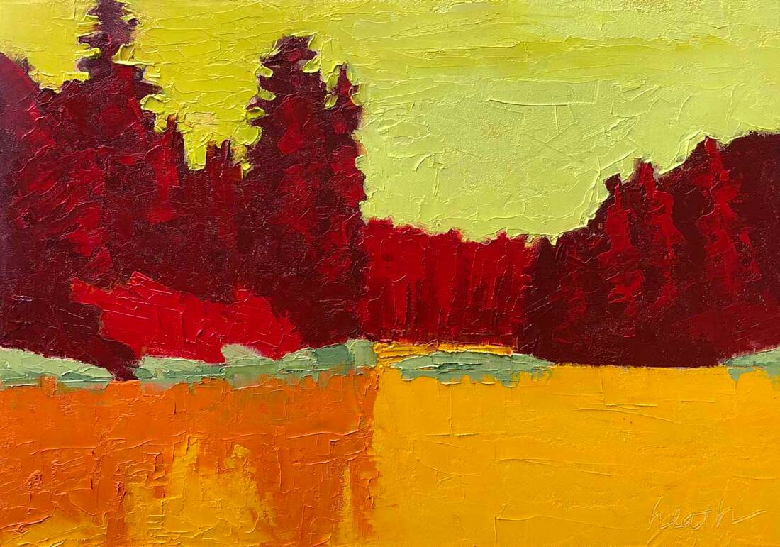 Backdoor to Seal Bay Complements 5"x7" oil on gessobord And sometimes, what starts as an underpainting becomes so interesting, that it stands by itself and becomes the final painting. That's what happened above in this version of Backdoor to Seal Bay, painted with a knife. Crazy color, no?
5 Comments
7/2/2020 05:35:19 am
Thank you, Bobbi for showing examples of your process. I love the loose stokes and the vibrant colors. Your paintings have a beautiful magical quality. Thanks for revealing the alchemy you put into them. 7/2/2020 09:17:15 am
Thank you, Leslie, for your kind words. I might just use them for promotions if you don't mind. :) 7/2/2020 11:41:56 am
I find the under-paintings just as intriguing as the final painting. The vibrant colors really are that much more stunning when paired with the compliment underneath. Thanks for sharing this behind-the-scenes glimpse. 7/2/2020 12:11:48 pm
You're very welcome, Pam. Sometimes I like the underpainting better than the finished version. Bright and cheerful is always welcome! 7/4/2020 07:00:44 am
Wow, Bobbie, Sometimes I like the underpaintings as much as the finished ones. Also, as an artist I love process pictures. Leave a Reply. |
AuthorBobbi - Painter. Sketcher. Teacher. Boat and Dog Lover. Archives
July 2024
|
 RSS Feed