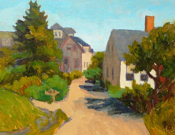
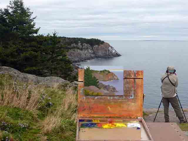
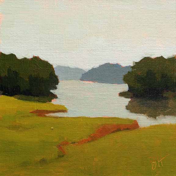
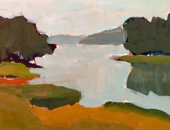
 Downtown Monhegan, 8"x10" oil on canvas panel I don’t have a good count of the number of islands in Maine you can visit by ferry (no bridge). There are quite a few in Portland Harbor, and many more as you head downeast. Of those, I’ve been to Isleboro, Vinalhaven, North Haven, Swans, Isleford (Little Cranberry), Isle au Haut, and Frenchboro Long Island. Every one was a special treat. One of the most iconic and farthest out, is Monhegan, ten miles off the midcoast Maine shore. It's nicknamed "The Artist's Island", so it's no surprise that I'm a big fan. In the summer, you can visit for a day, or stay a while. 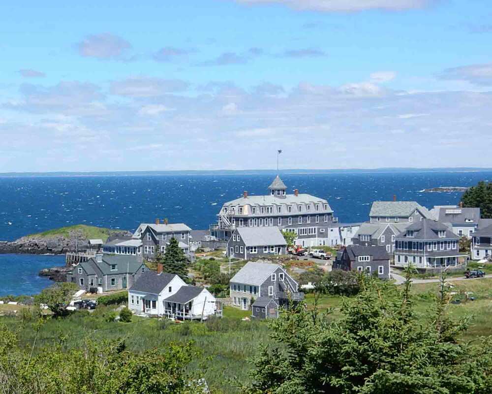 Monhegan Skyline from the Lighthouse "Monhegan" comes from the Algonquian Monchiggon, meaning "out-to-sea island." It was first visited by Europeans in the early 17th century and became a British fishing camp and trading post. The island was caught in the conflict between Britain and France for control of the region, but even during the times when the island was not inhabited, the protected harbor was a stopover for ships. The current lighthouse was built in 1850, after its 25 year old predecessor was damaged by storms. There is a wonderful museum in the Lighthouse Keeper's cottage. 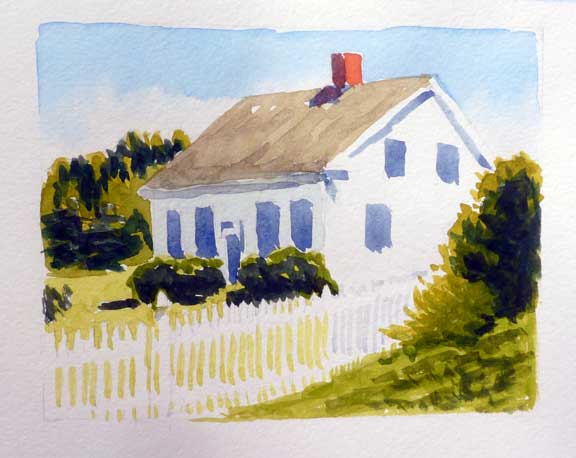 White house, Monhegan - 4"x5" watercolor on paper By 1890 the island was established as an artist's colony, which continues to today. Edward Hopper, Rockwell Kent, and Jamie Wyeth are names you've probably heard. What inspires artists to paint here? The light and the subject matter. Many places that are surrounded by water are wonderful for painters because the light bouncing off the water is everywhere, sparkling and giving life to the shadows. As to subject matter, the island is made up of the village, the harbor, forests, meadows, and the dramatic cliffs on the ocean side facing the Atlantic. There's plenty there to paint, photograph or simply enjoy.
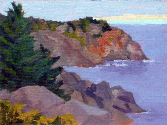
Black Head, Monhegan Eastern Shore - 8"x10" oil on canvas Monhegan is .7 mile wide and 1.7 miles long, and is not developed like the rest of the Maine coast. There are less than 100 year round residents, a working lobster fishing village, and a thriving artist's community. The island has no paved roads and visitors cannot bring cars, but if you are willing to walk, you are in for a treat. Two thirds of the island is protected as a nature preserve by the Monhegan Associates, "an island trust which has accepted the responsibility of holding and maintaining the land in its natural form, for all future generations to enjoy". Seventeen miles of natural trails encircle and crisscross the island, through meadows and forests, onto the headlands, and along the coves and ledges. Birdwatchers, nature lovers, and photographers will all find something to interest them. You'll likely see painters in both the village and on the ocean side cliffs. You can download a trail map of the island, courtesy of the Monhegan Associates, here.
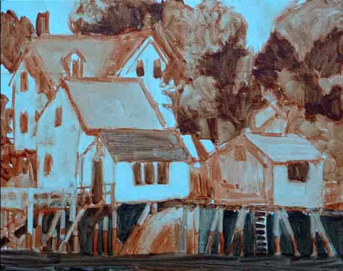
House on Monhegan - 8"x10" oil on canvas My recommendation for a day trip is to take a walk through the village and then visit the lighthouse, where you'll get a fabulous view of the village at your feet and the island of Manana, which makes up the far side of Monhegan's harbor. If you have time, continue past the lighthouse and walk through Cathedral Woods to White Head on the backside. To get a beautiful view of White Head, turn right on the trail and walk to Gull Cove. Alternatively, the walk to Lobster Cove is beautiful, and your rewards is the rocky cove and the remains of the wreck of the D T Sheridan. And FYI, these walks are somewhat rugged.
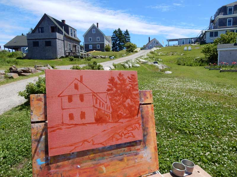
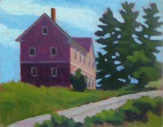
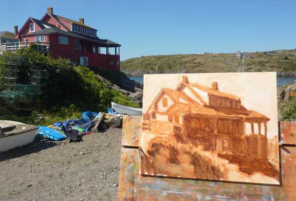
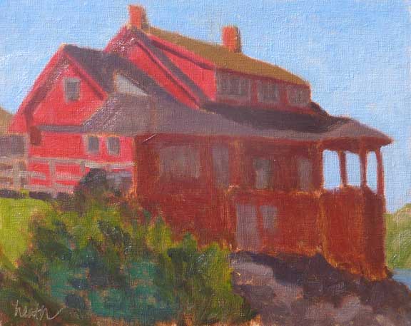
Red House, Monhegan - 8"x10" oil on canvas panel How can you get there? Monhegan is served by ferries from three Maine harbors, from southwest to northeast, BoothBay Harbor (Balmy Days Cruises), great for a day trip, and for a longer stay, Round Pond (Hardy Boat Cruises), and Port Clyde (Monhegan Boat Line). 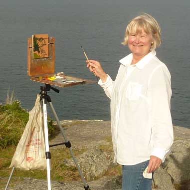 Me, enjoying painting on Monhegan Island Where can you stay? The largest hotels/BnBs are the Island Inn, the Monhegan House (my personal favorite), and the Trailing Yew, each offering an experience unique from the others.
I hope I’ve peaked your interest, and you get to visit Monhegan this year. Fall is a great time to visit.
0 Comments
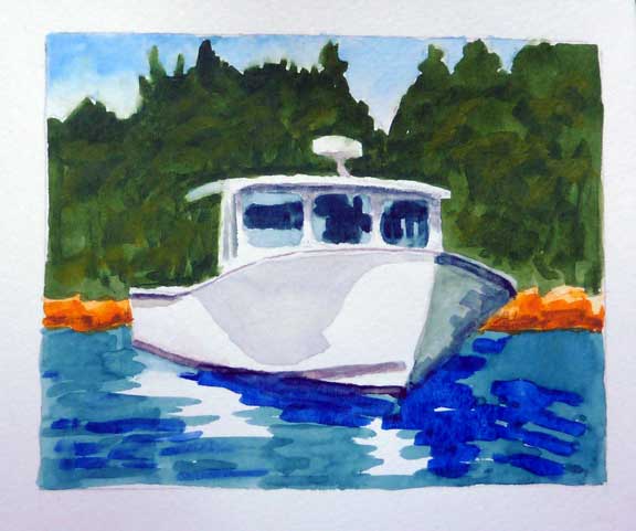 Martha Gayle - Port Clyde - watercolor on paper, in my sketchbook It's almost summer and I'm starting to think about this year's annual cruise down east on our boat. And of course, that reminds me of previous cruises, and the beautiful boats we've seen on our travels. (If you're wondering where down east is, check it out at www.bobbiheath.com/blog/what-does-down-east-really-mean.) 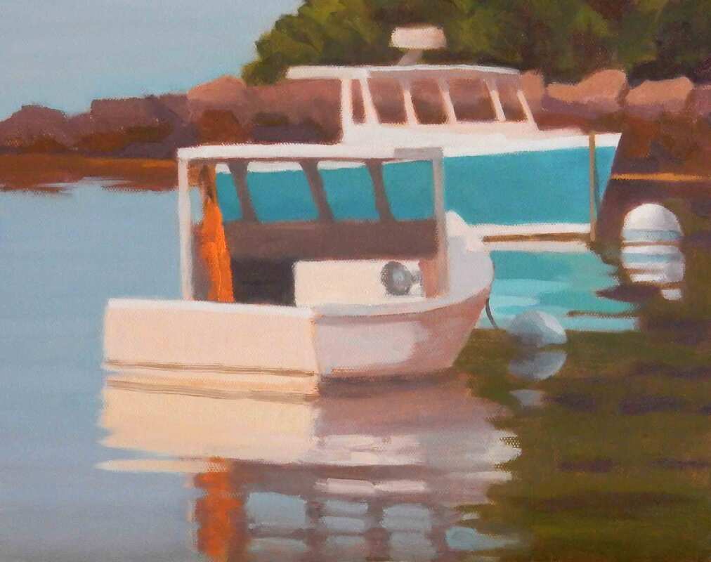 Sleeping In - Southport Island - 10"x12", oil on canvas panel It’s a special treat to be able to do this on your own boat. You get to decide the itinerary, and we like to alternate between quiet nature spots, often on islands, and pretty harbors, often with lobster boats. You know I love those! We also enjoy heading out with friends on other boats or meeting up with them at various times during the cruise. 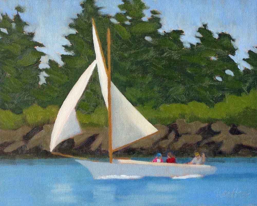 Friendship Sloop - Southwest Harbor - 8"x10", oil on canvas We see lots of boats on this journey, and I focus on them, taking photos, sketching, and painting, usually with watercolor. What catches my eye is color and style. And I prefer to be on the sun side, which sometimes means maneuvering our boat to get there. 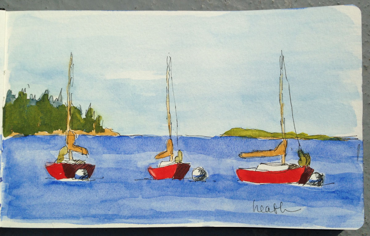 Red Sailboat 3 Times - Boothbay Harbor - watercolor on paper, in my sketchbook I’m particularly attracted to lobster boats. Drawing them is challenging and rewarding. And you get a different view as they move around on their moorings with the wind and the tide. Sailboats are fun too, showing the wind with the angle of their masts and sails. 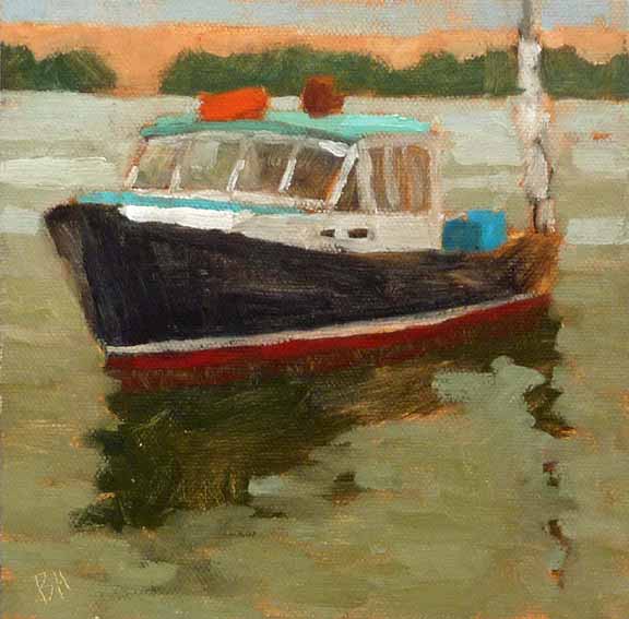 Diligence - Freeport - 6"x6", oil on canvas panel All of this is wonderful reference material for larger paintings in the studio in the months when the boats are no longer in the water.
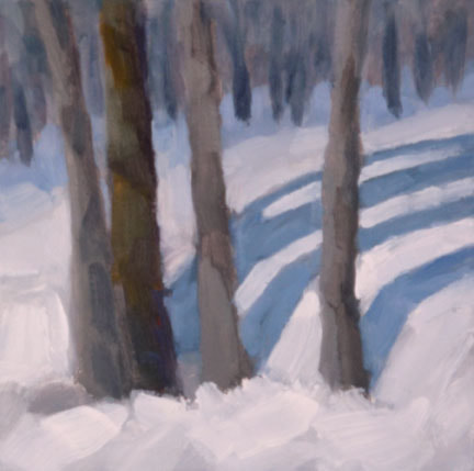
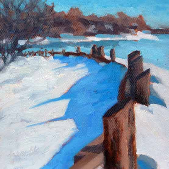
Two paintings of snow, both using the same color scheme, of blue, white, and a dark. The painting with four trees uses neutrals and the painting with the fence uses bright colors. Before my latest painting class, I asked my students to let me know what they were currently having the most trouble with. I was pleased to see that values and mixing colors were low on their lists, because that meant that my lessons on those subjects had hit home. Most of them told me that their biggest problem at the moment was simply deciding what colors to use.
The overcast sky in the first painting limits the saturation, while the sunshine in the other painting means the colors are brighter. Of course, one answer is to literally match the colors that you see before you in the scene, and many painters work hard to do that. But it’s interesting and fun to use nature as a starting point, and make your color choices part of your painting style. One painter who did this very successfully was Alfred (Chip) Chadbourn. He often predominantly used the secondary colors (orange, green, and purple) in his paintings. Google "alfred chardbourn paintings images" to see what I mean.
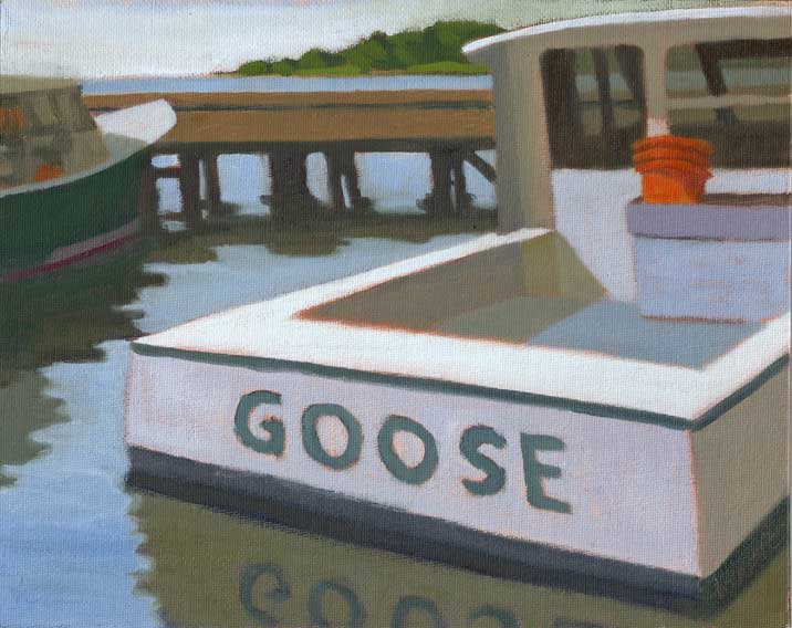
Above, I deliberately was going for bright colors in Ruby, and for neutrals (except for the buckets) in Goose.
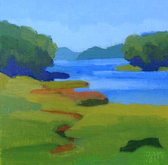
Once again, the bleak sky in the first painting calls for neutral colors, while the sunshine in the second is asking for bight saturated colors. As a part of a color scheme, we needed to look into another characteristic of color, which is saturation. Saturation is the brightness of the color, brighter is more saturated, and as the color becomes less saturated we call it a neutral. In most paintings there will be some more saturated and some more neutral colors, depending on the mood and conditions that are being portrayed. For our lesson we created two paintings of the same subject, one where we used very saturated colors, and another where we used neutral colors. I think it was the most popular lesson in the 6 week session. Do you have a preference for bright colors or for neutrals? My students were surprised how much they liked the neutral paintings that they created. I myself, as you will have probably guessed, love bright saturated color.  Picnic Island - 6"x8" oil on canvas You may never have heard the term "Oxford comma", but you've likely seen it many times. It's the second comma in the phrase "red, white, and blue". Also called the serial comma, whether to use it is a matter of personal preference. Google can fill you in on the pros and cons. Recently overhearing a conversation about the comma, I started thinking about similarly controversial topics in painting, of which I'm sure there are many!  Before Sunrise - 7"x5" oil on linen panel The topic I came up with for today is whether to include black paint on your palette, or to mix your blacks from other colors. Once again, this is a matter of personal preference. Those on the pro side include the Tonalists, who use black to limit chroma, even in their skies. I used that approach in the example above years ago in a class taught by Deborah Paris.  Little Whaleboat Island - 5"x10" oil on canvas board Black is also commonly used with various yellows to make greens. The painting at the top of this email and the one above this paragraph were painted using black and cadmium yellow medium to create the greens. It works really well. Of course there is more than one black paint on the market. The most common are Mars black, Lamp black, and Ivory black. Mars black is made from iron oxide, Lamp and Ivory black are made from carbon. The later are somewhat transparent and slow drying, the former is opaque. For more information look here. I've read comments online as to which of these blacks is more warm or cool, but it sounds like the variations between the manufacturers may swamp this distinction. The bottom line is you'll have to try them for yourself. 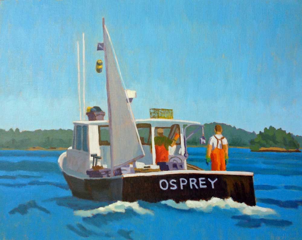 The Sternman - 16"x20" oil on canvas panel No black paint was used in this painting. On the con side, black paint is said to dull or kill whatever it's mixed with. Mixing your black and dark colors alleviates this problem. Some popular combinations are burnt sienna or burnt umber with ultramarine blue and alizarin crimson with viridian. If you're willing to mix three colors, there are many possibilities. Personally I like transparency in my darkest darks, so burnt sienna and ultramarine blue work well, and can be mixed to a strong black. And I use ultramarine blue and cadmium red medium with differing small amounts of cadmium yellow medium when I want to steer the mix towards dark purple (minimal cad yellow), dark red, dark blue, dark green, or dark brown.
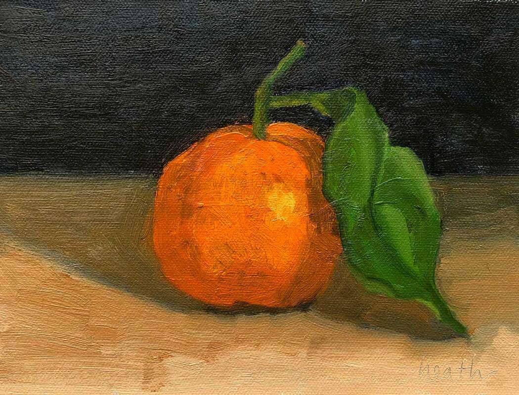 Satsuma With Leaf - 6"x8" oil on canvas panel What’s hanging on your kitchen walls? We’ve got three paintings in our kitchen at the moment. One is a still life of strawberries, one a cognac bottle with glasses and the other a floral. All of them are painted by my friends, some of whom were my teachers.  Dinnah - 10"x10" oil on canvas panel Does kitchen art have to be food themed? Not necessarily. But fruit and vegetables, as well as dishes and dishcloths, are common items used in still life paintings. I enjoy painting still life in the winter, because I can paint from life without going outside. Painting from life is my favorite way to paint. There’s nothing like transferring what you see directly to paint! 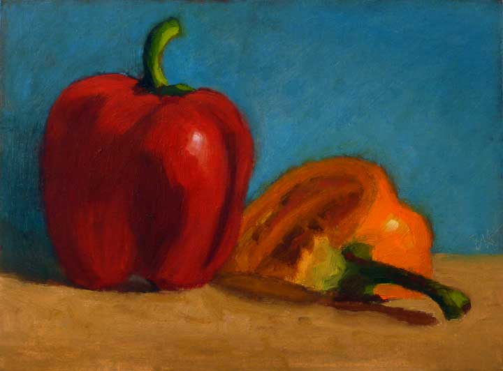 Peppers - 6"x8" oil on treated card Still life is also a great way to improve one’s painting. I spent some years painting still life subjects several mornings a week. That’s when I really learned how to paint. I used to set up a still life on top of a cooler sitting on the bed in our guest room. Then I set up my plein air box on a tripod next to it, and did my best to complete a painting before I went to work. 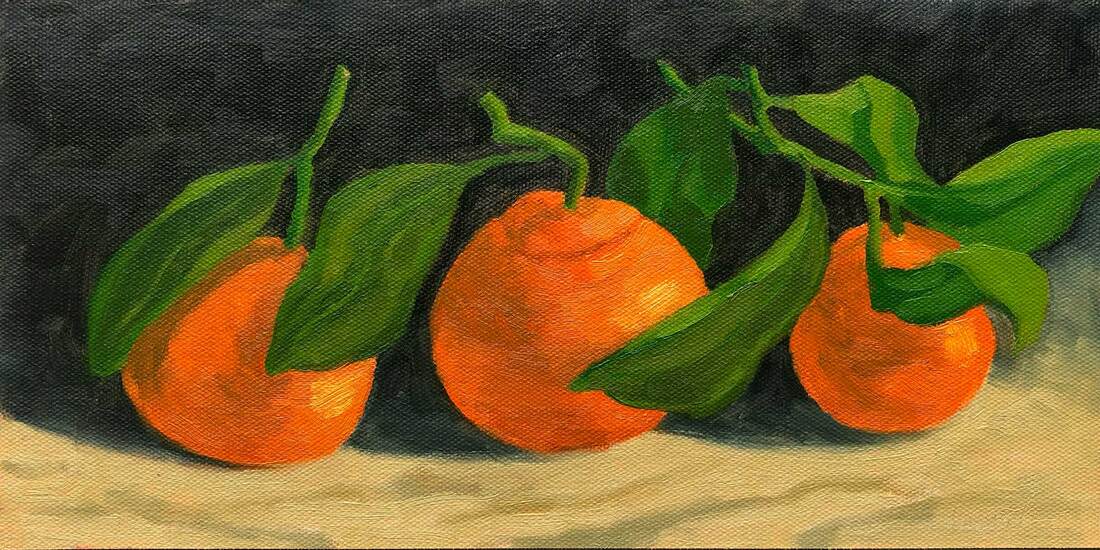 Three Satsumas - oil on canvas panel, 6"x12" I know, I’m a morning person, but there are many artists who’ve done the same thing, painting at night. It’s creating a painting from start to finish, in an hour or two, over and over, that imprints the process on the mind and creates muscle memory.
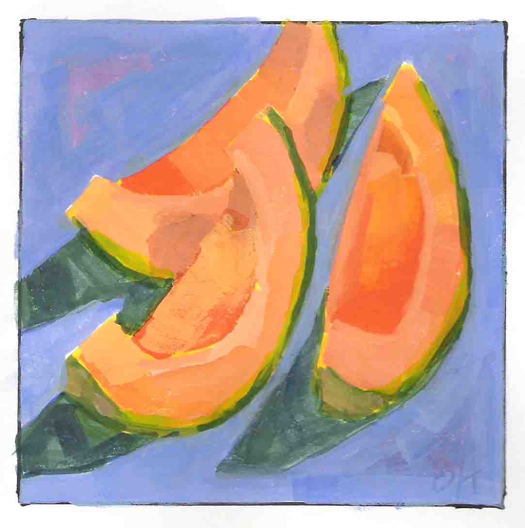
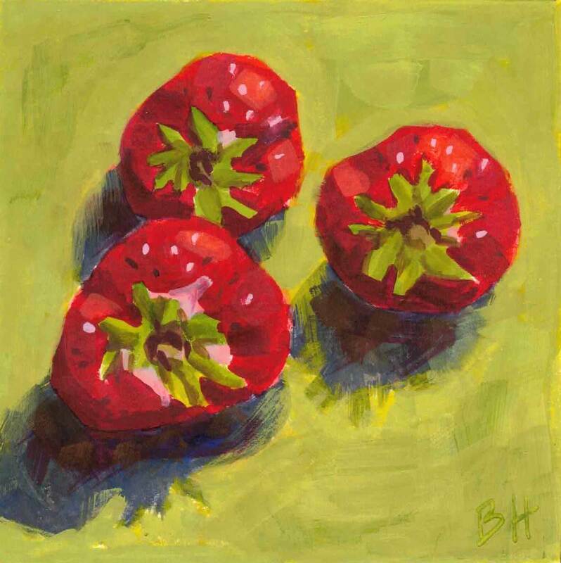
Breakfast of Melons, Early Strawberries - each painting is 5"x5" gouache on paper, painted in 2009 And, I'm not knocking refrigerator art. We have lots of that too, pictures of good times with our friends, our son and the grand dogs, and wonderful paintings made by young artists we love. The refrigerator is an excellent bulletin board!
 My Dream of Summer - 20"x24" oil on canvas There’s a saying in Maine “You can’t get there from here”. It’s a response people give when asked for directions to a location that’s hard to get to. I know sometimes our painting process feels just like that, Have you ever thought “I don’t think I can get there from here”? I know I have. But it’s NOT TRUE. You can get there. And it doesn’t matter where you start from. Most of us have learned to paint by a hodgepodge of approaches: some trial and error, some classes and workshops, some online demos by painters whose work we admire, and more trial and error. For some of us, this approach has left some gaps in our knowledge. 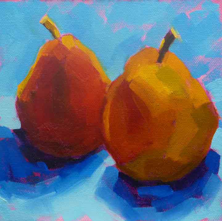 Pears in Blue - 6"x6" oil on canvas board Let's start with this question: Is it possible that you've missed some of the basics? There are two basics that will continue to frustrate you if you don’t address them: drawing and values. And just because someone told you weren’t good at drawing doesn’t mean it’s true! There are lots of ways to learn to become comfortable with drawing, and that’s what’s most important. Once you’re comfortable, and you put in a few minutes of practice each day, your drawing will improve quickly. I’ve got a free class called Confident Drawing for Artists on my website. Feel free to check it out HERE. Use the Register link (top right in blue) rather than the Log in link. Once you register, I’ll quickly approve the registration, and you’ll have access.
Cozy Harbor Inlet - 11"x14" oil on canvas panel - plein air The other basic is an understanding of how to use value in your painting. Value is simply the light or darkness of each shape in the painting. You can see values in a photo if you use your phone to change it to black and white. It’s the pattern of shapes with different values that creates the composition of a photo or a painting, not the line drawing by itself. Yes, that’s what I’m saying, the combination of the line drawing and the value shapes is the composition. Once you start looking at your work that way, it will be a lot easier to create a compelling painting. I’ve got a free resource on my website for values as well. It’s a simple PDF that will show you how to see the values, an exercise to drive that home, and a tool to help you as it becomes second nature. Feel free to check it out. Here’s a link.
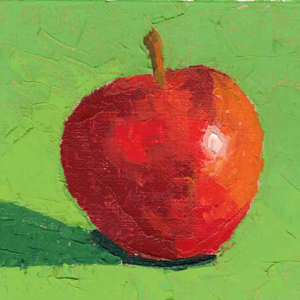
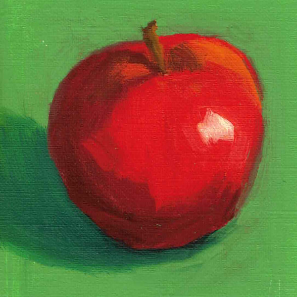
Apple - first painted with a knife, second with a brush Do you have a go to subject? I’ll bet you do. If you’re a musician, there’s probably a piece you go to when you aren’t playing well and need to get back into it. If you love to cook, you’ve likely got a go to recipe or two, comfort food for your brain and stomach. If you’re a jogger or bike rider, there must be a trail or road that attracts you when you’re not feeling on top of your game. Whatever you like to do for pleasure, I’ll bet you’ve got a go to subject, one that’s familiar and comforting. As for me, I've got go to painting subjects. I turn to them when things aren’t going well or I haven’t painted for a while. Apples are a favorite. They’re so cheerful and even more so on a green background. When I need to practice, I grab a few apples. And then I eat them after the painting is done.
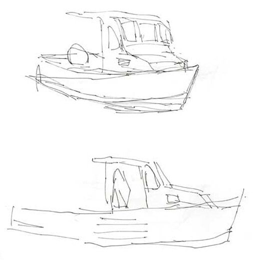
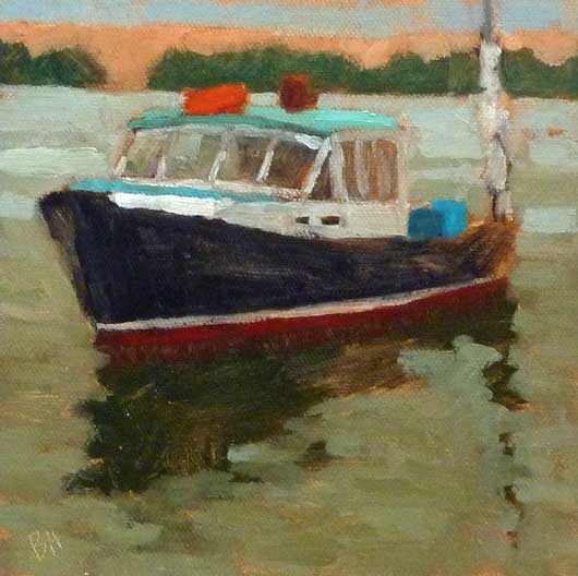
Lobster boat sketches first, Diligence - 6"x6" oil on canvas board, second You won’t be surprised to hear that boats are also a go to subject for me, especially for drawing practice. I love to sit on the dock or on our boat, and watch the other boats swing around on their moorings. Though moving, they give me the same view every 30 seconds or so. I have to be fast with my pen or wait until the next swing.
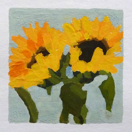
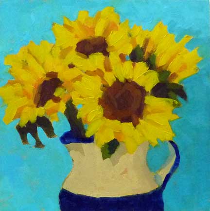
Sunflowers - painted with gouache first, and oils second Another go to subject for me is sunflowers, especially those with leaves. I love their chunky shapes and bright colors. They come with different colored centers, from green to ochre to brown. I like to get them in the light with shadows on their faces, or in a bunch in a vase. There aren’t many things more cheerful than a sunflower. They are just right when I need cheering up.
 Clinker Built - 6"x8" oil on canvas panel Each summer we take our boat down east from Yarmouth, ME, for a 10-12 day voyage. We visit harbors that we love and try to find someplace new to visit each year. Often we meet up with friends on their boats. It’s an idyllic time if the weather cooperates, and somewhat of an adventure if not. Clinker Built, the painting above, was a tender to a lovely sailboat that we saw in the harbor at Isle au Haut, at the bottom Merchants Row, south of Deer Isle. I’ve drawn and painted this boat lots of times, she’s such a classic. 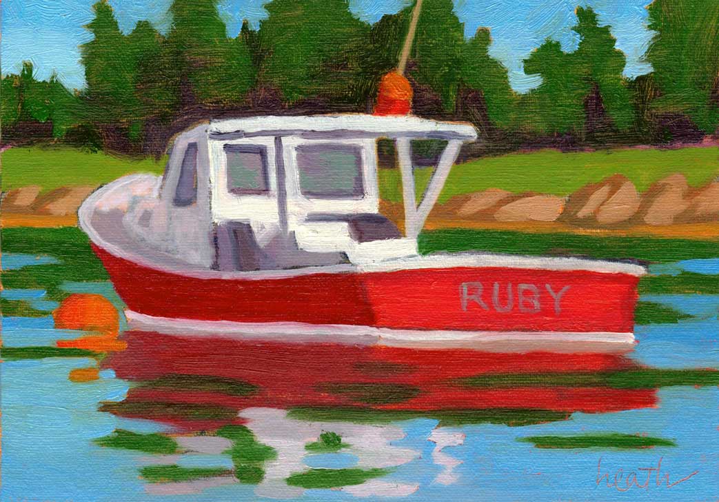 Ruby - 5"x7" oil on gessobord We split our time between harbors with villages, restaurants, and shops, and out of the way anchorages with only birds as companions. And of course, we see lots of other boats, both working vessels and pleasure craft. I love to draw and paint both types, and they were my chosen subjects for the holiday paintings for my galleries this year. These are at the Drawing Room in New Bedford. Ruby is moored in the little harbor that houses Billings Marine, near Stonington on Deer Isle. I don’t know the boat’s name, it was too far away from our mooring, but I loved the color, which gave me a name for the painting. 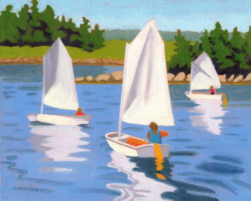 Sailing Dinghies - 8"x10" oil on canvas panel Just outside the inner harbor at Christmas Cove, we often see a sailing class. The kids bop around in their Optimist prams, a very popular boat for teaching children. I had to put together a few photos to create this painting, making sure to get the sizes right to make some farther away than the others. And back at our neighborhood dock someone had left the nice dinghy in the painting below tied up at the float. I was able to get a few good photos before they rowed it away.  Dinghy Color - 6"x6" oil on canvas panel But what about the whole down east thing? We say we’re sailing down east when we go up the coast of Maine because the coast goes in an easterly direction. The wind is generally from the southwest, so we sail down wind. Thus it’s called heading down east. And down east Maine to me is the area starting at Penobscot bay, and beyond towards Canada.  AFTER - Thomas Point - 6"x6" oil on canvas panel - 2010 There is no better way to get better at something than to practice. We’ve all learned how to ride a bike and drive a car, and we learned by practicing, falling down, and probably getting our first traffic ticket. But there’s more to it than just practice. How I practiced made a huge difference in becoming a better painter. The three principles described below were key. I think you can find analogies to them for anything you want to learn, such as cooking, or playing an instrument. You can see the change in my work through the paintings I’ve used to illustrate this post. There is about a year difference between the Before and After paintings, and during that time I used the techniques described here. 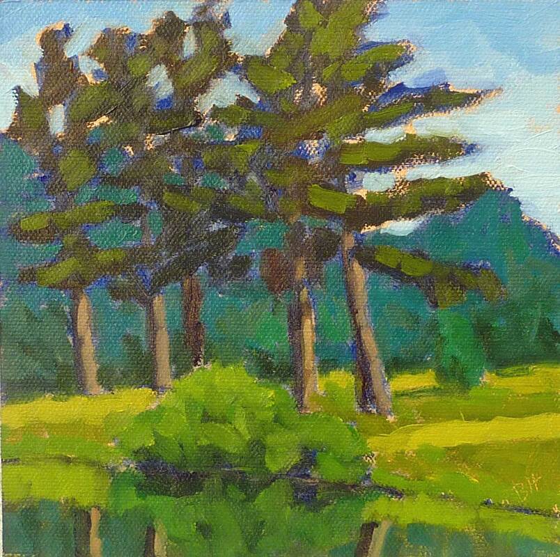 AFTER - Farm Pond Pines - 6"x 6" oil on canvas - 2010 First, you'll have the most effective learning experience if repetition of the whole process is part of your approach. For painting, it's best to paint several small paintings from start to finish each week, spending a short time on each one. Spending many hours on one painting doesn't build the muscle memory that the previous approach gives you, and you'll never become comfortable with the parts of the process that are hard for you. If you have stacks of partly completed paintings sitting around, it's likely because you're getting stuck, and you know what I mean! The same can be said for that piano piece that I can play the first page of so beautifully, and when I get to the last page, I’m slogging my way through it with lots of mistakes. 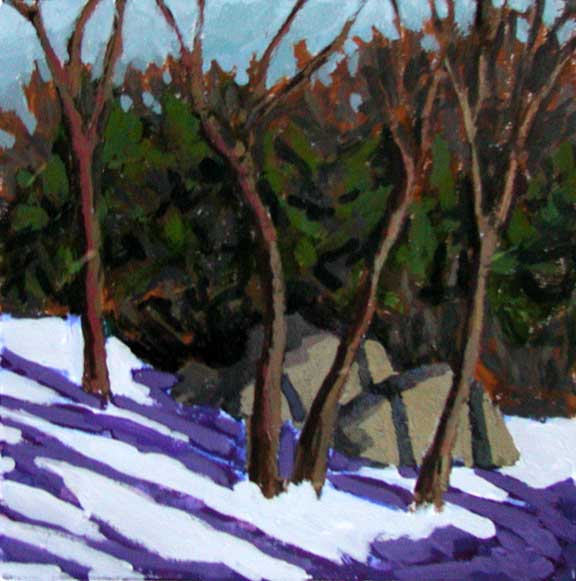 BEFORE - Afternoon Shadows - 6"x6" gouache on paper - 2009 Second, it’s easier to capture the form in space when working from life rather than from photos. Going from three dimensions to two works best when you do that with your own eyes, rather than relying on your camera, because the lenses in your eyes are so much better. I’m not sure what the analogy is here for playing an instrument, unless it’s playing a real piano rather than an app. Perhaps for baking, it’s doing that from scratch rather than from a mix. 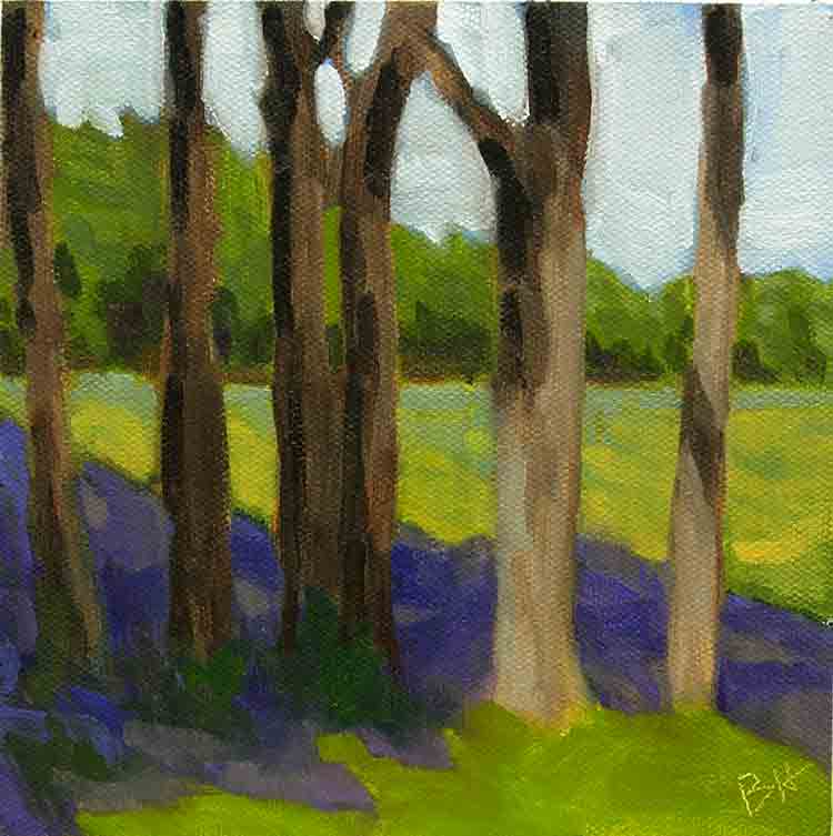 BEFORE - Gilsland Trees - 6"x6" oil on canvas panel - 2009 And finally, it helps in your exercises to paint a subject that's of interest, but isn't something that's really important to you, or that you've promised to paint for someone. Adding that stress subtracts from the learning experience. This is why, when I’m doing exercises, I divide my canvas into four parts. When I do that, it's no longer a frame-able picture, it's purely an exercise, and a weight comes off my shoulders. I know this works for cooking. There’s nothing more stressful than making something for the first time for a dinner party!
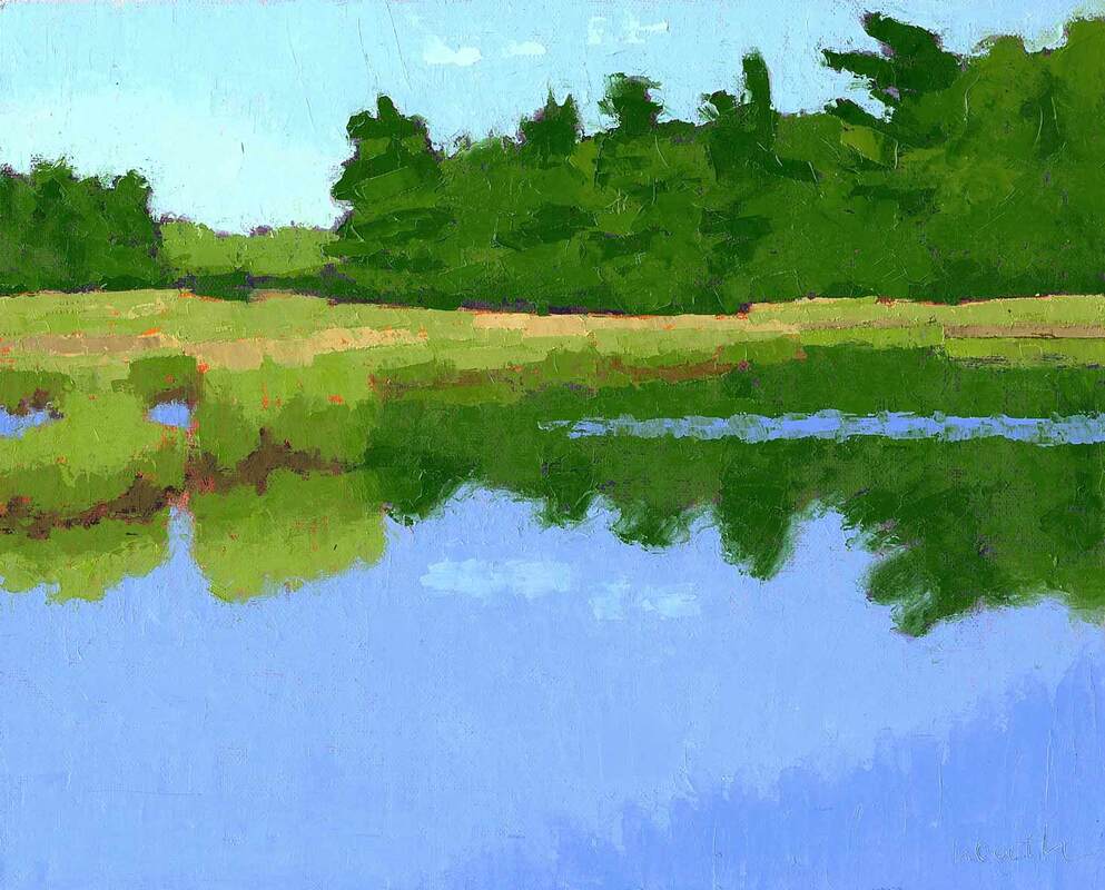
 Foxy Lady - 8"x10" oil on canvas panel It’s fun to create small works for my galleries’ holiday shows. These little gems are popular this time of year because they make great gifts. As you can see, I had boats on my mind when I was putting together this group. If you subscribe to multiple artists and gallery emails, you know there are paintings of many subjects available in many styles. It's almost overwhelming. So how do you, as a the gift giver, decide which painting is suitable for your recipient? That’s such a good question! 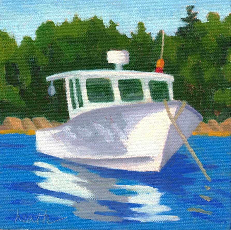 The Martha Gayle - 6"x6" oil on canvas panel In order to make a good choice, you should know the person pretty well, or have good knowledge of the inside of their house or office. Because the most important thing is that the painting have meaning for that person. You can figure that out based on their interests and hobbies, how they spend their time, and what they support, be that a sports team or a charity. 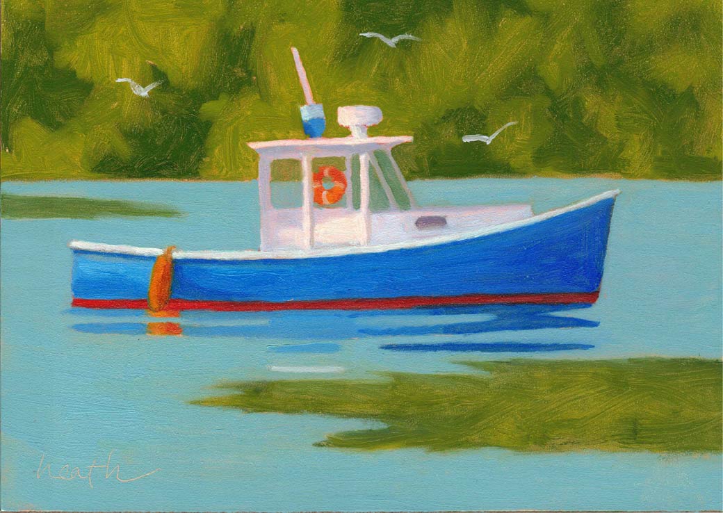 Blue Boat with Gulls - 5"x7" oil on gessoboard Hobbies are a good way to help figure out what subject matter would suit your giftee. We boaters are easy to please, we like paintings of boats. Golfers love golf course vistas, sports fans will be pleased with an action filled play, and, ... you get the idea. 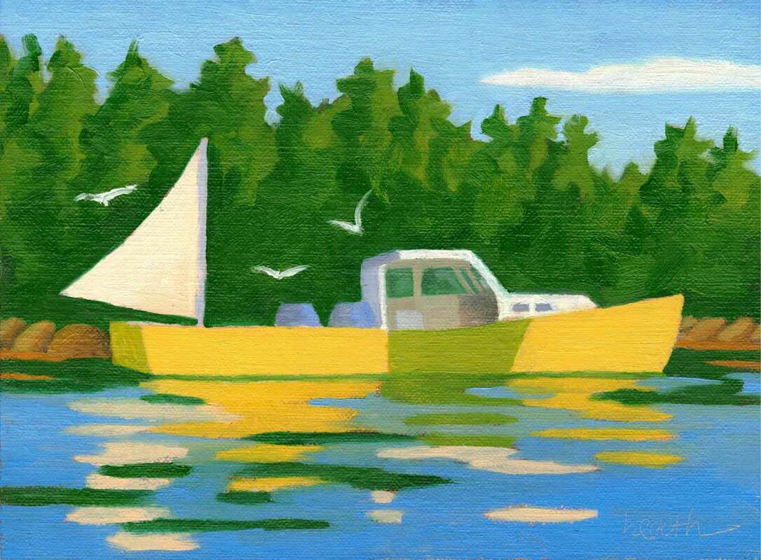 Mac and Lucy - 6"x8" oil on canvas panel Location is also a good guide. Nature lovers like landscapes of the areas they enjoy visiting, whether it’s a vista from a nearby hiking trail, or a mountain top view they were rewarded with after a tough climb. It’s best to stick to areas where your recipient lives, or that they have loved on their travels. And choosing the work of a local artist from the area is almost always a winner. They know the area and their work is most likely to evoke that sense of place that is important in a landscape.  Marsh From the Bridge - 8"x10" oil on canvas panel I’ve recently delivered my "On the Water" small paintings to both galleries that represent me. Those shown in this email are available at Yarmouth Frame and Gallery in Yarmouth, ME. Next time, I'll show my new paintings available at The Drawing Room in New Bedford.
|
AuthorBobbi - Painter. Sketcher. Teacher. Boat and Dog Lover. Archives
July 2024
|
 RSS Feed